
本文旨在解决在网页缩放时,图片位置偏移以及按钮等元素被挤压变形的问题。通过设置`display: block`,`max-width: fit-content`和`margin: auto`来保证按钮的居中显示,并使用`max-width: 100%`和`height: auto`来实现图片的响应式缩放,从而避免元素错位和变形。
在网页开发中,经常会遇到浏览器窗口大小改变时,页面元素位置错乱的问题,尤其是在包含图片和按钮等元素的页面中。为了解决这个问题,我们需要对CSS样式进行一些调整,使其能够适应不同尺寸的屏幕,保证页面在各种分辨率下都能正常显示。
默认情况下,标签是内联元素,其宽度会根据内容自适应。当浏览器窗口缩小时,如果标签的宽度不足以容纳按钮,按钮可能会被挤压变形,甚至换行显示。为了解决这个问题,我们需要将标签设置为块级元素,并设置其最大宽度为内容自适应,然后通过margin: auto来实现居中显示。
a {
  display: block;
  max-width: fit-content;
  margin: auto;
}为了让图片在不同尺寸的屏幕上都能正常显示,我们需要设置图片的max-width和height属性。
.picture {
  margin-top: 50px;
  max-width: 100%;
  height: auto;
}下面是包含以上CSS样式的完整示例代码:
<!DOCTYPE html>
<html lang="en">
<head>
<meta charset="UTF-8">
<meta name="viewport" content="width=device-width, initial-scale=1.0">
<title>Responsive Layout</title>
<style>
body {
text-align: center; /* 居中body内的所有内容 */
}
.new {
font-family: Arial;
color: rgb(202, 137, 15);
font-size: 18px;
margin-bottom: 15px;
}
.macbook {
font-family: Arial;
font-weight: bold;
font-size: 44px;
margin-top: 0px;
margin-bottom: 10px;
}
.supercharged {
font-family: Arial;
font-weight: bold;
font-size: 60px;
margin-top: 0px;
margin-bottom: 25px;
}
.price {
font-family: Arial;
font-size: 18px;
margin-top: 0px;
}
.button {
background-color: #007aff;
color: white;
border-radius: 100px;
font-weight: bold;
border: none;
padding-left: 16px;
padding-right: 16px;
padding-bottom: 10px;
padding-top: 10px;
}
.button:hover {
opacity: 0.8;
}
.button:active {
opacity: 0.5;
}
.charged {
color: plum;
text-decoration: underline;
}
.picture {
margin-top: 50px;
max-width: 100%;
height: auto;
}
a {
display: block;
max-width: fit-content;
margin: auto;
}
</style>
</head>
<body>
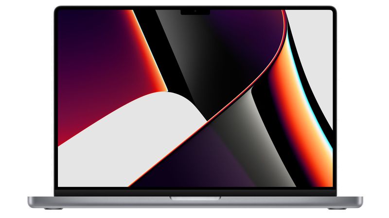
<p class='new'>New</p>
<h2 class='macbook'>MacBook Pro</h2>
<h1 class='supercharged'><span class='charged'>Supercharged</span> for pros.</h1>
<p class='price'>From $1999</p>
<a href="/text.html"><button class='button'>Buy</button></a>
@@##@@
</body>
</html>通过以上方法,我们可以有效地解决浏览器缩放时图片和元素位置错乱的问题,保证页面在不同尺寸的屏幕上都能正常显示。在实际开发中,可以根据具体情况进行调整,例如使用媒体查询来针对不同的屏幕尺寸设置不同的样式。
以上就是解决浏览器缩放时图片和元素位置错乱的问题的详细内容,更多请关注php中文网其它相关文章!

每个人都需要一台速度更快、更稳定的 PC。随着时间的推移,垃圾文件、旧注册表数据和不必要的后台进程会占用资源并降低性能。幸运的是,许多工具可以让 Windows 保持平稳运行。

 广告
广告Copyright 2014-2025 https://www.php.cn/ All Rights Reserved | php.cn | 湘ICP备2023035733号


 824
824


 收藏
收藏


