bootstrap 使用了一些 html5 元素和 css 属性,所以需要使用 html5 文档类型。
<!DOCTYPE html>
<html lang="zh-CN">
 ...
</html>
为了让 Bootstrap 开发的网站对移动设备友好,确保适当的绘制和触屏缩放,需要在网页的 head 之中添加 viewport meta 标签,如下所示:
<meta name="viewport" content="width=device-width, //视口宽度为设备宽度
          initial-scale=1.0, //缩放程度
          maximum-scale=1.0, //最大缩放级别(可选)
          user-scalable=no">//禁止页面缩放(可选)
Bootstrap 使用 Normalize 来建立跨浏览器的一致性。Normalize.css 是一个很小的 CSS 文件,在 HTML 元素的默认样式中提供了更好的跨浏览器一致性。
关于布局
Bootstrap 提供了一套响应式、移动设备优先的流式网格系统,随着屏幕或视口(viewport)尺寸的增加,系统会自动分为最多12列。
立即学习“Java免费学习笔记(深入)”;
img-responsive 用于img元素
container 用于包裹页面上的内容的元素
<div class="container">
 <div class="row">
  <div class="col-xs-6 col-md-2 col-md-offset-1"></div>
  <div class="col-xs-6 col-md-3"></div>
  <div class="col-xs-6 col-md-3"></div>
  <div class="col-xs-6 col-md-3"></div>
 </div>
 <div class="row">...</div>
</div>
<div class="container">....
<!--以上代码在手机上就是两行两列,在电脑上是一行四列,其中第一列前面有空白,比其它列宽度小三分之一-->
//可使用.col-md-push-* 和 .col-md-pull-* 这种类设定显示,col-md-push-6按照我个人的理解,是在左面浮动了6列,然后再插入元素,col-md-pull-3则是在右边浮动了3列,然后从右往左插入元素
@media (min-width: @screen-sm-min) and (max-width: @screen-sm-max) { ... }
//对于所有带有 min-width: @screen-sm-min 的设备,如果屏幕的宽度小于 @screen-sm-max,则会进行一些处理。
关于排版
<small>本行内容是在标签内</small><br>
<strong>本行内容是在标签内</strong><br>
<em>本行内容是在标签内,并呈现为斜体</em><br>
<p class="text-left">向左对齐文本</p>
<p class="text-center">居中对齐文本</p>
<p class="text-right">向右对齐文本</p>
<p class="text-muted">本行内容是减弱的</p>灰
<p class="text-primary">本行内容带有一个 primary class</p>蓝
<p class="text-success">本行内容带有一个 success class</p>绿
<p class="text-info">本行内容带有一个 info class</p>深蓝
<p class="text-warning">本行内容带有一个 warning class</p>黄
<p class="text-danger">本行内容带有一个 danger class</p>红
Bootstrap 定义 元素的样式为显示在文本底部的一条虚线边框,当鼠标悬停在上面时会显示完整的文本(只要您为 title 属性添加了文本)。为了得到一个更小字体的文本,请添加 .initialism 到 。
<abbr title="World Wide Web">WWW</abbr><br>
<abbr title="Real Simple Syndication" class="initialism">RSS</abbr>
<blockquote>这是一个带有源标题的引用。Someone famous in Source Title</blockquote>
内联显示代码,<div class="code" style="position:relative; padding:0px; margin:0px;"><pre class="brush:php;toolbar:false;">显示多行代码</strong></span><br />
</li>
</ul>
<p><strong>关于表格</strong></p>
<p style="text-align: center">@@##@@</p>
<p style="text-align: center">@@##@@</p>
<p>通过把任意的 .table 包在 .table-responsive class 内,您可以让表格水平滚动以适应小型设备(小于 768px)。当在大于 768px 宽的大型设备上查看时,您将看不到任何的差别。<br />
</p>
<div class="jb51code">
<pre class="brush:css;">
<div class="table-responsive">
<table class="table">
<caption>响应式表格布局</caption>
<thead>
<tr>
<th>产品</th>
<th>付款日期</th>
<th>状态</th>
</tr>
</thead>
<tbody>
<tr>
<td>产品1</td>
<td>23/11/2013</td>
<td>待发货</td>
</tr>
</tbody>
</table>
</div>
</pre>登录后复制</div>
<p><strong>关于表单</strong></p>
<div class="aritcle_card">
<a class="aritcle_card_img" href="/ai/2221">
<img src="https://img.php.cn/upload/ai_manual/001/246/273/68b6c52f05eb9477.png" alt="巧文书">
</a>
<div class="aritcle_card_info">
<a href="/ai/2221">巧文书</a>
<p>巧文书是一款AI写标书、AI写方案的产品。通过自研的先进AI大模型,精准解析招标文件,智能生成投标内容。</p>
<div class="">
<img src="/static/images/card_xiazai.png" alt="巧文书">
<span>61</span>
</div>
</div>
<a href="/ai/2221" class="aritcle_card_btn">
<span>查看详情</span>
<img src="/static/images/cardxiayige-3.png" alt="巧文书">
</a>
</div>
<ul>
<li><span style="color: #333333"><strong>在form上加上属性role="form"就会应用Bootstrap基本的表单结构,此时默认为垂直表单</strong></span></li>
<li><span style="color: #333333"><strong>把标签和控件放在一个带有 class .form-group 的 <div> 中。这是获取最佳间距所必需的。
<li>
<span style="color: #333333"><strong>向所有的文本元素 <input>、<textarea> 和 <select> 添加 class .form-control。</select></textarea></strong></span><br>
</li>
<div class="jb51code">
<div class="code" style="position:relative; padding:0px; margin:0px;"><pre class="brush:php;toolbar:false">
<input type="text" class="form-control" placeholder="文本输入"/>
<textarea class="form-control" rows="3"></textarea>
<label for="name">可多选的选择列表</label>
<select multiple class="form-control">
<option>1</option>
<option>2</option>
<option>3</option>
<option>4</option>
<option>5</option>
</select></pre>登录后复制</div>
</div>
<ul>
<li><span style="color: #333333"><strong>在form加上类calss=form-inline,那么表单元素就会变成内联的</strong></span></li>
<li><span style="color: #333333"><strong>在form加上类class=form-horizontal,那么表单元素就会变成水平的</strong></span></li>
</ul>
<p>1)设置表单控件padding和margin值<br>
2)改变“form-group”的表现形式,类似于网格系统的“row”。<br>
3)向标签添加 class .control-label。<br></p>
<ul>
<li><span style="color: #333333"><strong>复选框和单选框<br></strong></span></li>
</ul>
<p>1)对一系列复选框和单选框使用 .checkbox-inline 或 .radio-inline class,控制它们显示在同一行上。<br></p>
<ul>
<li><span style="color: #333333"><strong>当您需要在一个水平表单内的表单标签后放置纯文本时,请在 <p> 上使用 class .form-control-static。</p></strong></span></li>
<li><span style="color: #333333"><strong>禁用的输入框 input,如果您想要禁用一个输入框 input,只需要简单地添加 disabled 属性</strong></span></li>
<li><span style="color: #333333"><strong>对 <fieldset> 添加 disabled 属性来禁用 <fieldset> 内的所有控件。</fieldset>
</fieldset></strong></span></li>
<li><span style="color: #333333"><strong>Bootstrap 包含了错误、警告和成功消息的验证样式。只需要对父元素简单地添加适当的 class(.has-warning、 .has-error 或 .has-success)即可使用验证状态。</strong></span></li>
<li><span style="color: #333333"><strong>.input-lg 和.input-sm可以改变输入框的高度样式</strong></span></li>
<li>
<span style="color: #333333"><strong>help-block Bootstrap 表单控件可以在输入框 input 上有一个块级帮助文本。为了添加一个占用整个宽度的内容块,请在 <input> 后使用 .help-block。</strong></span><br>
</li>
</ul>
<div class="jb51code">
<div class="code" style="position:relative; padding:0px; margin:0px;"><pre class="brush:php;toolbar:false">
<input class="form-control" type="text" placeholder="">
<span class="help-block">一个较长的帮助文本块,超过一行,
需要扩展到下一行。本实例中的帮助文本总共有两行。</span>
</pre>登录后复制</div>
</div>
<p><strong>关于按钮</strong></p>
<div class="jb51code">
<div class="code" style="position:relative; padding:0px; margin:0px;"><pre class="brush:php;toolbar:false">
<button type="button" class="btn btn-default">默认按钮</button>
<!-- 提供额外的视觉效果,标识一组按钮中的原始动作 -->
<button type="button" class="btn btn-primary">原始按钮</button>
<!-- 表示一个成功的或积极的动作 -->
<button type="button" class="btn btn-success">成功按钮</button>
<!-- 信息警告消息的上下文按钮 -->
<button type="button" class="btn btn-info">信息按钮</button>
<!-- 表示应谨慎采取的动作 -->
<button type="button" class="btn btn-warning">警告按钮</button>
<!-- 表示一个危险的或潜在的负面动作 -->
<button type="button" class="btn btn-danger">危险按钮</button>
<!-- 并不强调是一个按钮,看起来像一个链接,但同时保持按钮的行为 -->
<button type="button" class="btn btn-link">链接按钮</button>
</pre>登录后复制</div>
</div>
<p>按钮的大小</p>
<div class="jb51code">
<div class="code" style="position:relative; padding:0px; margin:0px;"><pre class="brush:php;toolbar:false">
<p>
<button type="button" class="btn btn-primary btn-lg">
大的原始按钮
</button>
</p>
<p>
<button type="button" class="btn btn-primary">
默认大小的原始按钮
</button>
</p>
<p>
<button type="button" class="btn btn-primary btn-sm">
小的原始按钮
</button>
</p>
<p>
<button type="button" class="btn btn-primary btn-xs">
特别小的原始按钮
</button>
</p>
<p>
<button type="button" class="btn btn-primary btn-lg btn-block">
块级的原始按钮
</button>
</p></pre>登录后复制</div>
</div>
<ul>
<li><span style="color: #333333"><strong>class为active表示激活按钮</strong></span></li>
<li><span style="color: #333333"><strong>class为disabled表示禁用按钮</strong></span></li>
</ul>
<p>在a和input上使用按钮class也能弄成按钮的样子,但是考虑到跨浏览器的问题还是在button上比较好。</p>
<p><strong>关于图片</strong></p>
<p>关于图片的样式除了之前提到的img-responsive用于图片的自适应之外还有以下三个样式:<br></p>
<ul>
<li><span style="color: #333333"><strong>.img-rounded 圆角图片</strong></span></li>
<li><span style="color: #333333"><strong>.img-circle 圆形图片</strong></span></li>
<li><span style="color: #333333"><strong>.img-thumbnail 缩略图功能</strong></span></li>
</ul>
<p><strong> 关于其它样式类</strong></p>
<ul>
<li><span style="color: #333333"><strong>.pull-left左浮动<br></strong></span></li>
<li><span style="color: #333333"><strong>.pull-right右浮动<br></strong></span></li>
<li><span style="color: #333333"><strong>center-block内容居中<br></strong></span></li>
<li><span style="color: #333333"><strong>.clearfix清除浮动<br></strong></span></li>
<li><span style="color: #333333"><strong>.caret显示下拉式<br></strong></span></li>
<li>
<span style="color: #333333"><strong>.close关闭图标</strong></span><br>
</li>
</ul>
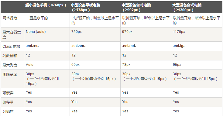
<p><strong>关于不同设备</strong></p>
<p style="text-align: center"><strong><img id="theimg" alt="" onclick="window.open(this.src)" src="http://files.jb51.net/file_images/article/201602/201621793115393.png?201611793123"></strong></p>
<p style="text-align: center"><img id="theimg" alt="" onclick="window.open(this.src)" src="http://files.jb51.net/file_images/article/201602/201621793141588.png?201611793156"></p>
<p>以上就是Bootstarp中CSS的使用方法,希望大家会喜欢。</p>
<img id="theimg" onclick="window.open(this.src)" src="http://files.jb51.net/file_images/article/201602/201621793609174.png?201611793617" alt=""><img id="theimg" onclick="window.open(this.src)" src="http://files.jb51.net/file_images/article/201602/201621793732648.png?201611793740" alt="">
</div></strong></span></li>
</ul>
java怎么学习?java怎么入门?java在哪学?java怎么学才快?不用担心,这里为大家提供了java速学教程(入门到精通),有需要的小伙伴保存下载就能学习啦!

 广告
广告Copyright 2014-2025 https://www.php.cn/ All Rights Reserved | php.cn | 湘ICP备2023035733号


 564
564


 收藏
收藏


