


作为一名前端开发,尤其是在做移动端适配时,rem是我们经常用到的单位,它的好处大家可以自行搜索,网上已经有很多了。
但是我们再将设计稿上的px转换成rem时,得手动的去计算,这是一个很耗时、费力的过程,有没有什么办法可以“解放”我们呢?(原谅我的懒~)
1.CSS处理器
Sass、LESS以及PostCSS这样的处理器都可以处理。
Sass(使用Sass的函数、混合宏这些功能来实现):
@function px2em($px, $base-font-size: 16px) {
  @if (unitless($px)) {
    @warn "Assuming #{$px} to be in pixels, attempting to convert it into pixels for you";
    @return px2em($px + 0px); // That may fail.
  } @else if (unit($px) == em) {
    @return $px;
  }
  @return ($px / $base-font-size) * 1em;
}
Sass(使用Sass的混合宏):
@mixin px2rem($property,$px-values,$baseline-px:16px,$support-for-ie:false){
  //Conver the baseline into rems
  $baseline-rem: $baseline-px / 1rem * 1;
  //Print the first line in pixel values
  @if $support-for-ie {
    #{$property}: $px-values;
  }
  //if there is only one (numeric) value, return the property/value line for it.
  @if type-of($px-values) == "number"{
    #{$property}: $px-values / $baseline-rem;
  }
  @else {
    //Create an empty list that we can dump values into
    $rem-values:();
    @each $value in $px-values{
      // If the value is zero or not a number, return it
      @if $value == 0 or type-of($value) != "number"{
        $rem-values: append($rem-values, $value / $baseline-rem);
      }
    }
    // Return the property and its list of converted values
    #{$property}: $rem-values;
  }
}
上面的方法,我们还得去额外学习sass这类的书写规则,也需要配置,虽然很简单,但是能不能更简单就更简单呢?
2.CSSREM
这是插件是flashlizi为sublime text编写的一个插件,用起来真的很方便!我们可以在GitHub上看到。
下面我介绍一下,如何配置:
立即学习“前端免费学习笔记(深入)”;

使用HTML,CSS,JavaScript开发Android应用程序 英文文字pdf版附源文件
下载
如果你了解HTML,CSS和JavaScript,您已经拥有所需的工具开发Android应用程序。本动手本书展示了如何使用这些开源web标准设计和建造,可适应任何Android设备的应用程序 - 无需使用Java。您将学习如何创建一个在您选择的平台的Android友好的网络应用程序,然后转换与自由PhoneGap框架到一个原生的Android应用程序。了解为什么设备无关的移动应用是未来的潮流,并开始构建应用程序,提供更
2.1 我们可以在GitHub上下载所依赖的文件;
2.2 打开Sublime Text,进入packages目录(Sublime Text -> Preferences -> Browse Packages);
2.3 将cssrem-master文件夹放在上一步打开的目录中,重启sublime text即可生效;
我们也可以修改默认配置:
打开cssrem-master文件夹下的cssrem.sublime-settings文件,进行修改
{
    "px_to_rem": 40, //px转rem的单位比例,默认为40
    "max_rem_fraction_length": 6, //px转rem的小数部分的最大长度。默认为6。
    "available_file_types": [".css", ".less", ".sass",".html"]
    //启用此插件的文件类型。默认为:[".css", ".less", ".sass"]
}
实际测试:
新建一个.css文件:
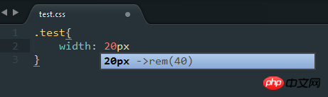
11.png
按tab键,得到如下结果:
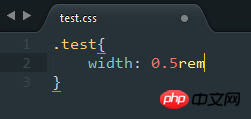
22.png
是不是很方便,快动手去尝试吧~
最后,附上 微网站—使用flexible.js实现移动端设备适配 。


