


大家应该都知道checkbox和radio这两个控件比较特殊,因为它在不同平台的拥有不同的展示。所以这篇文章就来给大家介绍如何利用css3的一些属性来实现自定义checkbox和radio样式,有需要的朋友们可以参考借鉴,下面来一起看看吧。
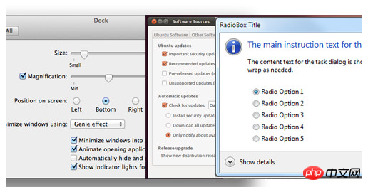
首先看看不同平台的checkbox & radio
我们可以利用CSS3的一些属性来实现自定义checkbox & radio样式。
HTML 代码
// radio input// checkbox input
CSS 代码
立即学习“前端免费学习笔记(深入)”;

label {
    display: inline-block;
    cursor: pointer;
    position: relative;
    padding-left: 25px;
    margin-right: 15px;
    font-size: 13px;
}

label:before {
    content: "";
    display: inline-block;

    width: 16px;
    height: 16px;

    margin-right: 10px;
    position: absolute;
    left: 0;
    bottom: 1px;
    background-color: #aaa;
    box-shadow: inset 0px 2px 3px 0px rgba(0, 0, 0, .3), 0px 1px 0px 0px rgba(255, 255, 255, .8);
}

.radio label:before {
    border-radius: 8px;
}
.checkbox label:before {
    border-radius: 3px;
}


input[type=radio],
input[type=checkbox] {
    display: none;
}

input[type=radio]:checked + label:before {
    content: "\2022";
    color: #f3f3f3;
    font-size: 30px;
    text-align: center;
    line-height: 18px;
}
input[type=checkbox]:checked + label:before {
    content: "\2713";
    text-shadow: 1px 1px 1px rgba(0, 0, 0, .2);
    font-size: 15px;
    color: #f3f3f3;
    text-align: center;
    line-height: 15px;
}
兼容性
:checked在IE8兼容性不理想
box-shadow在IE8不兼容,不过box-shadow对于自定义样式可有可无
:after :before在IE8不兼容双冒号写法
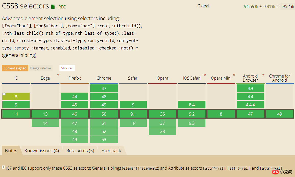
:checked属性兼容性
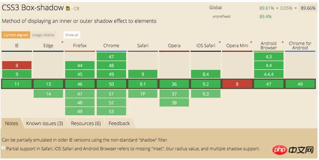
box-shadow属性兼容性
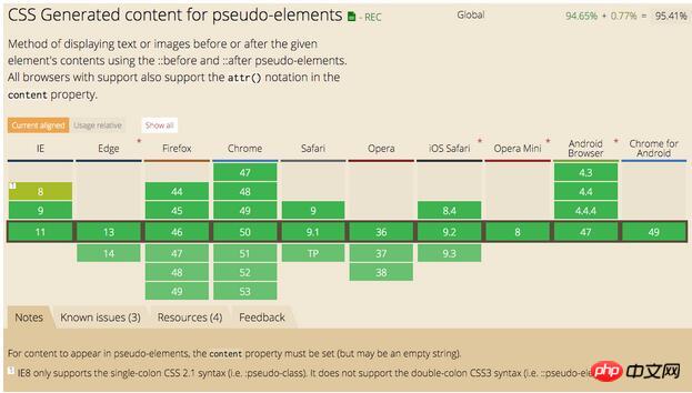
:before :after属性兼容性


