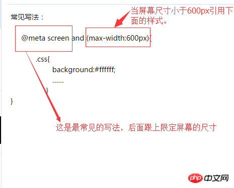
常见写法:
立即学习“前端免费学习笔记(深入)”;
下面总结常见的响应式布局的分类:
@media screen and (max-width:320px){
  #talkFooter .editArea{…… }}
@media screen and (min-width:321px) and (max-width:375px){
    #talkFooter .editArea{…… }}
@media screen and (min-width:376px) and (max-width:414px){
 #talkFooter .editArea{…… }}
@media screen and (min-width:415px) and (max-width:639px){
 #talkFooter .editArea{……}}
@media screen and (min-width:640px) and (max-width:719px){
 #talkFooter .editArea{……}}
@media screen and (min-width:720px) and (max-width:749px){
 #talkFooter .editArea{……}}
@media screen and (min-width:750px) and (max-width:799px){
 #talkFooter .editArea{……}}
@media screen(min-width:800px){}
立即学习“前端免费学习笔记(深入)”;
以上就是css响应式布局-media的详细内容,更多请关注php中文网其它相关文章!

每个人都需要一台速度更快、更稳定的 PC。随着时间的推移,垃圾文件、旧注册表数据和不必要的后台进程会占用资源并降低性能。幸运的是,许多工具可以让 Windows 保持平稳运行。

 广告
广告Copyright 2014-2025 https://www.php.cn/ All Rights Reserved | php.cn | 湘ICP备2023035733号


 701
701


 收藏
收藏