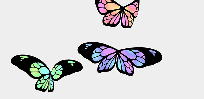
css3怎么制作蝴蝶飞舞的动画?蝴蝶飞舞的动画效果是什么样的?css3制作蝴蝶飞舞的动画需要注意哪些方面?今天给大家用css3做一个蝴蝶飞舞的动画。
<!DOCTYPE html>
<html >
<head>
  <meta charset="UTF-8">
<title>CSS3制作蝴蝶飞舞动画</title>
<meta name="keywords" content=" CSS3制作蝴蝶飞舞动画" />
<meta name="description" content=" CSS3制作蝴蝶飞舞动画" />
      <style>
      body{
  background-color: lightblue;
}
#container {
perspective: 600px;
perspective-origin: -20% 20%;
width: 850px;
height: 566px;
left: 300px;
top: 0px;
color: gray;
margin: 0px auto;
}
#butterfly {
transform: rotateZ(-30deg) rotate3d(0, 1, 0, 0deg) scale3d(0.5, 0.5, 0.5);
transform-origin: 51% 50%;
left: 0px;
top: 0px;
width: 400px;
height: 238px;
transform-style: preserve-3d;
/*Fly in a loop below*/
/*animation-name: butterflyani;
animation-duration: 5s;
animation-iteration-count: infinite;
animation-timing-function: linear;*/
}
.wing {
transform: rotateX(30deg)  translate3d(-200px, 0px, 0px) rotate3d(0, 1, 0, 160deg);
transform-origin: top right;
position: absolute;
left: 200px;
top: 0px;
width: 200px;
height: 238px;
background: url(butterfly.png) no-repeat;
animation-name: rightwingani;
animation-duration: 0.6s;
animation-delay: 2s;
animation-iteration-count: 4;
animation-timing-function: ease-out;
}
#butterfly .left{
transform: rotateX(30deg) rotate3d(0, 1, 0, 0deg);
animation-name: leftwingani;
left: 0px;
top: 0px;
}
@keyframes rightwingani {
         from {
                   transform:rotateX(30deg) translate3d(-200px, 0px, 0px) rotate3d(0, 1, 0, 160deg);
         }
         50% {
                   transform:rotateX(30deg) translate3d(-200px, 0px, 0px) rotate3d(0, 1, 0, 100deg);
         }
         to{
                   transform:rotateX(30deg) translate3d(-200px, 0px, 0px) rotate3d(0, 1, 0, 160deg);
         }
}

@keyframes leftwingani {
         from {
                   transform:rotateX(30deg) rotate3d(0, 1, 0, 0deg);
         }
         50% {
                   transform:rotateX(30deg) rotate3d(0, 1, 0, 80deg);
         }
         to{
                   transform:rotateX(30deg) rotate3d(0, 1, 0, 00deg);
         }
}
a {
  font-size: 5.5em;
  font-family: Arial;
  text-decoration: none;
  text-align: right;
  color: teal;
  letter-spacing: -2px;
  position: relative;
  top: -70%;
  left: -9%;
  width: 67%;
  display: block;
  line-height: 1.1em;
}
    </style>
</head>
<body>
  <div id="container">
  <div id="butterfly">
    <div class="left wing"></div>
    <div class="right wing"></div>
  </div>
</div>
    <script src="js/index.js"></script>
</body>
</html>蝴蝶飞舞的动画就是这么做出来的,更多精彩请关注php中文网其它相关文章!
相关阅读:
立即学习“前端免费学习笔记(深入)”;
以上就是CSS3怎么制作蝴蝶飞舞的动画的详细内容,更多请关注php中文网其它相关文章!

每个人都需要一台速度更快、更稳定的 PC。随着时间的推移,垃圾文件、旧注册表数据和不必要的后台进程会占用资源并降低性能。幸运的是,许多工具可以让 Windows 保持平稳运行。

Copyright 2014-2025 https://www.php.cn/ All Rights Reserved | php.cn | 湘ICP备2023035733号


 663
663


 收藏
收藏