有时对于响应式布局,我们需要根据组件的宽度自适应高度。css无法实现这种动态变化,传统是用jquery实现。本文主要介绍了react根据宽度自适应高度的示例代码,小编觉得挺不错的,现在分享给大家,也给大家做个参考。一起跟随小编过来看看吧,希望能帮助到大家。
而在React中无需依赖于JQuery,实现相对比较简单,只要在DidMount后更改width即可。
Try on Codepen
需要注意的是在resize时候也要同步变更,需要注册个监听器
class Card extends React.Component {
 constructor(props) {
  super(props);
  this.state = {
   width: props.width || -1,
   height: props.height || -1,
  }
 }

 componentDidMount() {
  this.updateSize();
  window.addEventListener('resize', () => this.updateSize());
 }

 componentWillUnmount() {
  window.removeEventListener('resize', () => this.updateSize());
 }

 updateSize() {
  try {
   const parentDom = ReactDOM.findDOMNode(this).parentNode;
   let { width, height } = this.props;
   //如果props没有指定height和width就自适应
   if (!width) {
    width = parentDom.offsetWidth;
   }
   if (!height) {
    height = width * 0.38;
   }
   this.setState({ width, height });
  } catch (ignore) {
  }
 }

 render() {
  return (
   <p className="test" style={ { width: this.state.width, height: this.state.height } }>
    {`${this.state.width} x ${this.state.height}`}
   </p>
  );
 }
}

ReactDOM.render(
 <Card/>,
 document.getElementById('root')
);参考资料
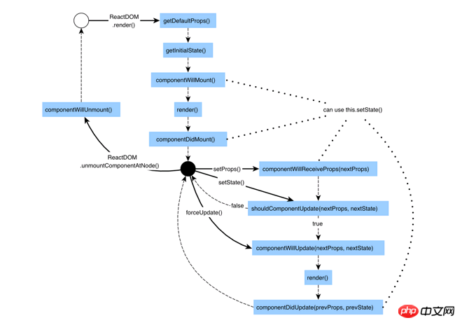
React生命周期
相关推荐:
JavaScript 处理Iframe自适应高度(同或不同域名下)
以上就是React根据宽度自适应高度实例分享的详细内容,更多请关注php中文网其它相关文章!

每个人都需要一台速度更快、更稳定的 PC。随着时间的推移,垃圾文件、旧注册表数据和不必要的后台进程会占用资源并降低性能。幸运的是,许多工具可以让 Windows 保持平稳运行。

Copyright 2014-2025 https://www.php.cn/ All Rights Reserved | php.cn | 湘ICP备2023035733号


 581
581


 收藏
收藏