
最近在做公司的登录页,ue同学希望第三方登录的图标在hover的时候有一个圆形的缩放效果(原话是波纹效果-_-||),效果参考腾讯新闻和网易新闻的分享按钮。
本文主要和大家介绍CSS圆形缩放动画简单实现的相关资料,小编觉得挺不错的,现在分享给大家,也给大家做个参考,希望能帮助到大家。
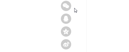
腾讯新闻的分享按钮hover效果(新闻页面):
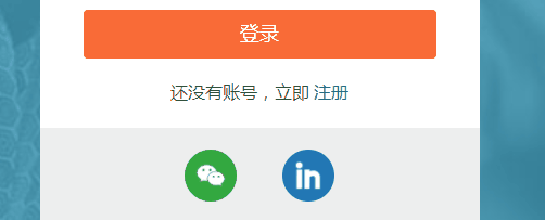
网易新闻的分享按钮hover效果(新闻页面):

看了一下这两个页面的源码,主要是用了 transform:scale() 和 transition ,自己的最终的实现效果如下:
立即学习“前端免费学习笔记(深入)”;
实现思路大体是模仿网易新闻的,布局如下:
<a href="" class="third-party third-party-weixin">
     <i></i>
     <span></span>
</a>外层的a标签用于整体容器和跳转,内层的i标签使用伪元素::before和::after分别作为背景色和前景色,这两个伪元素均绝对定位,垂直水平居中,::after设置缩放属性 transform:scale(0) ,过渡动画属性 transition: all .3s ,正常情况下::before可见,当hover的时候::after设置缩放属性 transform:scale(1) ,两个相邻绝对定位元素在不设置z-index的情况下,文档流在后的元素在上,并且在有过渡动画属性 transition 的情况下实现了缩放动画效果。
span标签用于展示logo,可以是图片或者web字体,只要透明就可以,这里用了图片。 CSS(此处使用的是sass)如下:
.third-party {
    position: relative;
    // 为了兼容firefox必须要变成block或inline-block
    display: inline-block;
    width: 48px;
    height: 48px;
    margin: {
        left: 6%;
        right: 6%;
    }
    &:hover {
        i {
            &::after {
                transform: scale(1);
            }
        }
    }
    span {
        // position: relative是为了兼容firefox和IE
        position: relative;
        display: block;
        width: 48px;
        height: 48px;
        background-size: 30px;
        background-position: center;
        background-repeat: no-repeat;
    }
    i {
        position: absolute;
        top: 0;
        left: 0;
        width: 48px;
        height: 48px;
        &::before {
            content: '';
            border-radius: 50%;
            position: absolute;
            top: 0;
            left: 0;
            right: 0;
            bottom: 0;
        }
        &::after {
            content: '';
            transition: all .3s;
            border-radius: 50%;
            position: absolute;
            top: 0;
            left: 0;
            right: 0;
            bottom: 0;
            transform: scale(0);
        }
    }
    &.third-party-weixin {
        span {
            background-image: url(../images/login/weixin-64.png);
        }
        i {
            &::before {
                background-color: #20a839;
            }
            &::after {
                background-color: #30cc54;
            }
        }
    }
}这样这个简单的圆形缩放动画就完成啦。
相关推荐:
以上就是CSS圆形缩放动画实现代码分享的详细内容,更多请关注php中文网其它相关文章!

每个人都需要一台速度更快、更稳定的 PC。随着时间的推移,垃圾文件、旧注册表数据和不必要的后台进程会占用资源并降低性能。幸运的是,许多工具可以让 Windows 保持平稳运行。

 广告
广告Copyright 2014-2025 https://www.php.cn/ All Rights Reserved | php.cn | 湘ICP备2023035733号


 302
302


 收藏
收藏


