这次给大家带来css3做出半圆弧线,css3做出半圆弧线的注意事项有哪些,下面就是实战案例,一起来看一下。
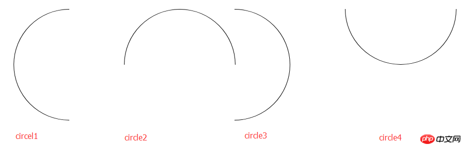
本文介绍了css3实现画半圆弧线的示例代码,分享给大家,具体如下:
css代码
.circle1 {
    width: 100px;
    height: 200px;
    border: 1px solid black;
    border-radius: 100% 0 0 100%/50%;
    border-right: none;
}
.circle2 {
    width: 200px;
    height: 100px;
    border: 1px solid black;
    border-radius: 50% 50% 0 0/100% 100% 0 0;
    border-bottom: none;
}
.circle3 {
    width: 100px;
    height: 200px;
    border: 1px solid black;
    border-radius: 0 100% 100% 0/50%;
    border-left: none;
}
.circle4 {
    width: 200px;
    height: 100px;
    border: 1px solid black;
    border-radius: 0 0 50% 50%/0 0 100% 100% ;
    border-top: none;
}html代码
<ul>
    <li><p class="circle1"></p></li>
    <li><p class="circle2"></p></li>
    <li><p class="circle3"></p></li>
    <li><p class="circle4"></p></li>
</ul>效果如下:
相信看了本文案例你已经掌握了方法,更多精彩请关注php中文网其它相关文章!
推荐阅读:
以上就是css3做出半圆弧线的详细内容,更多请关注php中文网其它相关文章!

每个人都需要一台速度更快、更稳定的 PC。随着时间的推移,垃圾文件、旧注册表数据和不必要的后台进程会占用资源并降低性能。幸运的是,许多工具可以让 Windows 保持平稳运行。

Copyright 2014-2025 https://www.php.cn/ All Rights Reserved | php.cn | 湘ICP备2023035733号


 779
779


 收藏
收藏