这次给大家带来css3的移动属性,使用css3移动属性的注意事项有哪些,下面就是实战案例,一起来看一下。
transform功能
放缩
使用sacle方法实现文字或图像的放缩处理,在参数中指定缩放倍率,比如sacle(0.5)表示缩小50%,例子如下:
<!DOCTYPE html>
<html lang="en">
<head>
    <meta charset="UTF-8">
    <title>scale方法使用示例</title>
    <style>
        p {
            width: 300px;
            margin: 150px auto;
            background-color: yellow;
            text-align: center;
            -webkit-transform: scale(0.5);
            -moz-transform: scale(0.5);
            -o-transform: scale(0.5);
        }
    </style>
</head>
<body>
<p>示例文字</p>
</body>
</html>另外,可以分别指定元素水平方向的放大倍率与垂直方向的放大倍率,例子如下:
<!DOCTYPE html>
<html lang="en">
<head>
    <meta charset="UTF-8">
    <title>scale方法使用示例</title>
    <style>
        p {
            width: 300px;
            margin: 150px auto;
            background-color: yellow;
            text-align: center;
            -webkit-transform: scale(0.5,2);
            -moz-transform: scale(0.5,2);
            -o-transform: scale(0.5,2);
        }
    </style>
</head>
<body>
<p>示例文字</p>
</body>
</html>倾斜
使用skew方法来实现文字或图像的倾斜处理,在参数中分别指定水平方向上的倾斜角度与垂直方向上的倾斜角度,例如”skew(30deg,30deg)”表示水平方向上倾斜30度,垂直方向倾斜30度,例子如下:
<!DOCTYPE html>
<html lang="en">
<head>
    <meta charset="UTF-8">
    <title>skew方法使用示例</title>
    <style>
        p {
            width: 300px;
            margin: 150px auto;
            background-color: yellow;
            text-align: center;
            -webkit-transform: skew(30deg, 30deg);
            -moz-transform: skew(30deg,30deg);
            -o-transform: skew(30deg,30deg);
        }
    </style>
</head>
<body>
<p>示例文字</p>
</body>
</html>旋转
使用rotate方法将元素进行旋转,共一个参数“角度”,单位deg为度的意思,正数为顺时针旋转,负数为逆时针旋转。例子如下:
<!DOCTYPE html>
<html lang="en">
<head>
    <meta charset="UTF-8">
    <title>对元素使用多重变形的示例</title>
    <style>
        p {
            margin: 100px;
            width: 300px;
            background-color: yellow;
            text-align: center;
            -webkit-transform:rotate(30deg);
            -moz-transform:rotate(30deg);
            -o-transform:rotate(30deg);
        }
    </style>
</head>
<body>
<p>示例文字</p>
</body>
</html>移动
使用translate方法来将文字或图像进行移动,在参数中分别指定水平方向上的移动距离与垂直方向上的移动距离。例如:
<!DOCTYPE html>
<html lang="en">
<head>
    <meta charset="UTF-8">
    <title>translate方法使用示例</title>
    <style>
        p {
            width: 300px;
            margin: 150px auto;
            background-color: yellow;
            text-align: center;
            -webkit-transform: translate(50px,50px);
            -moz-transform: translate(50px,50px);
            -o-transform: translate(50px,50px);
        }
    </style>
</head>
<body>
<p>示例文字</p>
</body>
</html>变形示例
示例1:
<!DOCTYPE html>
<html lang="en">
<head>
<meta charset="UTF-8">
<title>对元素使用多重变形的示例</title>
<style>
p {
width: 300px;
background-color: yellow;
text-align: center;
-webkit-transform: translate(150px,200px) rotate(45deg) scale(1.5);
-moz-transform: translate(50px,50px) rotate(45deg) scale(1.5);
-o-transform: translate(50px,50px) rotate(45deg) scale(1.5);
}
</style>
</head>
<body>
<p>示例文字</p>
</body>
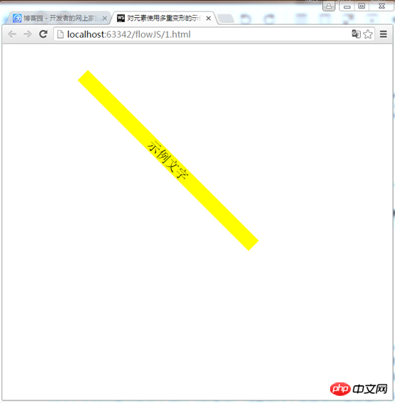
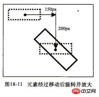
</html>这个例子是先移动,然后旋转,最后放缩
效果:
示例2:
<!DOCTYPE html>
<html lang="en">
<head>
<meta charset="UTF-8">
<title>对元素使用多重变形的示例</title>
<style>
p {
width: 300px;
background-color: yellow;
text-align: center;
-webkit-transform:rotate(45deg) scale(1.5) translate(150px,200px);
-moz-transform:rotate(45deg) scale(1.5) translate(150px,200px);
-o-transform: rotate(45deg) scale(1.5) translate(150px,200px);
}
</style>
</head>
<body>
<p>示例文字</p>
</body>
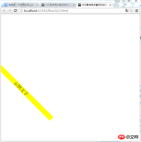
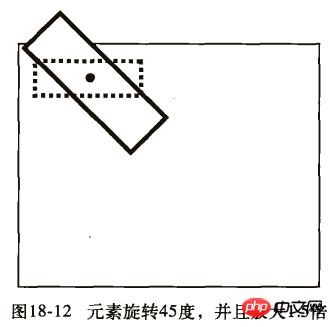
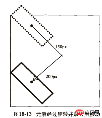
</html>先旋转,然后在放缩,最后移动
效果:
从两个示例的运行结果中我们可以看出,元素在两个页面上所处于位置并不相同。我们来看看他们的的详细步骤:
第一个示例:
1) 首先向右移动150px,向下移动200px。
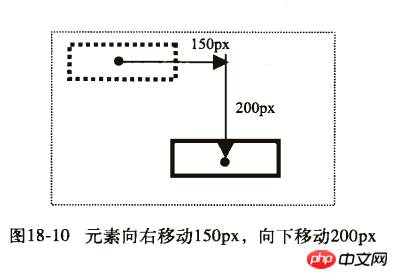
2) 然后旋转45度,并且放大1.5倍。
第二个示例:
1) 首先旋转45度,并且放大1.5倍。
2) 然后向右移动150px,向下移动200px。
相信看了本文案例你已经掌握了方法,更多精彩请关注php中文网其它相关文章!
推荐阅读:
以上就是css3的移动属性的详细内容,更多请关注php中文网其它相关文章!

每个人都需要一台速度更快、更稳定的 PC。随着时间的推移,垃圾文件、旧注册表数据和不必要的后台进程会占用资源并降低性能。幸运的是,许多工具可以让 Windows 保持平稳运行。

Copyright 2014-2025 https://www.php.cn/ All Rights Reserved | php.cn | 湘ICP备2023035733号


 290
290


 收藏
收藏