这次给大家带来CSS实现3D按钮效果,CSS实现3D按钮效果的注意事项有哪些,下面就是实战案例,一起来看一下。
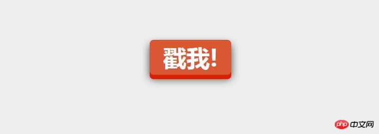
css巧妙利用了box-shadow来实现3D物体的立体感,当按钮按下的时候再去修改box-shadow和top值。
让人感觉有一种按钮被按下的感觉。css代码非常少,如下所示
a.css-3d-btn{
 position: relative;
 color: rgba(255, 255, 255, 1);
 text-decoration: none;
 background-color: rgba(219, 87, 51, 1);
 font-family: "Microsoft YaHei", 微软雅黑, 宋体;
 font-weight: 700;
 font-size: 3em;
 display: block;
 padding: 4px;
 border-radius: 8px;
 /* let's use box shadows to make the button look more 3-dimensional */
 box-shadow: 0px 9px 0px rgba(219, 31, 5, 1), 0px 9px 25px rgba(0, 0, 0, .7);
 margin: 100px auto;
 width: 160px;
 text-align: center;
 -webkit-transition: all .1s ease;
 -moz-transition: all .1s ease;
 transition: all .1s ease;
}
/* now if we make the box shadows smaller when the button is clicked, it'll look like the button has been "pushed" */
a.css-3d-btn:active{
 box-shadow: 0px 3px 0px rgba(219, 31, 5, 1), 0px 3px 6px rgba(0, 0, 0, .9);
 position: relative;
 top: 6px;
}效果如下:
相信看了本文案例你已经掌握了方法,更多精彩请关注php中文网其它相关文章!
推荐阅读:
以上就是CSS实现3D按钮效果的详细内容,更多请关注php中文网其它相关文章!

每个人都需要一台速度更快、更稳定的 PC。随着时间的推移,垃圾文件、旧注册表数据和不必要的后台进程会占用资源并降低性能。幸运的是,许多工具可以让 Windows 保持平稳运行。

 广告
广告Copyright 2014-2025 https://www.php.cn/ All Rights Reserved | php.cn | 湘ICP备2023035733号


 166
166


 收藏
收藏


 取消收藏
取消收藏


