这次给大家带来2D模拟实现摩天轮旋转动画特效,使用2D模拟实现摩天轮旋转动画特效的注意事项有哪些,下面就是实战案例,一起来看一下。
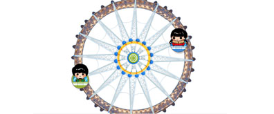
先看效果图:

由于上传的大小原因,只能录制成这种效果,原图是无限循环的转圈。
代码:
模拟摩天轮动画


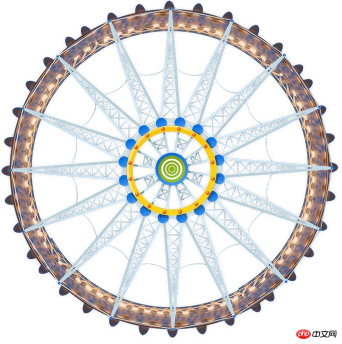
摩天轮原图:
注释:transform-origin 属性允许您改变被转换元素的位置。
这个属性主要的作用就是选择一个位置,然后绕着这个位置旋转。
相信看了本文案例你已经掌握了方法,更多精彩请关注php中文网其它相关文章!
推荐阅读: