这篇文章主要介绍了关于css3实现求婚小动画,有着一定的参考价值,现在分享给大家,有需要的朋友可以参考一下
昨天在微信公众号中看到这一篇文章,瞬间觉得css太强大了,只要你想做,everything is possible!

然后一步步分析一下:
.w-m img{
	margin-right: 0;
	float: right;
	margin-top: 60px;
	animation: toWoman 0.5s ease .5s both;
}
@keyframes toWoman{
	0%{
		opacity: 0;
		transform: translate(-200px);
	}
	100%{
		opacity: 1;
		transform: translate(0);
	}
}里面用到的知识点:
animation:是一个简写属性,用于设置六个动画属性
animation-name 规定需要绑定到选择器的 keyframe 名称
animation-duration 规定完成动画所花费的时间,以秒或毫秒计
animation-timing-function 规定动画的速度曲线
animation-delay 规定在动画开始之前的延迟
animation-iteration-count 规定动画应该播放的次数
animation-direction 规定是否应该轮流反向播放动画
keyframes:让开发者通过指定动画中特定时间点必须展现的关键帧样式(或者说停留点)来控制CSS动画的中间环节。这让开发者能够控制动画中的更多细节而不是全部让浏览器自动处理
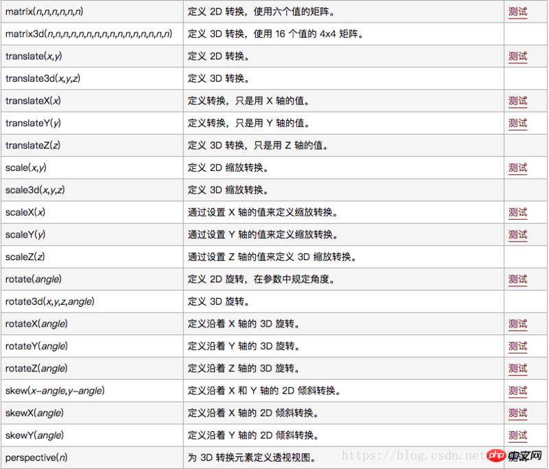
transform 向元素应用 2D 或 3D 转换。该属性允许我们对元素进行旋转、缩放、移动或倾斜
.w-f{
    position: absolute;
    z-index: 20;
    left: 50%;
    margin-left: -30px;
    margin-top: 75px;
}
.w-f img{
	width: 60px;
	animation: show 0.4s ease 1s both;
}

@keyframes show{
	0%{
		opacity: 0;
		transform: scale(0.1,0.1);
	}
	100%{
		opacity: 1;
		transform: scale(1,1);
	}
}.w-t-m{
position: absolute;
left: 50%;
z-index: 10;
line-height: 80px;
color: #ff720a;
letter-spacing: 5px;
opacity: 0;
animation: titleBloom 1s linear 1s both;
font-size: 26px;
margin-left: -125px;
}
@keyframes titleBloom{
0% {
transform: translate(-50px);
}
100% {
opacity: 1;
transform: translate(0);
}
}.w-t img{
opacity: 0;
animation: bloom 2s ease 1.2s infinite;
}
.w-t img.boom2{
float: right;
animation: bloom 2s ease 1.5s infinite;
}
.w-t img.boom3{
position: absolute;
margin-top: 40px;
animation: bloom 2s ease 1.4s infinite;
}
@keyframes bloom{
0% {
transform: scale(0,0);
}
100% {
opacity: 1;
transform: scale(1,1);
}
}.w-fls{
width: 820px;
margin: 0 auto;
}
.w-fls img{
height: 120px;
z-index: 400;
animation: showFlows 0.4s ease 2.3s both;
}
@keyframes showFlows{
0%{
opacity: 0;
transform: translate(0,200px);
}
100%{
opacity: 1;
transform: translate(0);
}
}
.w-2{
margin-top: -130px;
padding-left: 100px;
}
.w-2 img{
animation: showFlows 0.4s ease 2.7s both;
}写到这里,觉得前端开发原来是这么有趣的一件事哈~
立即学习“前端免费学习笔记(深入)”;
相关推荐:
以上就是css3实现求婚小动画的详细内容,更多请关注php中文网其它相关文章!

每个人都需要一台速度更快、更稳定的 PC。随着时间的推移,垃圾文件、旧注册表数据和不必要的后台进程会占用资源并降低性能。幸运的是,许多工具可以让 Windows 保持平稳运行。

Copyright 2014-2025 https://www.php.cn/ All Rights Reserved | php.cn | 湘ICP备2023035733号


 305
305


 收藏
收藏