下面为大家带来一篇css3绘制六边形的简单实现。内容挺不错的,现在就分享给大家,也给大家做个参考。
因为很简单,所以先总结一下:使用CSS3绘制六边形主要使用伪类:before和:after在源元素之前和之后再绘制两个元素,并利用css3的边框样式,将这两个元素变成三角形放置在源元素的两端即可。
(因为之前在生物公司工作过,觉得六边形更贴近生物分子、基因等概念,包括我们在网上搜索关于生物分子、基因等图片,好多也有六边形的样式,所以那时候在页面做一些功能性的导航或Tag,都会觉得六边形更贴近一些)。
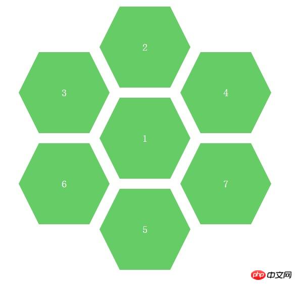
完整的页面效果如下图:(其实是多个六边形定位成这样子的。当然,也可以设置不同六边形的颜色,这样就可以更好的区分不同的模块功能了)。

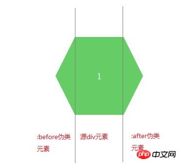
我们可以单独提出一个六边形分析一下,如下图:
立即学习“前端免费学习笔记(深入)”;

知道了分析思路,我们可以先了解一下如何绘制三角形,网上的列子也很多,不过没有使用过的童鞋不用找了,下面也给出代码和示例,如下:
效果图:

CSS代码:
.arrow{
display: inline-block;
width:0px;
height: 0px;
border-style: solid;
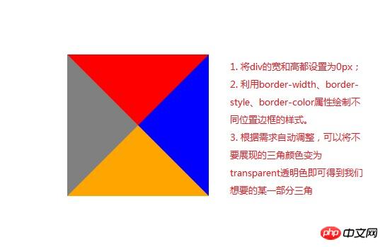
border-width: 100px; //与padding、margin属性类似,顺序为上、右、下、左
border-color: red blue orange gray; //顺序为上、右、下、左}HTML代码:
<p class="arrow"></p>
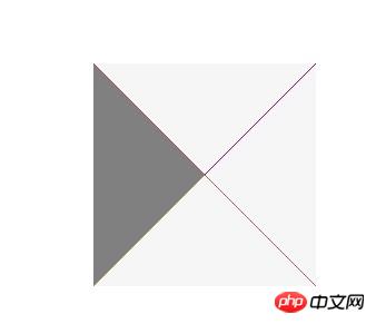
如上图所说,利用border边框属性,填充我们不想要的颜色为透明色,即可得到某一部分三角形,代码和图片效果如下。
效果图:(左边的三角形是我们需要的,其它的设置为了透明色)

CSS代码:
.arrow{
display: inline-block;
width:0px;
height: 0px;
border-bottom: 100px solid transparent; //设置透明色
border-top: 100px solid transparent; //设置透明色
border-right: 100px solid transparent; //设置透明色
border-left: 100px solid gray;
}HTML代码:
<p class="arrow"></p>
Okay。知道了如何画三角形,在利用CSS伪类:before和:after就可以完成我们想要绘制的六边形了。
:before是在元素的前面插入内容
:after是在元素的后面插入内容
如果我们想要插入一些文字性的内容可以在它的 content属性中录入需要展示的文字,例如 content:"HELLO WORLD",不过我们的例子是不需要展示额外信息的。我们只是需要将before和after这两个伪元素变成三角形放置到固定位置即可。
给出完整的代码如下:
<!DOCTYPE html>
<html>
<head lang="en">
<meta charset="UTF-8">
<title></title>
<style type="text/css">
.sharp:before{
content:""; //不需要展现文字等内容,所以设置为空字符
width:0px;
border-bottom:80px solid transparent;
border-top:80px solid transparent;
border-right:40px solid #6c6;
position:absolute;
left:-40px;
top:0px;
}
.sharp{
min-width:100px;
height:160px;
background:#6c6;
display: inline-block;
position: absolute;
line-height: 160px;
color:#FFFFFF;
font-size: 20px;
text-align: center;
}
.sharp:after{
content:""; //不需要展现文字等内容,所以设置为空字符
width:0px;
border-bottom:80px solid transparent;
border-top:80px solid transparent;
border-left-width:40px;
border-left-style: solid;
border-left-color:#6c6;
position:absolute;
right:-40px;
top:0px;
}
#sharpContainer{
width:100%;
height: 600px;
}
#sharpContainer .center{
top:200px;
left:300px;
}
#sharpContainer .top{
top:20px;
left:300px;
}
#sharpContainer .top-left{
top:110px;
left:140px;
}
#sharpContainer .top-right{
top:110px;
left:460px;
}
#sharpContainer .bottom{
top:380px;
left:300px;
}
#sharpContainer .bottom-left{
top:290px;
left:140px;
}
#sharpContainer .bottom-right{
top:290px;
left:460px;
}
</style>
</head>
<body>
<p id="sharpContainer">
<p class="sharp center">
</p>
<p class="sharp top">
</p>
<p class="sharp top-left">
</p>
<p class="sharp top-right">
</p>
<p class="sharp bottom">
</p>
<p class="sharp bottom-left">
</p>
<p class="sharp bottom-right">
</p>
</p>
</body>
</html>六边形绘制其实是很简单的效果,只要我们了解如何绘制三角形和使用:before,:after伪类样式即可。以后我们在项目中就可以加入更多的不规则的图形了
以上就是本文的全部内容,希望对大家的学习有所帮助,更多相关内容请关注PHP中文网!
相关推荐:
利用CSS3的border-radius实现绘制太极及爱心的图案
以上就是关于CSS3绘制六边形的方法的详细内容,更多请关注php中文网其它相关文章!
每个人都需要一台速度更快、更稳定的 PC。随着时间的推移,垃圾文件、旧注册表数据和不必要的后台进程会占用资源并降低性能。幸运的是,许多工具可以让 Windows 保持平稳运行。
Copyright 2014-2025 https://www.php.cn/ All Rights Reserved | php.cn | 湘ICP备2023035733号