


本篇文章通过代码实例给大家介绍一下svg+css3实现动感的波浪效果。有一定的参考价值,有需要的朋友可以参考一下,希望对大家有所帮助。

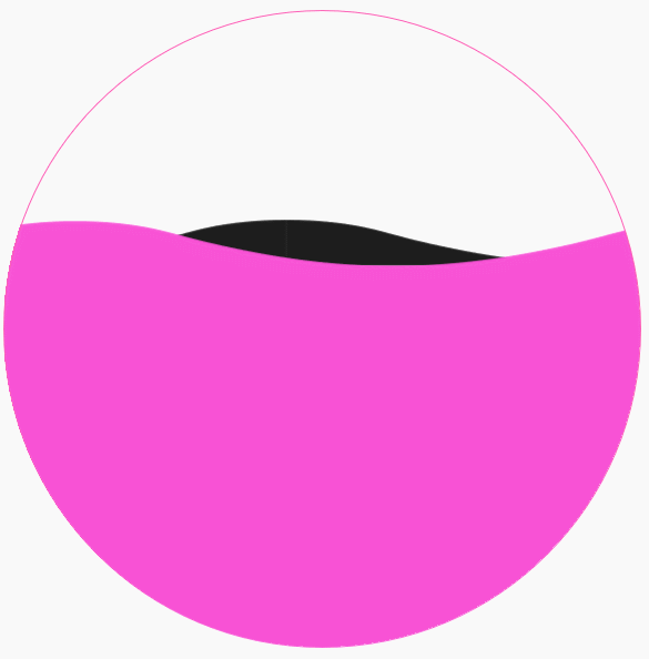
一根矢量的波浪
完整代码:
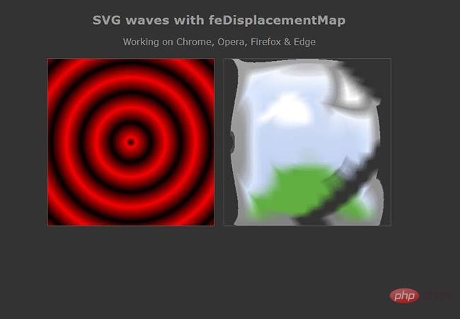
效果图:
立即学习“前端免费学习笔记(深入)”;
更多炫酷CSS3、html5、javascript特效代码,尽在:js特效大全


