
实现思路:
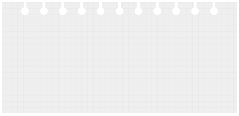
网格背景,由css3的线性渐变来实现。
纸上的打孔,由圆和圆柱组成,多个打孔,可以由box-shadow的平铺来实现。
实际代码:
立即学习“前端免费学习笔记(深入)”;
<!DOCTYPE html>
<html>
<head>
  <meta charset="UTF-8">
  <title>Title</title>
<style>
.bg-grid {
    height: 400px;
    padding: 10px;
    padding-top: 64px;
    background-color: #efefef;
    background-image:   linear-gradient(#e7e6e6 1px, transparent 0),
                        linear-gradient(90deg, #e7e6e6 1px, transparent 0);
    background-size: 21px 21px, 21px 21px;
    background-position: center;
}

.bg-grid:before,
.bg-grid:after{
    content: '';
    position: absolute;
    z-index: 0;
    left: 50%;
    transform: translateX(-50%);
    display: inline-block;
    background-color: #fff;
    height: 28px;
    box-shadow: 68px 0 0 0 #fff,
                calc(68px * 2) 0 0 0 #fff,
                calc(68px * 3) 0 0 0 #fff,
                calc(68px * 4) 0 0 0 #fff,
                calc(68px * 5) 0 0 0 #fff,
                -68px 0 0 0 #fff,
                calc(68px * -2) 0 0 0 #fff,
                calc(68px * -3) 0 0 0 #fff,
                calc(68px * -4) 0 0 0 #fff,
                calc(68px * -5) 0 0 0 #fff;
}
.bg-grid:before {
    top: 0;
    width: 10px;
}

.bg-grid:after {
    top: 26px;
    width: 28px;
    border-radius: 50%;
}
.bg-grid{

}
</style>
</head>
<body>
<div></div>

</body>
</html>更多炫酷CSS3、html5、javascript特效代码,尽在:js特效大全
更多相关教程请访问 CSS3最新版参考手册
以上就是纯css3实现信纸/同学录效果(代码示例)的详细内容,更多请关注php中文网其它相关文章!

每个人都需要一台速度更快、更稳定的 PC。随着时间的推移,垃圾文件、旧注册表数据和不必要的后台进程会占用资源并降低性能。幸运的是,许多工具可以让 Windows 保持平稳运行。

Copyright 2014-2025 https://www.php.cn/ All Rights Reserved | php.cn | 湘ICP备2023035733号


 634
634


 收藏
收藏


