
本篇文章通过代码示例介绍一下使用纯css画圆环的方法。有一定的参考价值,有需要的朋友可以参考一下,希望对大家有所帮助。

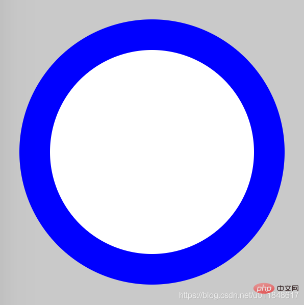
画圆环思想很简单:首先画两个圆,设置不同的背景色;然后让两个圆的圆心重合即可。
难度系数
☆☆
立即学习“前端免费学习笔记(深入)”;
HTML
<div class="container">
    <span class="ring-style"></span>
</div>解析:
CSS
.container {
    position: relative;
    top: 0;
    left: 0;
    width: 300px;
    height: 300px;
    background-color: lightgrey;
}
.ring-style {
    display: inline-block;
    position: absolute;
    top: 50%;
    left: 50%;
    transform: translate(-50%, -50%);
    background-color: blue;
    width: 260px;
    height: 260px;
    border-radius: 260px;
}
.ring-style::before {
    content: ' ';
    display: inline-block;
    position: absolute;
    top: 50%;
    left: 50%;
    transform: translate(-50%, -50%);
    background-color: white;
    width: 200px;
    height: 200px;
    border-radius: 200px;
}解析:
【推荐教程:CSS视频教程 】
效果图
知识点
更多编程相关知识,请访问:编程视频!!
以上就是使用纯CSS画一个圆环(代码示例)的详细内容,更多请关注php中文网其它相关文章!

每个人都需要一台速度更快、更稳定的 PC。随着时间的推移,垃圾文件、旧注册表数据和不必要的后台进程会占用资源并降低性能。幸运的是,许多工具可以让 Windows 保持平稳运行。

 广告
广告Copyright 2014-2025 https://www.php.cn/ All Rights Reserved | php.cn | 湘ICP备2023035733号


 927
927


 收藏
收藏


