
css怎么给文字加背景

奋力向前
发布: 2021-09-08 16:41:46
原创
13857人浏览过
方法:1、用“color: transparent”设置文字透明;2、用“background-image:url("图片地址")”给文字加背景图片;3、用“background-clip: text;”将图片和文字融合,实现文字背景效果。
本教程操作环境:windows7系统、CSS3&&HTML5版、Dell G3电脑。
今天我们我们来看看使用CSS怎么给文本添加背景图,让文字变得生动好看!在我们想要创建一个较大的文本标题,但不想使用普通又枯燥的颜色来修饰时,非常有用!
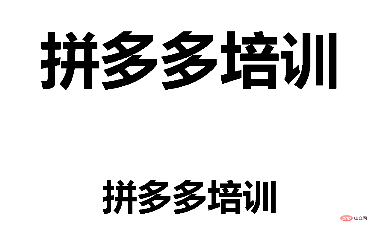
我们先来看看效果图:
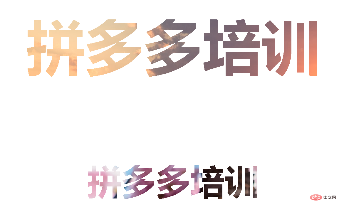 下面我们来研究一下是怎么实现这个效果的:
1、首先是HTML部分,定义两个标题
立即学习“前端免费学习笔记(深入)”;
<body>
	<h1>拼多多培训</h1>
	<h3>拼多多培训</h3>
</body>
登录后复制
2、然后开始定义css样式来进行修饰:


body {
  display: flex;
  align-items: center;
  justify-content: center;
  flex-direction: column;
  width: 100%;
  text-align: center;
  min-height: 100vh;
  font-size: 100px;
  font-family:Arial, Helvetica, sans-serif;
}
登录后复制
 3、最后就是给文字添加背景图片:
将文字原本的颜色设置为transparent透明,然后利用background-image属性给文字加背景图片
h1 {
color: transparent;
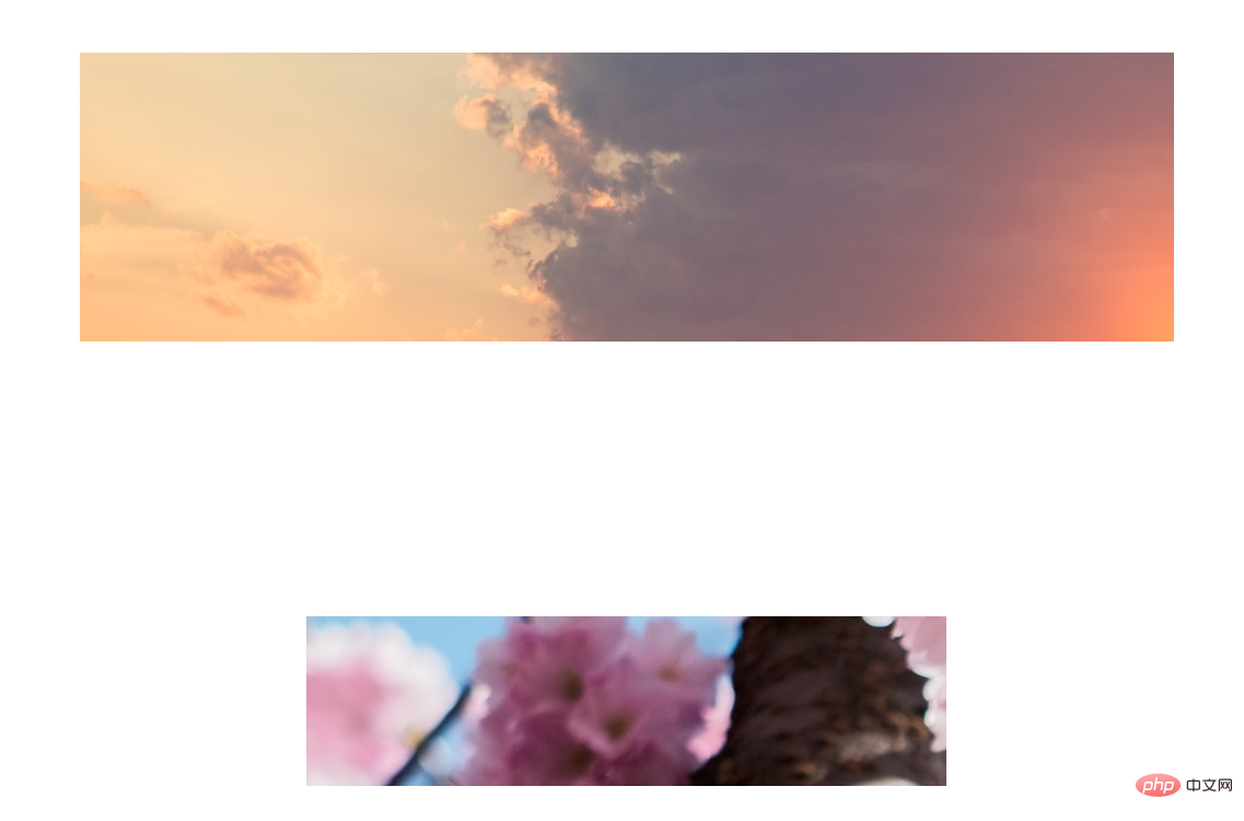
background-image: url("001.jpg");
}
h3{
color: transparent;
background-image: url("002");
}登录后复制
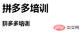
 发现效果是这样的,不如人意。这是因为缺少了一个关键属性
background-clip。background-clip属性是一个CSS3新属性,要添加前缀来兼容其他浏览器
h1 {
    color: transparent;
    background-image: url("001.jpg");
	background-clip: text;
    -webkit-background-clip: text;
}

h3{
    color: transparent;
    background-image: url("002.jpg");
	background-clip: text;
    -webkit-background-clip: text;
}
登录后复制
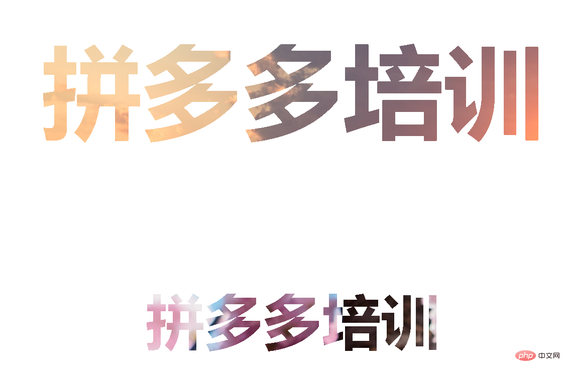
ok,大功告成!下面附上完整代码:
<html>
<head>
<meta charset="utf-8">
<title></title>
<style type="text/css">
body {
  display: flex;
  align-items: center;
  justify-content: center;
  flex-direction: column;
  width: 100%;
  text-align: center;
  min-height: 100vh;
  font-size: 100px;
  font-family:Arial, Helvetica, sans-serif;
}
h1 {
    color: transparent;
    background-image: url("001.jpg");
	background-clip: text;
    -webkit-background-clip: text;
}

h3{
    color: transparent;
    background-image: url("002.jpg");
	background-clip: text;
    -webkit-background-clip: text;
}
</style>
</head>
<body>
	<h1>拼多多培训</h1>
	<h3>拼多多培训</h3>
</body>
</html>
登录后复制
推荐学习:CSS视频教程
以上就是css怎么给文字加背景的详细内容,更多请关注php中文网其它相关文章!

最佳 Windows 性能的顶级免费优化软件
每个人都需要一台速度更快、更稳定的 PC。随着时间的推移,垃圾文件、旧注册表数据和不必要的后台进程会占用资源并降低性能。幸运的是,许多工具可以让 Windows 保持平稳运行。
来源:php中文网


本文内容由网友自发贡献,版权归原作者所有,本站不承担相应法律责任。如您发现有涉嫌抄袭侵权的内容,请联系admin@php.cn
作者最新文章
-
2021-10-08 11:14:48
-
2021-10-08 10:17:36
-
2021-10-06 20:00:26
-
2021-10-06 19:58:49
-
2021-09-30 15:13:04
-
2023-02-16 14:08:37
-
2023-02-16 14:09:06
-
2023-02-16 14:09:34
-
2023-02-16 14:10:18
-
2023-02-16 14:10:40
最新问题
 194
194


热门推荐
 广告
广告
 收藏
收藏


