
在制作网页时我们往往需要在网页中添加一些背景颜色、背景图像让网页更加美观,吸引访问者的眼球。css 中提供了一系列用于设置 html 元素背景效果的属性,下面本篇文章就来带大家聊聊css 背景属性,希望对大家有所帮助!

| 用于 | 属性名 | CSS 版本 | 浏览器支持 |
|---|---|---|---|
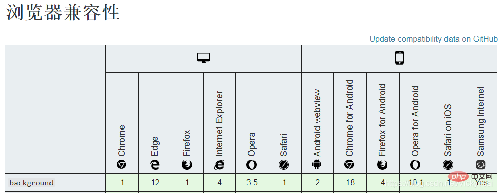
| 1.在一个声明中设置 所有的背景属性。 | background |
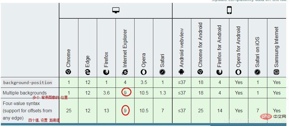
1 | IE8- 不支持多个背景图像。IE7- 不支持"inherit"。 |
| 2.背景图像是否 固定或者随着页面的其余部分 滚动。 | background-attachment |
1 | IE 不支持属性值 “inherit”。 |
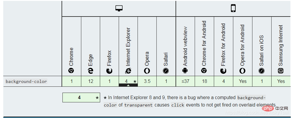
| 3.元素的 背景颜色。 | background-color |
1 | IE 不支持属性值 “inherit”。 |
| 4.元素的 背景图像。 | background-image |
1 | IE 不支持属性值 “inherit”。 |
| 5.背景图像的 开始位置。 | background-position |
1 | IE 不支持属性值 “inherit”。 |
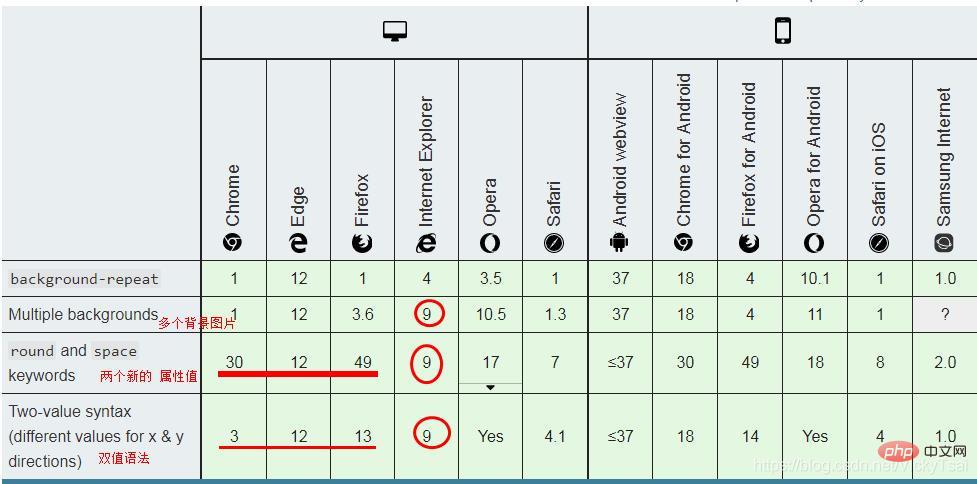
| 6.是否及如何 重复背景图像。 | background-repeat |
1 | IE 不支持属性值 “inherit”。 |
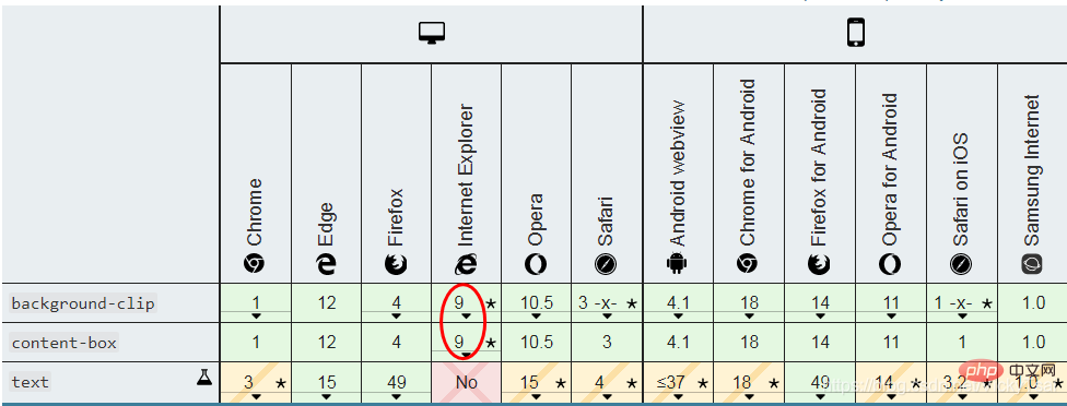
| 7.背景的 绘制区域。 | background-clip |
3 | 都支持,IE8- 不支持。 |
| 8.背景图片的 定位区域。 | background-origin |
3 | 都支持,IE8- 不支持。 |
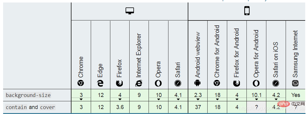
| 9.背景 图片的尺寸。 | background-size |
3 | 都支持,IE8- 不支持。 |
<style type="text/css">
    body
    {
    background: #ff0000 url(/i/eg_bg_03.gif) no-repeat fixed center;
    }
</style>⑴ 一个元素 多个背景图像 浏览器支持
⑵ background 属性 “inherit” 浏览器支持
inherit”。!DOCTYPE。inherit”。color, image, origin与 size, repeat 方式等等。【推荐学习:css视频教程】background 简写属性background的 属性值
color, image, origin 与 size, repeat 方式等等。(每个属性的意思,可以先学习完后面的内容 就能理解了)background的 属性值省略
background:#ff0000 url('smiley.gif');也是允许的。background-attachment
background-image
background-position
background-size
background-repeat
background-size 的 代码位置
background-size 只能 紧跟在 背景位置 background-position 后面出现,以"/"分割center/80%”.background-clip 和 background-origin 可能 出现的次数
background-origin 和 background-clip。background-origin,第二次的出现 设置 background-clip。background-color的 代码位置
background的 最后 一个属性上 定义,因为 整个元素 只有一种 背景颜色。⑺ 背景background 的继承性
立即学习“前端免费学习笔记(深入)”;
no⑻ 尽量使用 背景background属性
⑼ 背景简写background的版本
⑽ 背景简写background 的JavaScript 语法
object.style.background="white url(paper.gif) repeat-y"⑾ 背景简写background的 浏览器支持
background中 集中定义.p{
/*background-image: url(../images/四叶草背景.png);*/
/*background-repeat: no-repeat;*/
/*第一个值 水平位置,第二个值 垂直位置*/
/*background-position: 50px 100px; */
/*背景固定*/
/*background-attachment: fixed;*/
/*background-color: yellow; */
background: url(../images/四叶草背景.png) no-repeat 50px 100px;
}
background-color
transparent"二者选其一.background-color 属性⑶ 背景颜色 语法
color_name red |hex_number #ff0000| rgb_number rgb(255,0,0)| transparent| inherit;语法示例
/* 关键字 或 颜色名 Keyword values */
background-color: red;
background-color: indigo;

/* 十六进制值 Hexadecimal value  (设置透明值 和 不设置 不透明值) */
background-color: #bbff00;    /* 完全不透明 Fully opaque (不设置 不透明值)*/
background-color: #bf0;       /* 完全不透明的 简写 Fully opaque shorthand (不设置 不透明值)*/
background-color: #11ffee00;  /* 完全透明 Fully transparent (设置 不透明值)*/
background-color: #1fe0;      /* 完全透明的 简写 Fully transparent shorthand (设置 不透明值) */
background-color: #11ffeeff;  /* 完全不透明 Fully opaque (设置 不透明值)*/
background-color: #1fef;      /* 完全不透明的 简写 Fully opaque shorthand (设置 不透明值) */

/* RGB value */
background-color: rgb(255, 255, 128);        /* 完全不透明 Fully opaque */
background-color: rgba(117, 190, 218, 0.5);  /* 50%透明 50% transparent (设置 不透明值)*/

/* HSL value */
background-color: hsl(50, 33%, 25%);         /* 完全不透明 Fully opaque */
background-color: hsla(50, 33%, 25%, 0.75);  /* 75% transparent (设置 不透明值)*/

/* 特别的关键字 Special keyword values */
background-color: currentcolor;
background-color: transparent;

/* 全局性的值 Global values */
background-color: inherit;
background-color: initial;
background-color: unset;
关键点: 颜色名 十六进制 rgb代码 透明 继承
① 颜色名: color_name
red)。② 十六进制: hex_number
#ff0000)。③ rgb: rgb(),rgba()
rgb(255,0,0))④ hsl:hsl(),hsla()
⑤ 透明 (无颜色,默认值): transparent
rgba(0,0,0,0)的简写。⑥ 继承:inherit
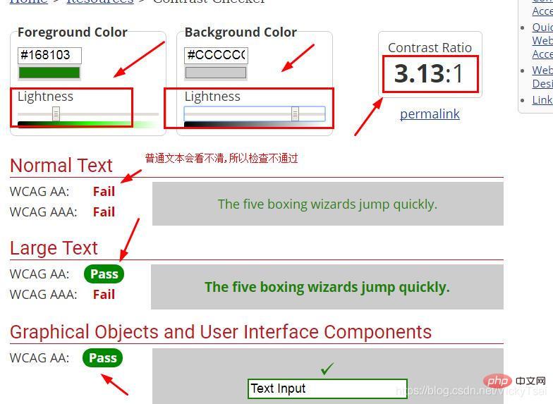
background-color 属性的设置noobject.style.backgroundColor="#00FF00"4.5:1
3:1。18.66px,粗体bold或更大,24px或更大。检查 文字颜色 和 背景颜色,看是否 能够很好的满足 用户的视觉需要
background-color 的 浏览器支持
示例1: 同时显示 背景图像 和 背景颜色
css
.bgimg-fixed {

    background-color: pink;
    background-image: url(../images/四叶草背景.png);
    background-repeat: no-repeat;

}
0-f)00: 完全透明了,看不到颜色,跟没设置颜色一样.ff: 就是 纯红色了,相当于没加 透明值. /*把十六进制 设置了透明值的 红色,最后两位的 33 就是透明值*/
background-color: #ff000066;
background-image: url(../images/四叶草背景.png);
background-repeat: no-repeat;
}
⑴ 背景图像:
background-image 属性⑵ 元素的 背景范围
背景色: background-color
边框区的下方 会显示 背景色,虚线边框的话,可以直接看到 边框下的背景色
背景图像: background-image
background-repeat:no-repeat;),图像 默认在 内边距区的 外边缘 不在边框区,也不会显示在 边框的下方 (特意加粗的边框,下方没有背景图像).
⑶ 背景图像的 位置
⑷ 背景图像的 语法
background-image: none|url('URL')|inherit;url('URL')
URL引用url值 带引号.none
none。inherit
background-image 属性的设置。background-color
background-color 属性。① 设置 背景图像: background-image
② 图像的 重复方式: background-repeat
③ 图像的 位置:background-position
background-position 属性的值放置。④ 图像/背景色的 裁剪/绘制 区域: background-clip
background-image指定 多个背景图像,用 逗号,分隔 多个背景地址.⑼ 和背景图像的 相对位置
border会在 背景图像之上 被绘制background-color 会在 背景图像之下 绘制。⑽ 图像和盒子:
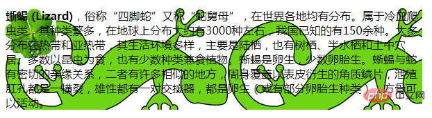
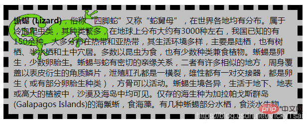
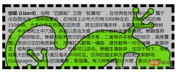
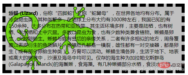
background-clip 和 background-origin中定义。#lizard{
background-image: url("../images/lizard.png"), url("../images/star.png");
}如果背景图像的 背景 不是透明的(比如 其他部分 是白色 ≠透明色),可能会完全遮盖会下方的图像.

#lizard{
	background-image: url("../images/四叶草背景.png"), url("../images/lizard.png");
	background-repeat: no-repeat,repeat;
}
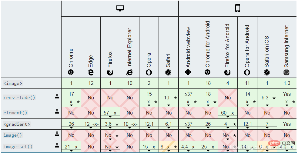
<image></image> css 图像 数据类型
<image></image> 图像 数据类型
URL引用element()生成image()、image-set()和cross-fade()。图像搭配的 CSS属性
background-image、border-image、content、cursor和 list-style-image。<image>> = <code><url> | <image> | <image-set> | <element> | <cross-fade> | <gradient></gradient></cross-fade></element></image-set></image></url>url 引用的图像页面的一个部分,定义在element()方法中;

由image()函数定义的 一种图像、图像片段 或 颜色的实色块

由cross-fade() 函数 定义的 两个或多个图像的 混合。

image-set() 函数定义的分辨率进行选择的图像。图像类型值的 浏览器支持
更多详情:
<image></image> CSS 图像 数据类型
/* url()方法, 只要 test.jpg 是图像文件*/
url(test.jpg)

 /*一个 <gradient> 标签*/
 linear-gradient(to bottom, blue, red)

/*页面的一部分, 使用了element()方法,如果 colonne3 是存在于页面中的一个元素id即可*/
element(#colonne3)

image(ltr 'arrow.png#xywh=0,0,16,16', red)
                            /* <url>的一个16x16节,从原来的左上角开始
图像只要arrow.png 是一个支持的图像,否则是一个固体
红色的样布。如果语言是rtl,则图像将水平翻转. */
cross-fade(20% url(twenty.png), url(eighty.png))
                            /* 交叉褪色的图像,其中20%是不透明的
80%是不透明的. */
image-set('test.jpg' 1x, 'test-2x.jpg' 2x)
/* 具有不同分辨率的 图像的选择 */background-attachment 属性background-attachment的属性值
① 滚动(默认值): scroll
② 固定: fixed
③ 相对于元素内容 固定: local
④ 继承 父元素: inherit
background-attachment: scroll|fixed|local|inherit;/* Keyword values */ background-attachment: scroll; background-attachment: fixed; background-attachment: local; /* Global values */ background-attachment: inherit; background-attachment: initial; background-attachment: unset;
nobackground-attachment的 版本
object.style.backgroundAttachment="fixed"⑺ 背景图像附着 background-attachment的 浏览器支持
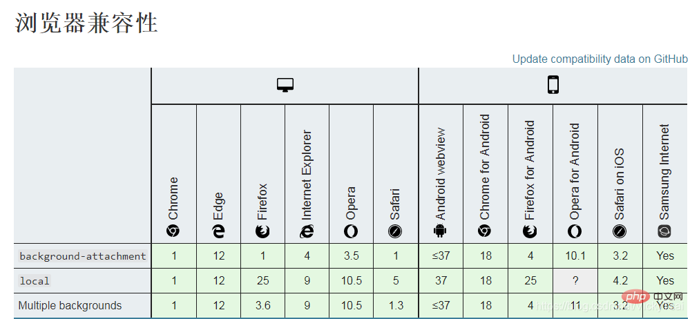
注释:任何版本的 Internet Explorer (包括 IE8)都不支持属性值 “inherit”。
.bgimg-fixed{
background-image: url(../images/四叶草背景.png);
background-attachment: fixed;
background-repeat: no-repeat;
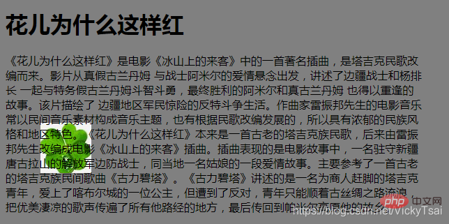
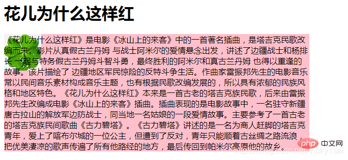
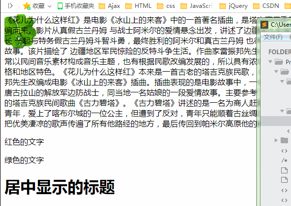
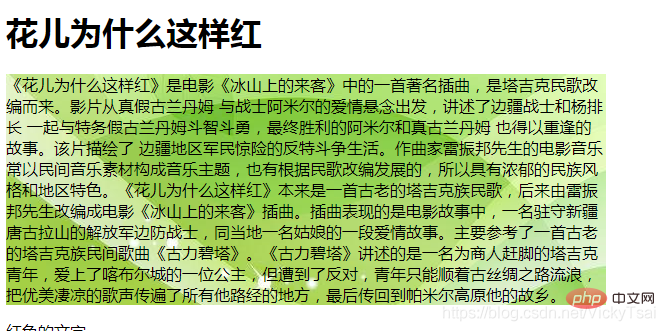
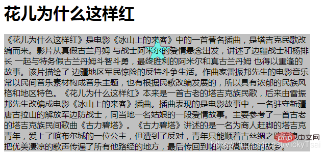
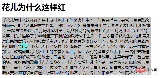
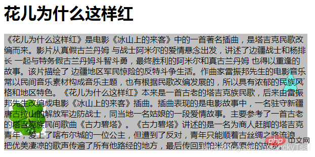
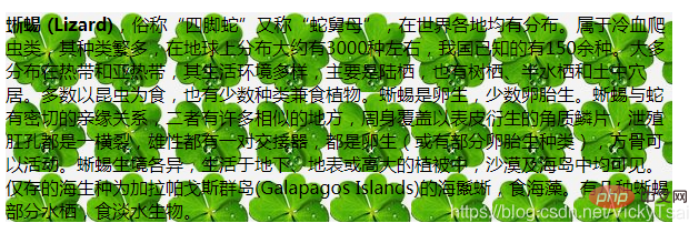
}<p class="bgimg-fixed">《花儿为什么这样红》是电影《冰山上的来客》中的一首著名插曲,是塔吉克民歌改编而来。影片从真假古兰丹姆 与战士阿米尔的爱情悬念出发,讲述了边疆战士和杨排长 一起与特务假古兰丹姆斗智斗勇,最终胜利的阿米尔和真古兰丹姆 也得以重逢的故事。该片描绘了 边疆地区军民惊险的反特斗争生活。作曲家雷振邦先生的电影音乐常以民间音乐素材构成音乐主题,也有根据民歌改编发展的,所以具有浓郁的民族风格和地区特色。《花儿为什么这样红》本来是一首古老的塔吉克族民歌,后来由雷振邦先生改编成电影《冰山上的来客》插曲。插曲表现的是电影故事中,一名驻守新疆唐古拉山的解放军边防战士,同当地一名姑娘的一段爱情故事。主要参考了一首古老的塔吉克族民间歌曲《古力碧塔》。《古力碧塔》讲述的是一名为商人赶脚的塔吉克青年,爱上了喀布尔城的一位公主,但遭到了反对,青年只能顺着古丝绸之路流浪,把优美凄凉的歌声传遍了所有他路经的地方,最后传回到帕米尔高原他的故乡。</p>
① 背景图像 一直显示 在固定的位置: fixed
② 跟着元素 一起滚动: scroll(默认值)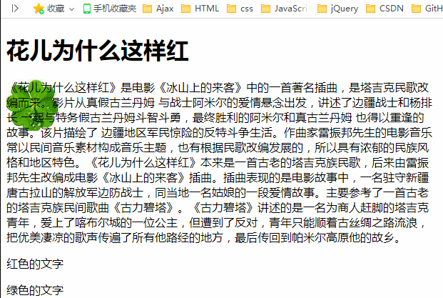
示例2: 多背景图 支持
background-attachment属性 支持 多张背景图片。background-attachment。background-attachment 类型。css
.bgimg-fixed{
	background-image:url(../images/greenbgimage.jpg), url(../images/四叶草背景.png);
	background-attachment: fixed,scroll;
	background-repeat: no-repeat,repeat-y;
}
background-origin 定义的 位置图层的。background-repeat,将 从这一点开始background-position 属性background-attachment="fixed"
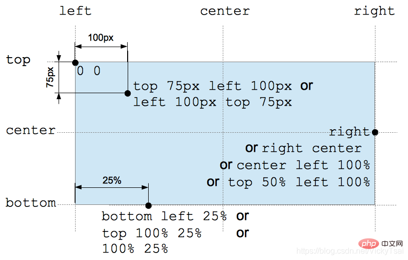
x% y%| xpos ypos|(left center right)X (top center bottom);/* 关键词 Keyword values */ background-position: top; background-position: bottom; background-position: left; background-position: right; background-position: center; /* 百分比值 <percentage> values */ background-position: 25% 75%; /* 长度值 <length> values */ background-position: 0 0; background-position: 1cm 2cm; background-position: 10ch 8em; /* 多背景图片的 的位置 Multiple images */ background-position: 0 0, center; /* 指明 距离 上下左右边缘的 的距离. Edge offsets values */ background-position: bottom 10px right 20px; background-position: right 3em bottom 10px; background-position: bottom 10px right; background-position: top right 10px; /* 全局支持的值 Global values */ background-position: inherit; background-position: initial; background-position: unset;
left center right x top center bottom
center
left center righttop center bottomx% y%
x 坐标,相对于上边缘 y 坐标0% 0%。50%
x%
y%
0% 0%
100% 100%
0
px)。所以 两个大小一样的时候,百分比值 才会无效,因为偏移值 会一直 等于 0

xpos ypos
x 坐标,相对于上边缘的 y坐标50%
xpos
ypos
0 0。0px 0px)% 和 position 值。属性值的 数目
(x,y) , 先指定水平位置,后指定垂直位置.,一个方向指定 一个值即可,所以 top top 和 left left 是无效的.属性值的 分隔
, 隔开。属性值的 正负: 图片 位移方向
背景图像位置的 浏览器支持
.bgimg-fixed {

    background-color: #c0c0c0;
    background-image: url("../images/star.png");
    background-repeat: no-repeat;
    /*top = center top */
    background-position: top;

}
top = cente top
left = left center
50%
10% = 10% 50%
.bgimg-fixed {

    background-color: #c0c0c0;
    background-image: url("../images/star.png");
    background-repeat: no-repeat;
    /*10% = 10% 50% */
    background-position: 10%;

}
.bgimg-fixed {

    background-color: #c0c0c0;
    background-image: url("../images/star.png");
    background-repeat: no-repeat;
    /*关键字 不分先后顺序*/
    background-position: right bottom;

}
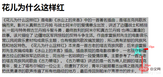
10px,距离下边缘60px
right 10px bottom 60px;right 10px bottom,这样也合法..bgimg-fixed {
background-color: #c0c0c0;
background-image: url("../images/star.png");
background-repeat: no-repeat;
/*关键字 不分先后顺序,距离右边缘 10px,距离 下边缘60px */
background-position: right 10px bottom 60px;
}
top 75px left 100x = left 100px top 75px
bottom left 25% = top 100% 25%
bottom = top 100%
left 25% = 25%
right = right center = left 100% center = left 100% top 50%
right = left 100%
center = top 50% = bottom 50%
.bgimg-fixed {

    background-color: #c0c0c0;
    background-image: url("../images/star.png"),url("../images/四叶草背景.png");
    background-repeat: no-repeat,no-repeat;
    background-position: right bottom 100px,left 10px bottom 30px;

}
.bgimg-fixed {

    background-color: #c0c0c0;
    background-image: url("../images/star.png"),url("../images/四叶草背景.png");
    background-repeat: no-repeat,no-repeat;
    background-position: right bottom -30px,left -30px bottom -30px;

}
background-repeat 属性round) 或者均匀地分布 (使用 space).background-repeat: repeat|repeat-x|repeat-y|no-repeat|inherit;/* 单值语法 */ background-repeat: repeat-x; background-repeat: repeat-y; background-repeat: repeat; background-repeat: space; background-repeat: round; background-repeat: no-repeat; /* 双值语法: 水平 horizontal | 垂直vertical */ background-repeat: repeat space; background-repeat: repeat repeat; background-repeat: round space; background-repeat: no-repeat round; background-repeat: inherit;
| 单值 | 等价的双值 |
|---|---|
| repeat-x | = repeat no-repeat |
| repeat-y | = no-repeat repeat |
| repeat | = repeat repeat |
| space | = space space |
| round | = round round |
| no-repeat | = no-repeat no-repeat |
<repeat-style></repeat-style> = repeat-x | repeat-y | [ repeat | space | round | no-repeat ]{1,2}
repeat-x | repeat-y, 其他的 可以在一个背景图像的 双值语法中 搭配使用.关键点:双向重复(默认) 水平重复 垂直重复 不重复 继承
① 双向重复 (默认值): repeat
不合适 会被裁剪: 最后一个图像, 如果它的大小 不合适的话, 会被裁剪.
最右边的 被裁剪了,最下方漏出来的一点,也可以看出 是被裁剪的.

② 水平重复: repeat-x
可以看到 右边缘的地方,图像被裁剪了.
③ 垂直重复: repeat-y
可以看到下边缘的地方, 图像被裁剪了
④ 不重复: no-repeat
没有被重复的背景图像 的位置: 是由 background-position 属性来决定.

⑤ 重复部分的图像 不会被裁剪: space
图像会 尽可能 得重复, 但是 不会裁剪.
❶ 重复的图像 不会被裁剪: 重复的图像,超出 元素边框,就会把超出的部分去掉,放大其余的部分 来填充 (不会进行裁剪式的重复)
空白的 均匀分布: 同时 空白会均匀地分布 在图像之间.
❷ 背景图像本身大小 超出元素大小: 背景原图像 本身的大小,就超出元素 边框了,则进行裁剪.

space值 排斥的属性:
background-position 图像定位属性 会被忽视,⑥ 压缩显示 图像(不裁剪): round
本来是放不下 两个 完整的图像的(背景图像 本身比较大),浏览器 把图像压缩后 ,就能放下 两个完整的图像了.
⑦ 继承 父亲: inherit
background-repeat 属性的 设置。⑷ 背景图像重复 background-repeat 属性和属性值 浏览器支持
示例1: 把背景图像设置成 round space和 round = round round的区别
#lizard{
	/*background-image: url("../images/lizard.png");*/
	background-image: url("../images/四叶草背景.png");
	background-repeat:round space;
}① 默认时的背景显示 = 双向重复repeat
可以看到 右边和下边缘 都有被裁剪
② 值为: round space 时
可以看到 背景会重复时,水平和垂直方向, 都没有被裁剪的部分.
③ 值为: round = round round 时
space值 多了一行图像.round 值 通过压缩其余的图像,多显示了一行,而不只是 去掉 图像被裁剪的部分.裁剪的区别: space 会因为 背景图像本身大小 超出元素大小时(不是因为 图像的重复),被裁剪, 但round 一直 都不会被裁剪,因为会 压缩图像来显示.
background-clip 属性background-image或背景颜色 background-color)background-clip 仅在边框 具有 透明区域 或 部分不透明区域 (根据 边框样式 border-style 或边框图像 border-image)时 才具有 视觉效果;background-clip:border-box|padding-box|content-box;/* 关键字值 Keyword values */ background-clip: border-box; background-clip: padding-box; background-clip: content-box; background-clip: text; /* Global values */ background-clip: inherit; background-clip: initial; background-clip: unset;
⑶ 背景裁剪的 属性值
关键点:边框盒 内边距框 内容框 文字
① 边框盒(默认): border-box
z顺序中 是在 边框的下面)。② 内边距框: padding-box
③ 内容框 : content-box
④ 文字: text (尚在 实验中的属性)
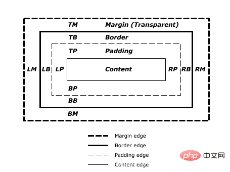
foreground text)中 绘制的。color:transparent 透明色从内到外的 顺序: 内容区 > 内边距区 > 边框区 > 外边距区
background-clip 属性。低版本的浏览器 也需要浏览器支持,这是个比较新的属性.
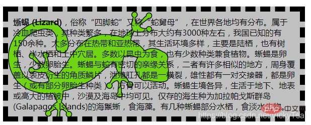
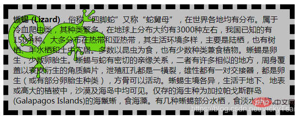
示例1: 把背景的 裁剪/绘制区域 分别设置为 到边框的外边缘, 内边距的外边缘, 内容区,文字的内部
html
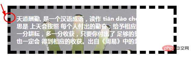
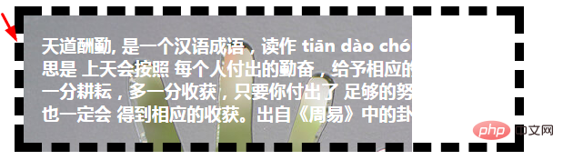
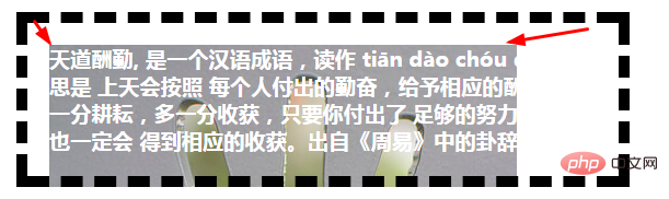
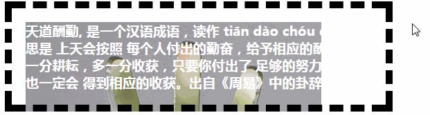
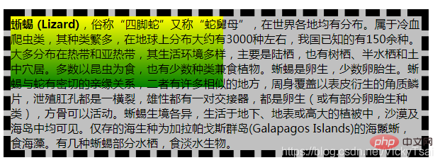
<p id="clipTest">天道酬勤, 是一个汉语成语,读作 tiān dào chóu qín。意思是 上天会按照 每个人付出的勤奋,给予相应的酬劳。多一分耕耘,多一分收获,只要你付出了 足够的努力,将来也一定会 得到相应的收获。出自《周易》中的卦辞。</p>
#clipTest{
	/*设置元素的 外边距 边框 内边距 字体大小/颜色/粗细*/
	margin: 20px;
	border: 10px dashed #000;
	padding: 20px;
	font-size: 1.2em;
	font-weight: bold;
	color: #fff;

	/*设置 背景图像 和 背景颜色(作为背景图像的回退)*/
	background-color: #c0c0c0;
	background-image: url("../images/hand.jpg");

	/*设置背景的 绘制/裁剪 区域*/

    /*到 边框区的 外边缘*/
	background-clip: border-box;

}border-box
background-image.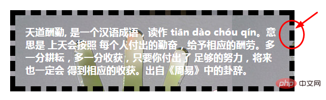
background-color,也是有效的.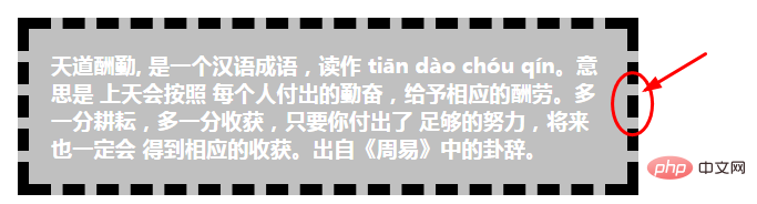
background-clip:padding-box
	/*到 内边距区的 外边缘*/
	-webkit-background-clip: padding-box;
	-moz-background-clip: padding-box;
	background-clip: padding-box;

content-box

text
color ≠#fff 白色,一定要设置成 color:transparent 透明色,才能在文字里, 显示出后面的背景色.
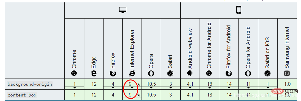
background-origin 属性background-position 属性,指定是 相对于 什么区域 来定位的。background-repeat:no-repeat 不重复,再设置 图像原点,看起来 才比较明显background-attachment:fixed,则 背景图像原点background-origin 属性 没有效果。background-origin: padding-box|border-box|content-box;/* 关键字值 Keyword values */ background-origin: border-box; background-origin: padding-box; background-origin: content-box; /* Global values */ background-origin: inherit; background-origin: initial; background-origin: unset;
border-box
padding-box
content-box
, 分隔.background-origin: content-box, padding-box;background-origin的 浏览器支持
比较新的属性,需要使用 浏览器前缀
#clipTest{
	/*设置元素的 外边距 边框 内边距 字体大小/颜色/粗细*/
	margin: 20px;
	border: 10px dashed #000;
	padding: 20px;
	font-size: 1.2em;
	font-weight: bold;
	/*color: transparent;*/
	color: #fff;

	/*设置 背景图像 和 背景颜色(作为背景图像的回退 这里为了看清原点位置,先注释掉)*/
	/*background-color: #c0c0c0;*/
	background-image: url("../images/hand.jpg");
	background-repeat: no-repeat;


	/*背景图像的原点 相对位置*/

	-webkit-background-origin: border-box;
	-moz-background-origin: border-box;
	background-origin: border-box;
}border-box
padding-box
content-box
10px
	-webkit-background-origin: content-box;
	-moz-background-origin:content-box;
	background-origin: content-box;


	/*背景图像的位置*/
	background-position:  10px 10px;
background-size 属性background-color 属性设置的 背景颜色。background-size: length|percentage % |cover|contain;/* 关键字 */ background-size: cover background-size: contain /* 一个值: 这个值指定图片的宽度,图片的高度隐式的为auto */ background-size: 50% background-size: 3em background-size: 12px background-size: auto /* 两个值 */ /* 第一个值指定图片的宽度,第二个值指定图片的高度 */ background-size: 50% auto background-size: 3em 25% background-size: auto 6px background-size: auto auto /* 逗号分隔的多个值:设置多重背景 */ background-size: auto, auto /* 不同于background-size: auto auto */ background-size: 50%, 25%, 25% background-size: 6px, auto, contain /* 全局属性 */ background-size: inherit; background-size: initial; background-size: unset;
① 宽高 长度值: 宽 x 高
宽 X 高
auto
② 宽高 百分比值: width% height%
percentage %auto
background-origin设置background-attachment 为fixed,背景区 为 浏览器可视区(即 视窗),不包括 滚动条。不能为负值。③ 裁剪式 完全覆盖 背景区 : cover
④ 不裁剪式 完全覆盖 背景区: contain
⑤ 按图片比例 自动缩放:auto
▲ 多个值: 若要指定 多个背景图像的大小,请使用 逗号,分隔 每个背景图像的值。
background-size: 50% 25%, contain, 3em;.JPG) 总是具有 固有的 大小和比例。SVG)不一定 具有固有尺寸。element()函数: 使用element()函数 创建的背景图像 使用 生成元素的 固有尺寸和比例。background-size 的两个值 并且不是auto
contain 或 cover
auto 或 auto auto
contain,不裁剪,按比例显示.auto ,另一个不是 auto
Firefox 7-与 Firefox 8+,以确定不同之处 能否接受。⑹ 背景图像大小 background-size 的 浏览器支持
  background-image: url(bg-image.png);

  -webkit-background-size: 100% 100%;           /* Safari 3.0 */
     -moz-background-size: 100% 100%;           /* Gecko 1.9.2 (Firefox 3.6) */
       -o-background-size: 100% 100%;           /* Opera 9.5 */
background-size: 100% 100%; /* Gecko 2.0 (Firefox 4.0) and other CSS3-compliant browsers */示例1: 如果您使用 渐变<gradient></gradient>作为背景 并指定了 背景尺寸background-size
auto值,或者 只使用宽度值 来指定(例如,background-size: 50%)。<gradient>s</gradient>在 Firefox 8 中发生了变化,目前在不同的浏览器之间 通常是不一致的安全值 示例
.gradient-example {
  width: 50px;
  height: 100px;
  background-image: linear-gradient(blue, red);

  /* 不能安全使用的 值形式 Not safe to use */
  background-size: 25px;
  background-size: 50%;
  background-size: auto 50px;
  background-size: auto 50%;

  /* 能安全使用的 值形式 Safe to use */
  background-size: 25px 50px;
  background-size: 50% 50%;
}#lizard {
border: 10px dashed #000;
/*用渐变 做背景图像*/
background-image: linear-gradient(yellow,green);
background-color: #c0c0c0;
background-repeat: no-repeat;
/*背景图像的大小*/
background-size: 300px 100px;
}300px,高100px
#lizard {
    border: 10px dashed #000;
    padding: 10px;
    background-image: url("../images/lizard.png");
    background-color: #c0c0c0;
    background-repeat: no-repeat;

    /*背景图像的大小*/
    /*background-size: 200px;*/
}
| 只设置 宽度值: background-size: 200px;(按比例缩放) | 宽高一起设置: background-size: 200px 100px;(按指定值,可能改变比例) |
|---|---|
| @@##@@ | @@##@@ |
| 裁剪式 完全覆盖: background-size: cover;(按比例缩放) | 不裁剪式 安全覆盖: background-size: contain;(按比例缩放) |
| @@##@@ | @@##@@ |
(学习视频分享:web前端入门)
以上就是手把手带你了解CSS 背景属性(Background)的详细内容,更多请关注php中文网其它相关文章!

每个人都需要一台速度更快、更稳定的 PC。随着时间的推移,垃圾文件、旧注册表数据和不必要的后台进程会占用资源并降低性能。幸运的是,许多工具可以让 Windows 保持平稳运行。

 广告
广告
 收藏
收藏
 收藏
收藏
 收藏
收藏
Copyright 2014-2025 https://www.php.cn/ All Rights Reserved | php.cn | 湘ICP备2023035733号


 948
948


