css3动画使圆形旋转的方法:1、新建一个HTML示例文件,并定义div为“”;2、通过动画属性设置不同效果的边框,进行旋转,代码为“animation: circle 2s infinite linear; @keyframes circle {0% {transform: rotate(0deg);}”。
本教程操作环境:Windows10系统、CSS3版、DELL G3电脑
css3动画怎么使圆形旋转?
CSS3 圆环旋转效果
一、CSS3圆环旋转效果 1
立即学习“前端免费学习笔记(深入)”;
原理:设置不同效果的边框,进行旋转
<div class="demo"></div><style>
    .demo {
        width: 250px;
        height: 250px;
        border: 50px solid red;
        border-left-color: blue;
        border-right-color: yellow;
        border-top-color: #04f105;
        margin: 100px;
        border-radius: 50%;
        animation: circle 2s infinite linear;
    }
    @keyframes circle {
        0% {
            transform: rotate(0deg);
        }

        100% {
            transform: rotate(-360deg);
        }
    }</style>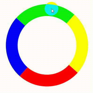
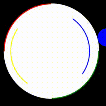
二、Css 3圆环效果2
原理:使用多层边框下沟哦,执行旋转
<div class="demoout">
    <div class="demo"></div></div><style>
    body {
        background: black;
    }

    .demo {
        width: 250px;
        height: 250px;
        border: 3px solid white;
        border-left-color: blue;
        border-right-color: yellow;
        margin: 25px;
        border-radius: 50%;
        animation: circle 4s infinite ease;
        background: white;
    }

    .demoout {
        width: 300px;
        height: 300px;
        border: 3px solid white;
        border-top-color: green;
        border-bottom-color: red;
        margin: 100px;
        border-radius: 50%;
        animation: circle 4s infinite linear;
        background: white;
    }

    @-webkit-keyframes circle {
        0% {
            transform: rotate(0deg);
        }

        100% {
            transform: rotate(-360deg);
        }
}</style>效果如下:
推荐学习:《css视频教程》
以上就是css3动画怎么使圆形旋转的详细内容,更多请关注php中文网其它相关文章!

每个人都需要一台速度更快、更稳定的 PC。随着时间的推移,垃圾文件、旧注册表数据和不必要的后台进程会占用资源并降低性能。幸运的是,许多工具可以让 Windows 保持平稳运行。

Copyright 2014-2025 https://www.php.cn/ All Rights Reserved | php.cn | 湘ICP备2023035733号


 650
650


 收藏
收藏