


随着移动互联网的普及,越来越多的人开始使用智能手机和平板电脑进行网络活动。随之而来的是,移动应用和网页设计的需求也越来越高。而uniapp就是一个解决这个问题的跨平台开发框架,它提供了跨平台开发的方案,可以实现一套代码,多端运行的效果,包括但不限于ios、android、h5等平台。
本篇文章主要探讨UniApp框架中的弹出框。
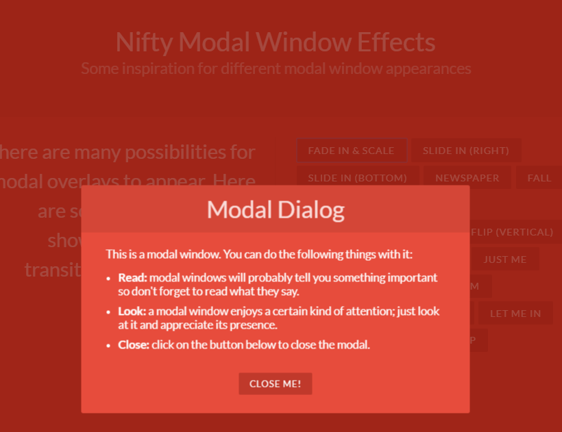
在UniApp框架中,弹出框是常用的组件之一,它可以帮助我们在客户端以弹窗的形式提示用户,比如确认操作、用户登录等信息的获取等。因此,如何实现UniApp弹出框,是我们必须要掌握的技能之一。
一、UniApp弹出框的使用
UniApp框架中提供了两种不同类型的弹出框,以帮助我们满足不同的需求。先看一下其中的一个基础用法:
- 使用 alert() 显示简单文本信息
在UniApp框架中,可以使用alert()方法使得简单的文本信息以弹窗的形式,展示给用户:
uni.alert({
  title: '提示信息',
  content: '这是一条简单的弹出提示',
  success: function () {
     console.log('弹出框已关闭')
  }
});
其中,title为弹框标题,content为弹框主体内容,success为弹框关闭后的回调函数,当然也可以通过cancel实现取消按钮回调函数的功能。
- 使用 confirm() 获取用户选择
在UniApp框架中,我们也可以通过confirm()方法实现弹出选择提示框,例如:
uni.confirm({
  title: '选择操作',
  content: '你确定要进行某个操作吗?',
  success: function (res) {
    if (res.confirm) {
      console.log('用户点击确认操作');
    } else if (res.cancel) {
      console.log('用户取消操作');
    }
  }
});
在上面的代码中,confirm()方法将会弹出一个选择提示框,提示用户进行选择,用户选完之后,我们将会通过回调函数,来获取用户的选择,并对选择结果进行相应的操作。其中的res.confirm表示用户确认操作,res.cancel表示用户取消操作。
二、实现自定义UniApp弹出框
除了使用框架提供的内置方法之外,我们也可以通过自定义弹出框的方式,来达到更加灵活的效果。现在,我们就来看一下如何实现自定义UniApp弹出框。
- HTML布局
首先,我们需要准备好一个弹出框的HTML布局,例如:
弹出框标题
这里是弹出框的主体内容
在以上布局中,我们使用了View组件,通过不同的class属性,实现不同的样式效果,同时,我们也使用了@click等Vue指令,来绑定点击事件。
- CSS样式
接下来,我们还需要对弹出框的样式进行进一步的处理,让它更加美观、合理,例如:
.modal {
  position: fixed;
  left: 0;
  top: 0;
  z-index: 99999;
  width: 100%;
  height: 100%;
  background-color: rgba(0, 0, 0, 0.7);
  display: flex;
  justify-content: center;
  align-items: center;
}

.modal .modal-content {
  width: 400rpx;
  background-color: #ffffff;
  border-radius: 10rpx;
  overflow: hidden;
}

.modal .modal-content .modal-header {
  background-color: #337ab7;
  color: #ffffff;
  display: flex;
  justify-content: space-between;
  align-items: center;
  padding: 10rpx;
}

.modal .modal-content .modal-header h2 {
  margin: 0;
}

.modal .modal-content .modal-header i {
  font-size: 20rpx;
  cursor: pointer;
}

.modal .modal-content .modal-body {
  padding: 20rpx;
}

.modal .modal-content .modal-footer {
  background-color: #eeeeee;
  padding: 10rpx;
  display: flex;
  justify-content: flex-end;
}

.modal .modal-content .modal-footer button {
  border: none;
  padding: 10rpx 20rpx;
  margin-left: 10rpx;
  border-radius: 5rpx;
  cursor: pointer;
}

.modal .modal-content .modal-footer button:first-child {
  background-color: #337ab7;
  color: #ffffff;
}

.modal .modal-content .modal-footer button:last-child {
  background-color: #dddddd;
  color: #333333;
}
在以上CSS样式中,我们使用了一些CSS技巧,通过:after、:before等伪类标志符,实现了多组按钮的样式效果,同时,我们也使用了@keyframes等规则,来定义动画效果。
- JS代码
最后,我们需要编写JS代码,实现弹出框的具体功能,例如:
export default {
  data() {
    return {
      visible: false
    }
  },
  methods: {
    showModal() {
      this.visible = true;
    },
    closeModal() {
      this.visible = false;
    },
    submit() {
      console.log('执行提交操作');
      this.closeModal();
    }
  }
}
在上面的代码中,我们使用data()方法,定义了一个名为visible的数据属性,用于存储弹出框的显示和关闭的状态。同时,我们还定义了showModal()、closeModal()和submit()三个方法,分别用于控制弹出框的显示、关闭以及确认按钮的点击行为。
- 页面使用
在完成了以上步骤之后,我们就可以在具体的页面中,使用我们自定义的弹出框了,例如:
在以上代码中,我们使用了Vue组件的写法,通过import语法,引入了我们定义的Modal组件,接着,在data()方法中,同样定义了一个名为visible的数据属性。在template模板中,我们通过button标签的@click绑定事件,来调用showModal方法,实现弹出框的显示。
三、总结
到这里,我们就完成了一个自定义UniApp弹出框的完整流程。总体而言,UniApp提供的弹出框组件有alert()、confirm()等内置方法,可以满足基本需求;而如果需要更为复杂的弹出框,则可以通过HTML布局、CSS样式、JS代码等多个方面,实现自定义弹出框的效果。希望本篇文章能对大家的UniApp开发工作有所帮助。


