

使用transform-style属性来设置嵌套元素在3D空间中的渲染方式。
您可以尝试运行以下代码来实现transform- style 属性
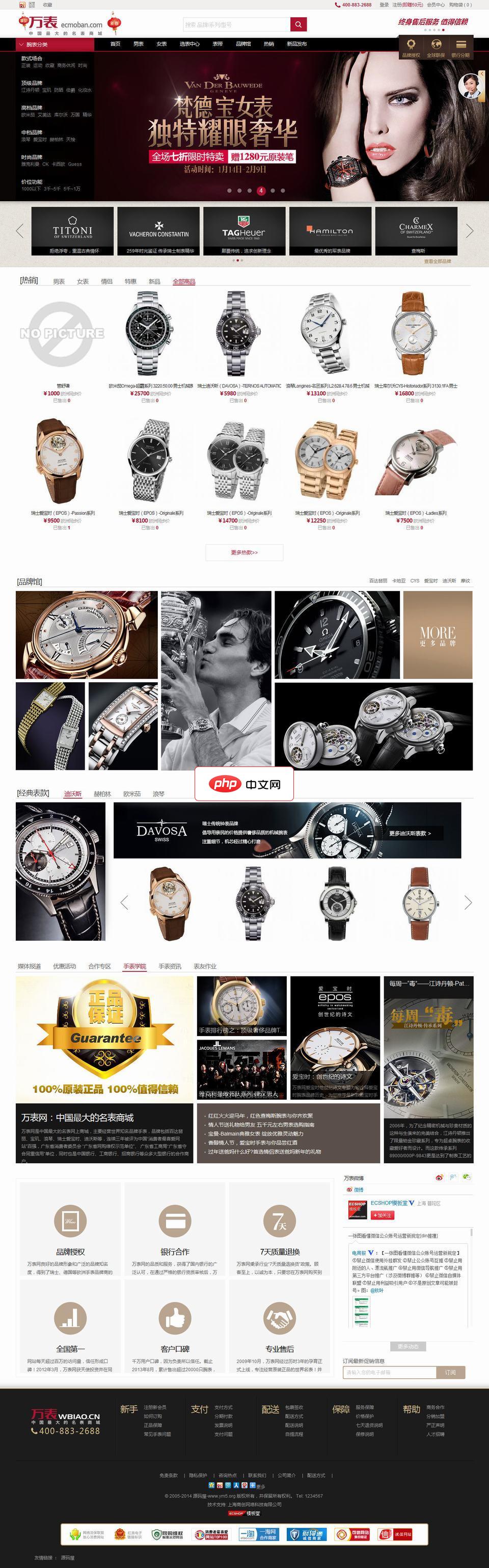
该软件是以ecshop作为核心的仿制万表网的商场网站源码。万表网模板 2015最新版整体简洁大气,功能实用,是一款时尚典雅的综合类模板!样式精美的商品分类树,层次分明,分类结构一目了然。首页轮播主广告分别对应切换小广告,商品宣传更到位。独家特色增加顶级频道页面、品牌页面,以及仿京东对比功能,提升网站档次,让您的网站更加高端大气!并且全站采用div+css布局,兼容性良好,更注重页面细节,增加多种j
 0
0

实时演示
<!DOCTYPE html>
<html>
   <head>
      <style>
         .demo1 {
            width: 300px;
            height: 300px;
            background-color: yellow;
         }
         .demo2 {
            width: 200px;
            height: 200px;
            background-color: orange;
         }
         .demo3 {
            width: 100px;
            height: 100px;
            background-color: blue;
            transform: rotate(10deg);
            transform-origin: 30% 40%;
            transform-style: preserve-3d;
         }
      </style>
   </head>
   <body>
      <h1>Rotation</h1>
      <div class = "demo1">Demo
         <div class = "demo2">Demo
            <div class = "demo3">
               Demo
            </div>
         </div>
      </div>
   </body>
</html>以上就是CSS 中转换样式属性的使用的详细内容,更多请关注php中文网其它相关文章!

每个人都需要一台速度更快、更稳定的 PC。随着时间的推移,垃圾文件、旧注册表数据和不必要的后台进程会占用资源并降低性能。幸运的是,许多工具可以让 Windows 保持平稳运行。

Copyright 2014-2025 https://www.php.cn/ All Rights Reserved | php.cn | 湘ICP备2023035733号


 360
360


 收藏
收藏


