更多>
最新下载


24小时阅读排行榜
- 1 css想设定checkbox被选中后样式怎么办_使用:checked伪类控制展示
- 2 如何在 Django 中高效流式传输大量零字节数据
- 3 c++的学习路线图是怎样的_c++从入门到精通学习路径【2025版】
- 4 CSS 动画循环间添加停顿的正确实现方法
- 5 Go 中接口类型值访问底层结构体字段的正确方式:类型断言的必要性与最佳实践
- 6 如何在 Hydra 中处理非字符串类型的配置项(如 sys.stdout)
- 7 Django 表单未渲染?正确使用 Form 字段与 Widget 是关键
- 8 如何解决 Nx 工作区创建时因网络代理导致的 npm ENOTFOUND 错误
- 9 Go 语言支持的主流 NoSQL 数据库驱动一览
- 10 css不同设备间间距不统一怎么办_使用相对单位统一比例
- 11 如何在 Angular 中通过事件获取按钮的父元素
- 12 mysql数据库备份和恢复概念_mysql备份恢复原理解析
- 13 如何使用inner join_mysql内连接用法
- 14 RSC与PHP生态有何区别_工具库支持对比【生态】
- 15 如何启用密码复杂度策略_mysql安全配置
更多>
最新教程

-
- Node.js 教程
- 14497 2025-08-28
-
- CSS3 教程
- 1541628 2025-08-27
-
- Rust 教程
- 22162 2025-08-27
-
- Vue 教程
- 24648 2025-08-22
-
- PostgreSQL 教程
- 21340 2025-08-21
-
- Git 教程
- 8433 2025-08-21
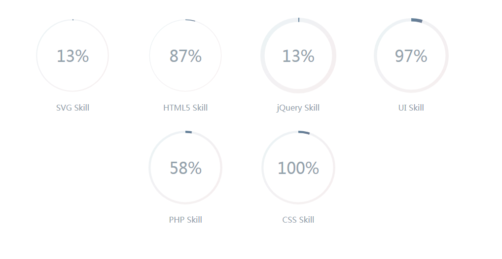
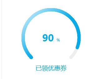
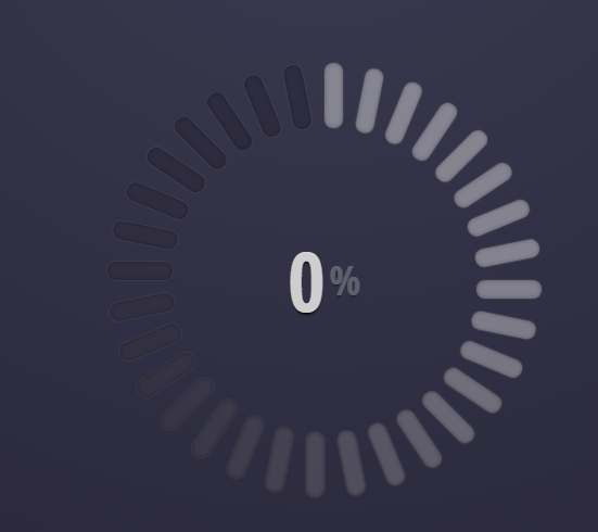
CSS3圆形进度条动画效果


<style>
body{background-color: #fff}
@-webkit-keyframes load {
0% {
stroke-dashoffset: 0;
}
}
@keyframes load {
0% {
stroke-dashoffset: 0;
}
}
.progress {
position: relative;
display: inline-block;
padding: 0;
text-align: center;
}
.progress > li {
display: inline-block;
position: relative;
text-align: center;
color: #93A2AC;
font-family: Lato;
font-weight: 100;
margin: 2rem;
}
.progress > li:before {
content: attr(data-name);
position: absolute;
width: 100%;
bottom: -2rem;
font-weight: 400;
}
.progress > li:after {
content: attr(data-percent);
position: absolute;
width: 100%;
top: 3.7rem;
left: 0;
font-size: 2rem;
text-align: center;
}
.progress svg {
width: 10rem;
height: 10rem;
}
.progress svg:nth-child(2) {
position: absolute;
left: 0;
top: 0;
-webkit-transform: rotate(-90deg);
transform: rotate(-90deg);
}
.progress svg:nth-child(2) path {
fill: none;
stroke-width: 25;
stroke-dasharray: 629;
stroke: #fff;
opacity: .9;
-webkit-animation: load 10s;
animation: load 10s;
}
</style>
本站所有资源都是由网友投搞发布,或转载各大下载站,请自行检测软件的完整性!本站所有资源仅供学习与参考,请勿用于商业用途,否则产生的一切后果将由您自己承担!如有侵权请联系我们删除下架,联系方式:admin@php.cn
相关推荐


热门下载


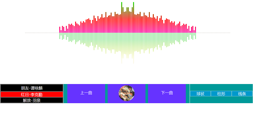
canvas音谱可视化mp3音乐播放器代码
html5 canvas通过AudioContext对获取audio标签播放的音域和音高,调用js绘制相应高度的矩形或线条。
播放器特效
2021-03-10