最新下载

谷歌浏览器插件IconFont检查器 自动获取当前页面使用到的iconfont库,预览、修改、使用


谷歌浏览器插件Color Picker for Chrome™ 在网页上拾取颜色 获取颜色HEX/RGB代码
24小时阅读排行榜
- 1 什么是javascript的Promise对象_如何处理Promise中的错误
- 2 javascript类如何定义_它与构造函数有什么联系?
- 3 如何将XML数据可视化 XML数据图表生成方法
- 4 如何使用Golang反射获取struct字段信息_Golang reflect解析struct字段信息方法汇总
- 5 如何在Golang中实现代理+单例模式_控制访问并保证唯一实例
- 6 XML文档对象模型 (DOM) 是什么 内存树结构解析
- 7 css浮动图片不居中_css图片浮动居中解决方法
- 8 javascript事件如何工作_怎样阻止事件冒泡和默认行为?
- 9 html5数据怎么抓_HTML5用浏览器F12抓包或JS拦截请求抓数据【抓取】
- 10 如何配置mysql复制参数_mysql复制参数配置方法
- 11 如何用javascript实现加密和解密_为什么Web Crypto API适合安全操作
- 12 DTD如何处理命名空间
- 13 C++的编译过程是怎样的_从预处理到链接的C++源码编译全流程解析
- 14 PHP网站设计如何集成第三方登录_PHP集成第三方登录步骤【扩展】
- 15 css grid布局在小屏幕显示异常怎么办_结合媒体查询修改grid template
最新教程

-
- Node.js 教程
- 14413 2025-08-28
-
- CSS3 教程
- 1541397 2025-08-27
-
- Rust 教程
- 22096 2025-08-27
-
- Vue 教程
- 24600 2025-08-22
-
- PostgreSQL 教程
- 21288 2025-08-21
-
- Git 教程
- 8388 2025-08-21
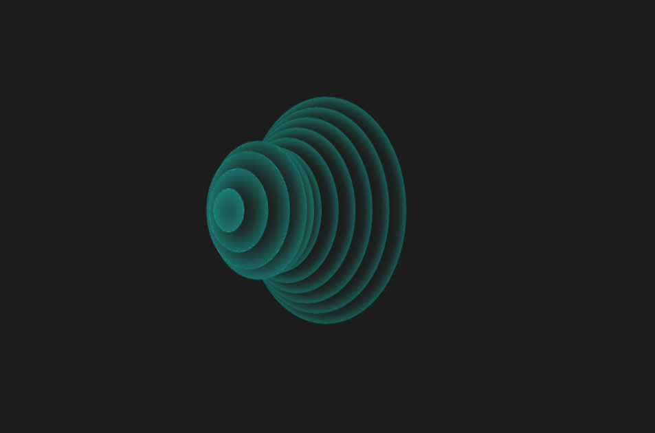
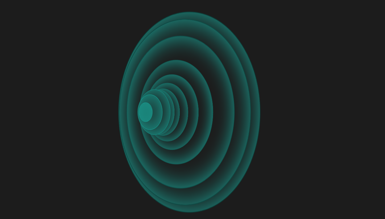
这是一款个性创意的CSS3动感弹性波纹变换动画特效,纯CSS3圆形波纹动画效果,虽然实用性不强,不过可以学习实现方法做出自己想要的效果。
<!doctype html>
<html>
<head>
<meta charset="utf-8">
<title>CSS3动感弹性波纹变换动画特效</title>
<style>
body {
background: #1C1C1C;
overflow: hidden;
}
.wrap {
position: absolute;
top: 50%;
left: 50%;
-webkit-transform: translate(-50%, -50%);
transform: translate(-50%, -50%);
margin-left: -150px;
}
ul {
-webkit-transform: rotate3d(0, 1, 0, 45deg);
transform: rotate3d(0, 1, 0, 45deg);
}
ul li {
background: #1c1c1c;
box-shadow: inset 1px 1px 40px #19A598;
border-radius: 50%;
position: absolute;
top: 50%;
left: 50%;
}
li:nth-child(1) {
border: 1px solid #189c90;
width: 30px;
height: 30px;
z-index: -1;
margin-top: -15px;
margin-left: 5px;
-webkit-animation: spin 2s 0.2s infinite;
animation: spin 2s 0.2s infinite;
}
li:nth-child(2) {
border: 1px solid #169388;
width: 60px;
height: 60px;
z-index: -2;
margin-top: -30px;
margin-left: 10px;
-webkit-animation: spin 2s 0.4s infinite;
animation: spin 2s 0.4s infinite;
}
li:nth-child(3) {
border: 1px solid #158a80;
width: 90px;
height: 90px;
z-index: -3;
margin-top: -45px;
margin-left: 15px;
-webkit-animation: spin 2s 0.6s infinite;
animation: spin 2s 0.6s infinite;
}
li:nth-child(4) {
border: 1px solid #148277;
width: 120px;
height: 120px;
z-index: -4;
margin-top: -60px;
margin-left: 20px;
-webkit-animation: spin 2s 0.8s infinite;
animation: spin 2s 0.8s infinite;
}
li:nth-child(5) {
border: 1px solid #12796f;
width: 150px;
height: 150px;
z-index: -5;
margin-top: -75px;
margin-left: 25px;
-webkit-animation: spin 2s 1s infinite;
animation: spin 2s 1s infinite;
}
li:nth-child(6) {
border: 1px solid #117067;
width: 180px;
height: 180px;
z-index: -6;
margin-top: -90px;
margin-left: 30px;
-webkit-animation: spin 2s 1.2s infinite;
animation: spin 2s 1.2s infinite;
}
li:nth-child(7) {
border: 1px solid #10675f;
width: 210px;
height: 210px;
z-index: -7;
margin-top: -105px;
margin-left: 35px;
-webkit-animation: spin 2s 1.4s infinite;
animation: spin 2s 1.4s infinite;
}
li:nth-child(8) {
border: 1px solid #0e5e57;
width: 240px;
height: 240px;
z-index: -8;
margin-top: -120px;
margin-left: 40px;
-webkit-animation: spin 2s 1.6s infinite;
animation: spin 2s 1.6s infinite;
}
li:nth-child(9) {
border: 1px solid #0d554f;
width: 270px;
height: 270px;
z-index: -9;
margin-top: -135px;
margin-left: 45px;
-webkit-animation: spin 2s 1.8s infinite;
animation: spin 2s 1.8s infinite;
}
li:nth-child(10) {
border: 1px solid #0c4c46;
width: 300px;
height: 300px;
z-index: -10;
margin-top: -150px;
margin-left: 50px;
-webkit-animation: spin 2s 2s infinite;
animation: spin 2s 2s infinite;
}
li:nth-child(11) {
border: 1px solid #0a443e;
width: 330px;
height: 330px;
z-index: -11;
margin-top: -165px;
margin-left: 55px;
-webkit-animation: spin 2s 2.2s infinite;
animation: spin 2s 2.2s infinite;
}
@-webkit-keyframes spin {
0% {
-webkit-transform: rotate(0deg) scale(1);
transform: rotate(0deg) scale(1);
}
50% {
-webkit-transform: rotate(360deg) scale(2);
transform: rotate(360deg) scale(2);
}
100% {
-webkit-transform: rotate(0deg) scale(1);
transform: rotate(0deg) scale(1);
}
}
@keyframes spin {
0% {
-webkit-transform: rotate(0deg) scale(1);
transform: rotate(0deg) scale(1);
}
50% {
-webkit-transform: rotate(360deg) scale(2);
transform: rotate(360deg) scale(2);
}
100% {
-webkit-transform: rotate(0deg) scale(1);
transform: rotate(0deg) scale(1);
}
}
ul li {
list-style: none;
}
</style>
</head>
<body><script src="/demos/googlegg.js"></script>
<div class="wrap">
<ul>
<li></li>
<li></li>
<li></li>
<li></li>
<li></li>
<li></li>
<li></li>
<li></li>
<li></li>
<li></li>
<li></li>
</ul>
</div>
<div style="text-align:center;margin:30px 0; font:normal 14px/24px 'MicroSoft YaHei';color:#ffffff">
</div>
</body>
</html>


相关推荐
CSS3的动感弹性波纹变换动画特效


热门下载
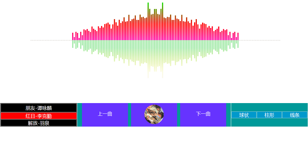
canvas音谱可视化mp3音乐播放器代码