
本文主要介绍了vue组件之alert的实现代码,小编觉得挺不错的,现在分享给大家,也给大家做个参考。一起跟随小编过来看看吧,希望能帮助到大家。
前言
本文主要Alert 组件的大致框架, 提供少量可配置选项。 旨在大致提供思路
Alert
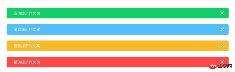
用于页面中展示重要的提示信息。
立即学习“前端免费学习笔记(深入)”;
templat模板结构
<template> <p v-show="visible" class="Alert"> <i v-show="closable" class="iconhandle close" @click="close"></i> <slot></slot> </p> </template>
大致结构 alert框,icon图标, slot插值 (其他样式颜色选项...)
如果需要动画 可以在外层包上Vue内置组件transition
<transition name="alert-fade">
</transition>
script
export default {
 name: 'Alert',

 props: {
  closable: {
   type: Boolean,
   default: true
  },
  show: {
   type: Boolean,
   default: true,
   twoWay: true
  },
  type: {
   type: String,
   default: 'info'
  }
 },
 data() {
  return {
   visible: this.show
  };
 },
 methods: {
  close() {
   this.visible = false;
   this.$emit('update:show', false);
   this.$emit('close');
  }
 }
};name: 组件的名字
props: 属性
methods: 方法
点击关闭 向外暴露2个事件
使用
import Alert from './Alert.vue'

Alert.install = function(Vue){
  Vue.component('Alert', Alert);
}
export default Alert<Alert :closable="false"> 这是一个不能关闭的alert </Alert> <Alert> 这是一个可以关闭的alert </Alert>
Attribute
| 参数 | 说明 | 类型 | 可选值 | 默认值 |
|---|---|---|---|---|
| closable | 是否可关闭 | boolean | — | true |
| show | 是否显示 | boolean | — | true |
Event
| 事件名称 | 说明 | 回调参数 |
|---|---|---|
| update:show | 关闭时触发,是否显示false | false |
| close | 关闭时触发 | — |
相关推荐:
javascript中alert()与console.log()的区别
以上就是vue组件之Alert详解的详细内容,更多请关注php中文网其它相关文章!

每个人都需要一台速度更快、更稳定的 PC。随着时间的推移,垃圾文件、旧注册表数据和不必要的后台进程会占用资源并降低性能。幸运的是,许多工具可以让 Windows 保持平稳运行。

 广告
广告
 收藏
收藏
 收藏
收藏
 收藏
收藏
Copyright 2014-2025 https://www.php.cn/ All Rights Reserved | php.cn | 湘ICP备2023035733号


 788
788


