


本项目是配合《数据可视化技术》课程设计的实践项目,旨在帮助学习者系统掌握数据可视化的核心技能。从数据读取与清洗入手,逐步学习使用Python主流可视化工具完成不同层次的可视化任务。
☞☞☞AI 智能聊天, 问答助手, AI 智能搜索, 免费无限量使用 DeepSeek R1 模型☜☜☜

数据可视化技术
小柒的知识库:数据库可视化技术
 ————灯火星星 人声杳杳 歌不尽乱世烽火.
本Lab是跟随学校课程《数据可视化技术》节奏的课下练手项目。
任务:使用Python可视化库:Matplotlib、seaborn、pyecharts进行数据可视化。 数据已挂载在数据集以节省在线运行空间。
立即学习“Python免费学习笔记(深入)”;
- 实验一:数据的读取与处理
- 实验二:Matplotlib数据可视化基础
- 实验三:seaborn绘制进阶图形
- 实验四:pyecharts交互式图形的绘制
- 实验五:广电大数据可视化项目实战
- 实验六:新零售智能销售数据可视化实战
- 实验七:基于TipDM大数据挖掘建模平台实现广电大数据可视化项目
解决警告
指定数据类型
警告中提到 "Columns (9) have mixed types",可以在读取CSV文件时指定数据类型,尤其是第9列。
data1 = pd.read_csv('销售流水记录1.csv', encoding='gb18030', dtype={'column_name': str})关闭警告
import warningswarnings.filterwarnings("ignore")设置low_memory为False
data1 = pd.read_csv('销售流水记录1.csv', encoding='gb18030', low_memory=False)# 忽略警告import warnings
warnings.filterwarnings("ignore")# 解压数据import zipfileimport os# 定义数据文件路径zip_file = '/home/aistudio/data/data262120/file.zip'# 定义解压后的目标文件夹路径extract_folder = '/home/aistudio/data/'# 创建一个 ZipFile 对象with zipfile.ZipFile(zip_file, 'r') as zip_ref: # 解压所有文件到目标文件夹
zip_ref.extractall(extract_folder)print('数据文件解压完成。')数据文件解压完成。
实验一:数据的读取与处理
本节将会学习:
- 掌握CSV、Excel文件数据和数据库数据的读取与保存的方法
- 掌握一致性、缺失值和异常值的校验
- 掌握重复值、缺失值和异常值的处理方法
- 掌握数据堆叠合并、主键合并、重叠合并的原理和方法
1. 读取csv数据
# 代码2-1# 使用read_csv读取销售流水记录表import pandas as pd
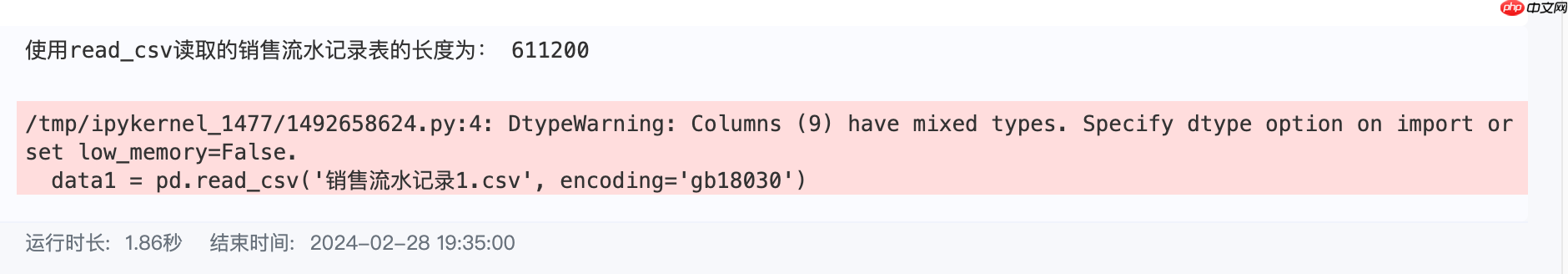
data1 = pd.read_csv('/home/aistudio/data/class/1.fetch/销售流水记录1.csv', encoding='gb18030', low_memory=False)print('使用read_csv读取的销售流水记录表的长度为:', len(data1))使用read_csv读取的销售流水记录表的长度为: 611200
# 代码2-2# 使用read_csv读取销售流水记录表, header=Nonedata2 = pd.read_csv('/home/aistudio/data/class/1.fetch/销售流水记录2.csv', header=None, encoding='gb18030')print('使用read_csv读取的销售流水记录表的长度为:', len(data2))print('列名为None时订单信息表为:')
data2.iloc[0:5,0:4]# 使用utf-8解析销售流水记录表=>报错,解决(更换编码解析)如下# data3 = pd.read_csv('/home/aistudio/data/class/1.fetch/销售流水记录2.csv', header=None, encoding='utf-8')# 使用gb18030编码解析销售流水记录表data3 = pd.read_csv('/home/aistudio/data/class/1.fetch/销售流水记录2.csv', header=None, encoding='gb18030')使用read_csv读取的销售流水记录表的长度为: 610656 列名为None时订单信息表为:
# 代码2-3import os# 定义目录路径directory = '/home/aistudio/tmp/'# 创建目录os.makedirs(directory, exist_ok=True)print('销售流水记录表写入文本文件前目录内文件列表为:\n', os.listdir('/home/aistudio/tmp/'))
data1.to_csv('./tmp/SaleInfo.csv', sep=';', index=False) # 将data1以CSV格式存储print('销售流水记录表表写入文本文件后目录内文件列表为:\n', os.listdir('/home/aistudio/tmp/'))销售流水记录表写入文本文件前目录内文件列表为: [] 销售流水记录表表写入文本文件后目录内文件列表为: ['SaleInfo.csv']
2. 读取Excel数据
!pip install openpyxl
Looking in indexes: https://mirror.baidu.com/pypi/simple/, https://mirrors.aliyun.com/pypi/simple/ Collecting openpyxl Downloading https://mirrors.aliyun.com/pypi/packages/6a/94/a59521de836ef0da54aaf50da6c4da8fb4072fb3053fa71f052fd9399e7a/openpyxl-3.1.2-py2.py3-none-any.whl (249 kB) ━━━━━━━━━━━━━━━━━━━━━━━━━━━━━━━━━━━━━ 250.0/250.0 kB 582.8 kB/s eta 0:00:00a 0:00:01Collecting et-xmlfile (from openpyxl) Downloading https://mirrors.aliyun.com/pypi/packages/96/c2/3dd434b0108730014f1b96fd286040dc3bcb70066346f7e01ec2ac95865f/et_xmlfile-1.1.0-py3-none-any.whl (4.7 kB) Installing collected packages: et-xmlfile, openpyxl Successfully installed et-xmlfile-1.1.0 openpyxl-3.1.2
# 代码2-4data3 = pd.read_excel('/home/aistudio/data/class/1.fetch/折扣信息表.xlsx') # 读取折扣信息表的数据print('data3信息长度为:', len(data3))data3信息长度为: 11420
# 代码2-5print('data3写入Excel文件前目录内文件列表为:\n', os.listdir('/home/aistudio/tmp/'))
data3.to_excel('/home/aistudio/tmp/data_save.xlsx')print('data3写入Excel文件后目录内文件列表为:\n', os.listdir('/home/aistudio/tmp/'))data3写入Excel文件前目录内文件列表为: ['SaleInfo.csv'] data3写入Excel文件后目录内文件列表为: ['data_save.xlsx', 'SaleInfo.csv']
# 下文模块缺失报错解决:安装pymysql库!pip install pymysql !pip install sqlalchemy
Looking in indexes: https://mirror.baidu.com/pypi/simple/, https://mirrors.aliyun.com/pypi/simple/ Requirement already satisfied: pymysql in /opt/conda/envs/python35-paddle120-env/lib/python3.10/site-packages (1.1.0) Looking in indexes: https://mirror.baidu.com/pypi/simple/, https://mirrors.aliyun.com/pypi/simple/ Collecting sqlalchemy Downloading https://mirrors.aliyun.com/pypi/packages/15/a6/ffe06d6d70ffa9e678302f11428030761b7b7e91bd9cb797701d9fdb97ad/SQLAlchemy-2.0.28-cp310-cp310-manylinux_2_17_x86_64.manylinux2014_x86_64.whl (3.1 MB) ━━━━━━━━━━━━━━━━━━━━━━━━━━━━━━━━━━━━━━━━ 3.1/3.1 MB 594.0 kB/s eta 0:00:0000:0100:01 Requirement already satisfied: typing-extensions>=4.6.0 in /opt/conda/envs/python35-paddle120-env/lib/python3.10/site-packages (from sqlalchemy) (4.9.0) Collecting greenlet!=0.4.17 (from sqlalchemy) Downloading https://mirrors.aliyun.com/pypi/packages/24/35/945d5b10648fec9b20bcc6df8952d20bb3bba76413cd71c1fdbee98f5616/greenlet-3.0.3-cp310-cp310-manylinux_2_24_x86_64.manylinux_2_28_x86_64.whl (616 kB) ━━━━━━━━━━━━━━━━━━━━━━━━━━━━━━━━━━━━━ 616.0/616.0 kB 572.4 kB/s eta 0:00:0000:0100:01 Installing collected packages: greenlet, sqlalchemy Successfully installed greenlet-3.0.3 sqlalchemy-2.0.28
3. 读取数据库数据
注:需要修改为自己的数据库相关配置,下文只做代码演示、已对数据集数据进行删减。
# 代码2-6import pandas as pdimport sqlalchemy# 创建一个mysql连接器,用户名为poboll,密码为M01w8flxzpdY3squ# 地址为mysql.sqlpub.com:3306,数据库名称为sale2、数据库文件可见/home/aistudio/data/class/1.fetch/sale2.sqlsqlalchemy_db = sqlalchemy.create_engine( 'mysql+pymysql://poboll:M01w8flxzpdY3squ@mysql.sqlpub.com:3306/sale2')print(sqlalchemy_db)
Engine(mysql+pymysql://poboll:***@mysql.sqlpub.com:3306/sale2)
# 代码2-7import pandas as pd# 使用read_sql_query函数查看sale2中的数据表数目formlist = pd.read_sql_query('show tables', con=sqlalchemy_db)print('testdb数据库数据表清单为:', '\n', formlist)# 使用read_sql_table函数读取销售流水记录表sale2detail1 = pd.read_sql_table('sale2', con=sqlalchemy_db)print('使用read_sql_table读取销售流水记录表的长度为:', len(detail1))# 使用read_sql函数读取销售流水记录表detail2 = pd.read_sql('select * from sale2', con=sqlalchemy_db)print('使用read_sql函数 + sql语句读取销售流水记录表的长度为:', len(detail2))
detail3 = pd.read_sql('sale2', con=sqlalchemy_db)print('使用read_sql函数+表格名称读取的销售流水记录表的长度为:', len(detail3))# 代码2-8# 使用to_sql方法存储orderDatadetail1.to_sql('sale_copy', con=sqlalchemy_db, index=False, if_exists='replace')# 使用read_sql读取test表格formlist1 = pd.read_sql_query('show tables', con=sqlalchemy_db)print('新增一个表格后test数据库数据表清单为:', '\n', formlist1)新增一个表格后test数据库数据表清单为: Tables_in_test 0 sale2 1 sale_copy
4. 检验数据
# 代码2-9import pandas as pd
data = pd.read_excel('/home/aistudio/data/class/1.fetch/data.xlsx')print('data中元素是否为空值的布尔型DataFrame为:\n', data.isnull())print('data中元素是否为非空值的布尔型DataFrame为:\n', data.notnull())print('data中每个特征对应的非空值数为:\n', data.count())print('data中每个特征对应的缺失率为:\n', 1-data.count() / len(data))data中元素是否为空值的布尔型DataFrame为:
x1 x2 x3 x4 x5
0 False False False False False
1 False True False False True
2 False False True False False
3 True False False False True
4 False True False False False
5 False False False False True
6 False False True False False
data中元素是否为非空值的布尔型DataFrame为:
x1 x2 x3 x4 x5
0 True True True True True
1 True False True True False
2 True True False True True
3 False True True True False
4 True False True True True
5 True True True True False
6 True True False True True
data中每个特征对应的非空值数为:
x1 6
x2 5
x3 5
x4 7
x5 4
dtype: int64
data中每个特征对应的缺失率为:
x1 0.142857
x2 0.285714
x3 0.285714
x4 0.000000
x5 0.428571
dtype: float64# 代码2-10# 什么是箱型图的四分位距?:https://zhuanlan.zhihu.com/p/634796969import pandas as pdimport numpy as np
arr = (18.02, 63.77, 79.52, 29.89, 68.86, 54.49, 92.59, 376.04, 5.92, 83.75, 70.12, 459.38, 82.96, 37.81, 65.08, 59.07, 47.56, 86.96, 38.38, 1100.34, 7.98, 2.82, 74.76, 87.64, 67.90, 89.9, 2000.67)# 利用箱型图的四分位距(IQR)对异常值进行检测Percentile = np.percentile(arr, [0, 25, 50, 75, 100]) # 计算百分位数IQR = Percentile[3] - Percentile[1] # 计算箱型图四分位距UpLimit = Percentile[3] + IQR*1.5 # 计算临界值上界arrayownLimit = Percentile[1] - IQR * 1.5 # 计算临界值下界# 判断异常值,大于上界或小于下界的值即为异常值abnormal = [i for i in arr if i > UpLimit or i < arrayownLimit]
print('箱型图的四分位距(IQR)检测出的array中异常值为:\n', abnormal)print('箱型图的四分位距(IQR)检测出的异常值比例为:\n', len(abnormal) / len(arr))# 利用3sigma原则对异常值进行检测array_mean = np.array(arr).mean() # 计算平均值array_sarray = np.array(arr).std() # 计算标准差array_cha = arr - array_mean # 计算元素与平均值之差# 返回异常值所在位置ind = [i for i in range(len(array_cha)) if np.abs(array_cha[i]) > array_sarray]
abnormal = [arr[i] for i in ind] # 返回异常值print('3sigma原则检测出的array中异常值为:\n', abnormal)print('3sigma原则检测出的异常值比例为:\n', len(abnormal) / len(arr))箱型图的四分位距(IQR)检测出的array中异常值为: [376.04, 459.38, 1100.34, 2000.67] 箱型图的四分位距(IQR)检测出的异常值比例为: 0.14814814814814814 3sigma原则检测出的array中异常值为: [1100.34, 2000.67] 3sigma原则检测出的异常值比例为: 0.07407407407407407
5. 清洗数据
# 代码2-11import pandas as pd
data1 = pd.read_csv('/home/aistudio/data/class/1.fetch/销售流水记录1.csv', encoding='gb18030')# 使用列表(list)去重# 定义去重函数def delRep(list1):
list2 = [] for i in list1: if i not in list2:
list2.append(i) return list2
# 去重sku_names = list(data1['sku_name']) # 将sku_name从数据框中提取出来print('去重前商品总数为:', len(sku_names))
sku_name = delRep(sku_names) # 使用自定义的去重函数去重print('使用列表(list)去重后商品的总数为:', len(sku_name))# 使用集合(set)去重print('去重前商品总数为:', len(sku_names))
sku_name_set = set(sku_names) # 利用set的特性去重print('使用集合(set)重后商品总数为:', len(sku_name_set))去重前商品总数为: 611200 使用列表(list)去重后商品的总数为: 10427 去重前商品总数为: 611200 使用集合(set)重后商品总数为: 10427
# 代码2-12sku_name_pandas = data1['sku_name'].drop_duplicates() # 对sku_name去重print('drop_duplicates方法去重之后商品总数为:', len(sku_name_pandas))drop_duplicates方法去重之后商品总数为: 10427
# 代码2-13print('去重之前销售流水记录表的形状为:', data1.shape)
shapeDet = data1.drop_duplicates(subset=['order_id', 'sku_id']).shapeprint('依照订单编号,商品编号去重之后销售流水记录表大小为:', shapeDet)去重之前销售流水记录表的形状为: (611200, 10) 依照订单编号,商品编号去重之后销售流水记录表大小为: (608176, 10)
# 代码2-14# 求取标价和卖价的相似度corrDet = data1[['sku_prc', 'sku_sale_prc']].corr(method='kendall')print('标价和卖价的kendall相似度为:\n', corrDet)标价和卖价的kendall相似度为:
sku_prc sku_sale_prc
sku_prc 1.000000 0.900969
sku_sale_prc 0.900969 1.000000# 代码2-15# 添加sku_name列会导致数据中包含了字符串类型报错:需要先处理数据,将字符串列排除,只选择数值型的列进行计算。corrDet1 = data1[['sku_prc', 'sku_sale_prc']].corr(method='pearson')print('标价和卖价的pearson相似度为:\n', corrDet1)标价和卖价的pearson相似度为:
sku_prc sku_sale_prc
sku_prc 1.000000 0.970264
sku_sale_prc 0.970264 1.000000# 代码2-16# 定义求取特征是否完全相同的矩阵的函数def FeatureEquals(df):
dfEquals = pd.DataFrame([], columns=df.columns, index=df.columns) for i in df.columns: for j in df.columns:
dfEquals.loc[i, j] = df.loc[: , i].equals(df.loc[: , j]) return dfEquals# 应用上述函数detEquals = FeatureEquals(data1)print('data1的特征相等矩阵的前5行5列为:\n', detEquals.iloc[: 5, : 5])data1的特征相等矩阵的前5行5列为:
create_dt order_id sku_id sku_name is_finished
create_dt True False False False False
order_id False True False False False
sku_id False False True False False
sku_name False False False True False
is_finished False False False False True# 代码2-17# 遍历所有数据lenDet = detEquals.shape[0]
dupCol = []for k in range(lenDet): for l in range(k+1, lenDet): if detEquals.iloc[k, l] & (detEquals.columns[l] not in dupCol):
dupCol.append(detEquals.columns[l])# 进行去重操作print('需要删除的列为:', dupCol)
data1.drop(dupCol, axis=1, inplace=True)
print('删除多余列后detail的特征数目为:', data1.shape[1])需要删除的列为: [] 删除多余列后detail的特征数目为: 10
# 代码2-18print('去除含缺失的列前detail的形状为:', data1.shape)print('去除含缺失的列后detail的形状为:', data1.dropna(axis=1, how='any').shape)去除含缺失的列前detail的形状为: (611200, 10) 去除含缺失的列后detail的形状为: (611200, 9)
# 代码2-19data1 = data1.fillna(-99)print('datal每个特征缺失的数目为:\n', data1.isnull().sum())datal每个特征缺失的数目为: create_dt 0 order_id 0 sku_id 0 sku_name 0 is_finished 0 sku_cnt 0 sku_prc 0 sku_sale_prc 0 sku_cost_prc 0 upc_code 0 dtype: int64
# 代码2-20# 线性插值import numpy as npfrom scipy.interpolate import interp1d
x = np.array([1, 2, 4, 5, 6, 8, 10]) # 创建自变量xy1 = np.array([3, 17, 129, 251, 433, 1025, 2001]) # 创建因变量y1y2 = np.array([5, 8, 14, 17, 20, 26, 32]) # 创建因变量y2LinearInsValue1 = interp1d(x, y1, kind='linear') # 线性插值拟合x, y1LinearInsValue2 = interp1d(x, y2, kind='linear') # 线性插值拟合x, y2print('当x为3、7、9时,使用线性插值y1为:', LinearInsValue1([3, 7, 9]))print('当x为3、7、9时,使用线性插值y2为:', LinearInsValue2([3, 7, 9]))# 拉格朗日插值from scipy.interpolate import lagrange
LargeInsValue1 = lagrange(x, y1) # 拉格朗日插值拟合x, y1LargeInsValue2 = lagrange(x, y2) # 拉格朗日插值拟合x, y2print('当x为3、7、9时,使用拉格朗日插值y1为:', LargeInsValue1([3, 7, 9]))print('当x为3、7、9时,使用拉格朗日插值y2为:', LargeInsValue2([3, 7, 9]))# 样条插值from scipy.interpolate import splrep, splev
tck1 = splrep(x, y1)
x_new = np.array([3, 7, 9])
SplineInsValue1 = splev(x_new, tck1) # 样条插值拟合x, y1tck2 = splrep(x, y2)
SplineInsValue2 = splev(x_new, tck2) # 样条插值拟合x, y2print('当x为3、7、9时,使用样条插值y1为:', SplineInsValue1)print('当x为3、7、9时,使用样条插值y2为:', SplineInsValue2)当x为3、7、9时,使用线性插值y1为: [ 73. 729. 1513.] 当x为3、7、9时,使用线性插值y2为: [11. 23. 29.] 当x为3、7、9时,使用拉格朗日插值y1为: [ 55. 687. 1459.] 当x为3、7、9时,使用拉格朗日插值y2为: [11. 23. 29.] 当x为3、7、9时,使用样条插值y1为: [ 55. 687. 1459.] 当x为3、7、9时,使用样条插值y2为: [11. 23. 29.]
6. 合并数据
# 代码2-21import pandas as pd# 创建数据data1 = pd.DataFrame({ 'A': ['A1', 'A2', 'A3', 'A4'], 'B': ['B1', 'B2', 'B3', 'B4'], 'C': ['C1', 'C2','C3', 'C4'], 'D': ['D1', 'D2', 'D3', 'D4']}, index=[1, 2, 3, 4])
data2 = pd.DataFrame({ 'B': ['B2', 'B4', 'B6', 'B8'], 'D': ['D2', 'D4', 'D6', 'D8'], 'F': ['F2', 'F4','F6', 'F8']},
index=[2, 4, 6, 8])print('内连接合并后的数据框为:\n', pd.concat([data1, data2], axis=1, join='inner'))print('外连接合并后的数据框为:\n', pd.concat([data1, data2], axis=1, join='outer'))内连接合并后的数据框为:
A B C D B D F
2 A2 B2 C2 D2 B2 D2 F2
4 A4 B4 C4 D4 B4 D4 F4
外连接合并后的数据框为:
A B C D B D F
1 A1 B1 C1 D1 NaN NaN NaN
2 A2 B2 C2 D2 B2 D2 F2
3 A3 B3 C3 D3 NaN NaN NaN
4 A4 B4 C4 D4 B4 D4 F4
6 NaN NaN NaN NaN B6 D6 F6
8 NaN NaN NaN NaN B8 D8 F8# 代码2-22print('内连接纵向合并后的数据框为:\n', pd.concat([data1, data2], axis=0, join='inner'))print('外连接纵向合并后的数据框为:\n', pd.concat([data1, data2], axis=0, join='outer'))内连接纵向合并后的数据框为:
B D
1 B1 D1
2 B2 D2
3 B3 D3
4 B4 D4
2 B2 D2
4 B4 D4
6 B6 D6
8 B8 D8
外连接纵向合并后的数据框为:
A B C D F
1 A1 B1 C1 D1 NaN
2 A2 B2 C2 D2 NaN
3 A3 B3 C3 D3 NaN
4 A4 B4 C4 D4 NaN
2 NaN B2 NaN D2 F2
4 NaN B4 NaN D4 F4
6 NaN B6 NaN D6 F6
8 NaN B8 NaN D8 F8# 代码2-23import pandas as pd
data1 = pd.read_csv('/home/aistudio/data/class/1.fetch/销售流水记录1.csv', encoding='gb18030')print('堆叠前data1数据框的大小:', data1.shape)
data2 = pd.read_csv('/home/aistudio/data/class/1.fetch/销售流水记录2.csv', encoding='gb18030')print('堆叠前data2数据框的大小:', data2.shape)
concatenated_data = pd.concat([data1, data2])print('concat纵向堆叠后的数据框大小为:', concatenated_data.shape)堆叠前data1数据框的大小: (611200, 10) 堆叠前data2数据框的大小: (610655, 10) concat纵向堆叠后的数据框大小为: (1221855, 10)
# 代码2-24import pandas as pd
data1 = pd.read_csv('/home/aistudio/data/class/1.fetch/销售流水记录1.csv', encoding='gb18030', low_memory=False)print('销售流水记录表的原始形状为:', data1.shape)
goods_info = pd.read_excel('/home/aistudio/data/class/1.fetch/商品信息表.xlsx')print('商品信息表的原始形状为:', goods_info.shape)
sale_detail = pd.merge(data1, goods_info, on='sku_id')print('销售流水记录表和商品信息表主键合并后的形状为:', sale_detail.shape)销售流水记录表的原始形状为: (611200, 10) 商品信息表的原始形状为: (6570, 8) 销售流水记录表和商品信息表主键合并后的形状为: (611111, 17)
# 代码2-25sale_detail2 = data1.join(goods_info, on='sku_id', rsuffix='1')print('销售流水记录表和商品信息表join合并后的形状为:', sale_detail2.shape)销售流水记录表和商品信息表join合并后的形状为: (611200, 18)
# 代码2-26import numpy as npimport pandas as pd# 生成两个数据框df1 = pd.DataFrame({'a': [2., np.nan, 1., np.nan], 'b': [np.nan, 6., np.nan, 8.],'c': range(1, 8, 2)})
df2 = pd.DataFrame({'a': [6., 2., np.nan, 1., 8.], 'b': [np.nan, 2., 5., 8., 9.]})# 采取不同的方式print('\ndf1.combine_first(df2)的结果:\n', df1.combine_first(df2))print('\ndf2.combine_first(df1)的结果:\n', df2.combine_first(df1))df1.combine_first(df2)的结果:
a b c
0 2.0 NaN 1.0
1 2.0 6.0 3.0
2 1.0 5.0 5.0
3 1.0 8.0 7.0
4 8.0 9.0 NaN
df2.combine_first(df1)的结果:
a b c
0 6.0 NaN 1.0
1 2.0 2.0 3.0
2 1.0 5.0 5.0
3 1.0 8.0 7.0
4 8.0 9.0 NaN回顾
五、实验注意事项:
-
数据读取与保存方法:
- CSV文件: 使用pandas库的read_csv()函数读取,to_csv()函数保存。
- Excel文件: 利用pandas的read_excel()函数读取,to_excel()函数保存。
- 数据库数据: 使用数据库连接工具(如SQLAlchemy、pyodbc等),执行相应的查询语句获取数据,通过pandas的to_sql()函数保存。
-
一致性、缺失值和异常值校验:
- 一致性: 确保数据格式、单位、命名一致。
- 缺失值校验: 使用isnull()函数检查缺失值,根据情况选择删除、填充或插值。
- 异常值校验: 利用统计方法、可视化等手段检查异常值,根据业务需求决定如何处理。
-
重复值、缺失值和异常值处理方法:
- 重复值处理: 使用drop_duplicates()函数删除重复值,或者利用业务逻辑合并。
- 缺失值处理: 删除缺失值、填充缺失值(均值、中位数、众数等)或者使用插值方法。
- 异常值处理: 根据业务需求选择删除、修正或标记异常值。
-
数据合并与堆叠:
- 数据堆叠: 使用concat()函数将多个数据集按照指定轴堆叠。
- 主键合并: 利用merge()函数按照指定列合并具有相同主键的数据。
- 重叠合并: 使用combine_first()函数在两个数据集中选择非缺失值。
六、思考题:
-
CSV、Excel文件数据和数据库数据的读取与保存方法异同点:
- 异同点:
- 相同点: 都可以使用pandas库进行读取和保存。
- 不同点:
- CSV和Excel文件是本地文件,而数据库数据需要通过相应的数据库连接进行读取。
- 数据库数据的读取通常需要使用SQL查询语句,而文件数据可以直接使用文件读取方法。
- 数据库保存需要使用to_sql()方法,而文件可以直接使用to_csv()或to_excel()方法。
- 异同点:
-
重复值、缺失值和异常值的处理方法:
- 重复值处理: 可以使用drop_duplicates()函数删除重复值,或者通过业务逻辑合并相同主键的数据。
- 缺失值处理: 可以选择删除缺失值、填充缺失值(均值、中位数、众数等)或者使用插值方法,具体方法取决于数据特征和分析需求。
- 异常值处理: 可以根据业务需求选择删除异常值、修正异常值或者标记异常值。利用统计方法和可视化工具识别异常值,再根据具体情况进行处理。
P51课后作业
实训1 读取无人售货机数据
训练要点
- 掌握数据的读取方法
- 掌握数据的合并方法
需求说明
某商场在不同地点安放了5台自动售货机,编号分别为A、B、C、D、E。数据1提供了从2017年1月1日至2017年12月31日每台自动售货机的商品数据,数据2提供了商品的分类。现在要对两个表格中的数据进行合并。
实现步骤
- 使用pandas中的readesv函数分别读取数
- 使用pandas中的merge函数或join方法进行数据合开
- 保存合并后的结果.
实训2 处理无人售货机数据
训练要点
- 掌握数据的校验方法
- 掌握数据的清洗方法
需求说明
对实训1中合并的数据进行数据校验、清晰,如重复值教研与处理、异常值检验与处理、缺失值检验与处理。
实现步骤
- 查找重复记录并进行删除
- 查找异常数据并进行删除
- 查我缺失值并进行处理(删除,填索引)
- 保存处理后的数据
# 实训1 读取无人售货机数据# 步骤1: 读取数据1.csv和数据2.csvimport pandas as pd# 读取数据1.csv,指定编码格式为'utf-8-sig',数据1.csv包含每台自动售货机的商品数据data1 = pd.read_csv('data/task/1.P51/数据1.csv', encoding='gb18030')# 读取数据2.csv,指定编码格式为'utf-8-sig',数据2.csv包含商品的分类数据data2 = pd.read_csv('data/task/1.P51/数据2.csv', encoding='gb18030')# 显示数据1的前几行data1.head()# 显示数据2的前几行data2.head()商品 大类 二级类 0 100g*5瓶益力多 饮料 乳制品 1 100g越南LIPO奶味面包干 非饮料 饼干糕点 2 10g卫龙亲嘴烧香辣味 非饮料 肉干/豆制品/蛋 3 10g越南LIPO奶味面包干 非饮料 饼干糕点 4 110g顺宝九制话梅 非饮料 蜜饯/果干
import os# 检查当前工作目录下是否已经存在名为"result"的文件夹folder_name = "result"if not os.path.exists(folder_name):
os.makedirs(folder_name) print(f"文件夹 '{folder_name}' 创建成功!")else: print(f"文件夹 '{folder_name}' 已经存在。")文件夹 'result' 已经存在。
# 步骤2: 合并数据# 数据1、2中均有商品列'商品'# 根据'商品'列进行合并merged_data = pd.merge(data1, data2, on='商品', how='inner')# 显示合并后的数据的前几行merged_data.head()# 步骤3: 保存合并后的结果merged_data.to_csv('result/合并后数据.csv', index=False)# 实训2 处理无人售货机数据import pandas as pd# 步骤1: 查找并删除重复记录# 读取合并后的数据merged_data = pd.read_csv('result/合并后数据.csv', low_memory=False)# 查找重复记录并进行删除duplicated_rows = merged_data.duplicated()
merged_data = merged_data[~duplicated_rows]# 步骤2: 查找并删除异常数据# 查找异常数据并进行删除# 假设应付金额小于等于0的数据为异常数据# 先将应付金额列转换为数值型数据,然后再进行比较merged_data['应付金额'] = pd.to_numeric(merged_data['应付金额'], errors='coerce') # 将应付金额列转换为数值型数据merged_data = merged_data.dropna(subset=['应付金额']) # 删除缺失值merged_data = merged_data[merged_data['应付金额'] > 0] # 删除应付金额小于等于0的异常数据
# 步骤3: 查找并处理缺失值# 查找缺失值并进行处理(这里直接删除缺失值)merged_data.dropna(inplace=True)# 保存处理后的数据merged_data.to_csv('result/处理缺失后数据.csv', index=False)print(merged_data) 订单号 设备ID 应付金额 实际金额 \
1 DD20170816749368329675770932 E43A6E078A07631 4.5 4.5
2 DD20170816749300229112037656709 E43A6E078A06874 4.5 4.5
3 DD201708167493529849068514902 E43A6E078A04228 4.0 4
4 DD201708167493876353091909391 E43A6E078A04228 14.0 14
5 DD201708167493682323795309392 E43A6E078A07631 4.5 4.5
... ... ... ... ...
70685 DD201708167493878114605918673 E43A6E078A04228 11.0 11
70686 DD201708167493690426013200961 E43A6E078A04228 4.0 4
70687 DD201708167493774605081730209 E43A6E078A04172 11.0 11
70688 DD2017041716541957D1BE9289A69 E43A6E078A04228 0.1 0.1
70689 DD2017041716040483BC6D38F8F83 E43A6E078A06874 0.1 0.1
商品 支付时间 地点 状态 提现 大类 二级类
1 68g好丽友巧克力派2枚 2017/1/2 20:58 D 已出货未退款 已提现 非饮料 饼干糕点
2 68g好丽友巧克力派2枚 2017/1/3 1:53 E 已出货未退款 已提现 非饮料 饼干糕点
3 68g好丽友巧克力派2枚 2017/1/8 20:22 C 已出货未退款 已提现 非饮料 饼干糕点
4 68g好丽友巧克力派2枚 2017/1/9 21:38 C 已出货未退款 已提现 非饮料 饼干糕点
5 68g好丽友巧克力派2枚 2017/1/15 22:38 D 已出货未退款 已提现 非饮料 饼干糕点
... ... ... .. ... ... ... ...
70685 20g洽洽每日坚果 2017/11/19 10:41 C 已出货未退款 已提现 非饮料 坚果炒货
70686 商品36 2017/11/15 15:16 C 已出货未退款 已提现 非饮料 其他
70687 80g粤光宝盒芒果干 2017/12/4 6:47 A 已出货未退款 已提现 非饮料 蜜饯/果干
70688 商品21 2017/12/10 16:18 C 已出货未退款 已提现 非饮料 其他
70689 商品21 2017/12/10 21:29 E 已出货未退款 已提现 非饮料 其他
[70461 rows x 11 columns]实验二:Matplotlib数据可视化基础
本节将会学习:
- 掌握pyplot模块常用的绘图参数的调节方法
- 掌握散点图和折线图的绘制方法
- 掌握饼图的绘制方法
- 掌握柱形图与条形图的绘制方法
- 账务箱线图的绘制方法
1. 基础语法与常用函数
表3-1 创建画布与创建并选中子图的常用函数
| 函数名称 | 函数作用 |
|---|---|
| plt.figure() | 创建一个新的画布 |
| plt.subplot() | 创建一个新的子图,并将其设为当前活动子图 |
| plt.subplots() | 创建一个包含多个子图的画布,并返回一个包含所有子图的numpy数组 |
| plt.add_subplot() | 创建并添加一个子图到指定位置 |
| plt.subplot2grid() | 在网格中创建一个子图 |
表3-2 添加各类标签和图例的常用函数
| 函数名称 | 函数作用 |
|---|---|
| plt.title() | 添加图表标题 |
| plt.xlabel() | 添加x轴标签 |
| plt.ylabel() | 添加y轴标签 |
| plt.legend() | 添加图例 |
| plt.text() | 在指定位置添加文本 |
| plt.annotate() | 在图中添加注释 |
| plt.grid() | 显示网格 |
表3-3 保存与显示的常用函数
| 函数名称 | 函数作用 |
|---|---|
| savefig() | 保存当前图形为图像文件 |
| show() | 显示当前图形 |
表3-4 常用的线条rc参数名称及其说明
| rc函数名称 | 说明 |
|---|---|
| lines.linewidth | 线条的宽度 |
| lines.linestyle | 线条的样式 |
| lines.color | 线条的颜色 |
| lines.marker | 线条上的标记样式 |
| lines.markersize | 线条上标记的大小 |
| lines.markeredgecolor | 线条上标记的边缘颜色 |
| lines.markerfacecolor | 线条上标记的填充颜色 |
| lines.markeredgewidth | 线条上标记的边缘宽度 |
表3-5 lines.linestyle参数的4种取值及其意义
| 取值 | 意义 | 取值 | 意义 |
|---|---|---|---|
| '-' | 实线 | '--' | 虚线 |
| ':' | 点线 | '-.' | 点划线 |
表3-6 lines.marker参数的20种取值及其意义
| 取值 | 意义 | 取值 | 意义 | 取值 | 意义 |
|---|---|---|---|---|---|
| '.' | 点 | ',' | 像素点 | 'o' | 圆圈 |
| 'v' | 下三角形 | '^' | 上三角形 | ' | 左三角形 |
| '>' | 右三角形 | '1' | 下花三角 | '2' | 上花三角 |
| '3' | 左花三角 | '4' | 右花三角 | 's' | 正方形 |
| 'p' | 五角形 | '*' | 星形 | 'h' | 六边形1 |
| 'H' | 六边形2 | `+' | 加号 | x' | X形 |
| D' | 菱形 | `d' | 瘦菱形 | ` | ' |
表3-7 坐标轴常用的rc参数名称及其说明
| RC参数名称 | 说明 |
|---|---|
| axes.grid | 控制是否显示坐标轴网格线,可选值为True或False |
| axes.labelsize | 设置坐标轴标签的字体大小 |
| axes.linewidth | 设置坐标轴的线条宽度 |
| axes.titlesize | 设置坐标轴标题的字体大小 |
| axes.titleweight | 设置坐标轴标题的字体粗细 |
| axes.titlepad | 设置坐标轴标题与图表的距离 |
| axes.formatter | 设置坐标轴刻度的格式化函数 |
| axes.spines.left | 设置左侧坐标轴线的显示与样式 |
| axes.spines.right | 设置右侧坐标轴线的显示与样式 |
| axes.spines.bottom | 设置底部坐标轴线的显示与样式 |
| axes.spines.top | 设置顶部坐标轴线的显示与样式 |
| axes.spines.color | 设置坐标轴线的颜色 |
| axes.spines.linewidth | 设置坐标轴线的宽度 |
| axes.xmargin | 设置x轴数据范围的留白比例 |
| axes.ymargin | 设置y轴数据范围的留白比例 |
| axes.labelcolor | 设置坐标轴标签的颜色 |
| axes.labelpad | 设置坐标轴标签与轴线的距离 |
| axes.labelweight | 设置坐标轴标签的字体粗细 |
| axes.labelrotation | 设置坐标轴标签的旋转角度 |
表3-8 字体常用的rc参数名称及其说明
| RC参数名称 | 说明 |
|---|---|
| font.family | 字体系列(例如['sans-serif']、['serif']、['monospace']) |
| font.style | 字体样式(例如'normal'、'italic'、'oblique') |
| font.variant | 字体变体(例如'normal'、'small-caps') |
| font.weight | 字体粗细(例如'normal'、'bold'、'light'、'ultralight'、'heavy') |
| font.stretch | 字体拉伸(例如'normal'、'ultra-condensed'、'extra-condensed'、'condensed'、'semi-condensed') |
| font.size | 字体大小(例如12、16、20) |
| font.serif | 字体名称(例如'DejaVu Serif'、'Times New Roman') |
| font.sans-serif | 字体名称(例如'DejaVu Sans'、'Arial') |
| font.cursive | 字体名称(例如'Apple Chancery'、'Comic Sans MS') |
| font.monospace | 字体名称(例如'Courier New'、'DejaVu Sans Mono') |
# 解压数据import zipfileimport os# 定义数据文件路径zip_file = '/home/aistudio/data/data262120/file.zip'# 定义解压后的目标文件夹路径extract_folder = '/home/aistudio/data/'# 创建一个 ZipFile 对象with zipfile.ZipFile(zip_file, 'r') as zip_ref:    # 解压所有文件到目标文件夹
    zip_ref.extractall(extract_folder)print('数据文件解压完成。')
数据文件解压完成。
# 创建输出目录import os# 检查当前工作目录下是否已经存在名为"result"的文件夹folder_name = "result"if not os.path.exists(folder_name):
os.makedirs(folder_name) print(f"文件夹 '{folder_name}' 创建成功!")else: print(f"文件夹 '{folder_name}' 已经存在。")文件夹 'result' 已经存在。
# 设置中文字体#创建字体目录fontsfolder_name = ".fonts"if not os.path.exists(folder_name):
os.makedirs(folder_name) print(f"文件夹 '{folder_name}' 创建成功!")else: print(f"文件夹 '{folder_name}' 已经存在。")# 复制字体文件到系统路径# 一般只需要将字体文件复制到系统字体目录下即可,但是在aistudio上该路径没有写权限,所以此方法不能用# !cp simhei.ttf /usr/share/fonts/print("已复制字体,请手动重启内核!")
!cp data/SimHei.ttf /opt/conda/envs/python35-paddle120-env/lib/python3.10/site-packages/matplotlib/mpl-data/fonts/ttf/
!cp data/SimHei.ttf /opt/conda/envs/python35-paddle120-env/lib/python3.10/site-packages/matplotlib/mpl-data/fonts/ttf/# 创建系统字体文件路径!mkdir .fonts# 复制文件到该路径!cp data/SimHei.ttf .fonts/
!rm -rf .cache/matplotlib# 注:完成后请手动点击重启内核!文件夹 '.fonts' 创建成功! 已复制字体,请手动重启内核!
# 代码3-1 基础绘图语法pyplotimport numpy as npimport matplotlib.pyplot as plt
get_ipython().run_line_magic('matplotlib', 'inline')
data = np.arange(0, 1.1, 0.01)
plt.title('lines') # 添加标题plt.xlabel('x') # 添加x轴的名称plt.ylabel('y') # 添加y轴的名称plt.xlim((0, 1)) # 确定x轴范围plt.ylim((0, 1)) # 确定y轴范围plt.xticks([0, 0.2, 0.4, 0.6, 0.8, 1]) # 规定x轴刻度plt.yticks([0, 0.2, 0.4, 0.6, 0.8, 1]) # 确定y轴刻度plt.plot(data, data) # 添加y=x曲线plt.plot(data, data**2) # 添加y=x^2曲线plt.legend(['y=x', 'y=x^2'])
plt.savefig('result/不包含子图.png')
plt.show()# 代码3-2 会只包含子图图形的基础语法rad = np.arange(0, np.pi*2, 0.01)# 第一幅子图p1 = plt.figure(figsize=(8, 10), dpi=80) # 确定画布大小ax1 = p1.add_subplot(2, 1, 1) # 创建一个两行1列的子图,并开始绘制第一幅plt.title('lines') # 添加标题plt.xlabel('x1') # 添加x轴的名称plt.ylabel('y1') # 添加y轴的名称plt.xlim((0, 1)) # 确定x轴范围plt.ylim((0, 1)) # 确定y轴范围plt.xticks([0, 0.2, 0.4, 0.6, 0.8, 1]) # 规定x轴刻度plt.yticks([0, 0.2, 0.4, 0.6, 0.8, 1]) # 确定y轴刻度plt.plot(rad, rad) # 添加y=x^2曲线plt.plot(rad, rad**2) # 添加y=x^4曲线plt.legend(['y=x', 'y=x^2'])# 第二幅子图ax2 = p1.add_subplot(2, 1, 2) # 创开始绘制第2幅plt.title('sin/cos') # 添加标题plt.xlabel('x2') # 添加x轴的名称plt.ylabel('y2') # 添加y轴的名称plt.xlim((0, np.pi * 2)) # 确定x轴范围plt.ylim((-1, 1)) # 确定y轴范围plt.xticks([0, np.pi / 2, np.pi, np.pi * 1.5, np.pi * 2]) # 规定x轴刻度plt.yticks([-1, -0.5, 0, 0.5, 1]) # 确定y轴刻度plt.plot(rad, np.sin(rad)) # 添加sin曲线plt.plot(rad, np.cos(rad)) # 添加cos曲线plt.legend(['sin', 'cos'])
plt.savefig('result/包含子图.png')
plt.show()# 代码3-3 查看与使用预设风格print('Matplotlib中预设风格为:\n', plt.style.available)
x = np.linspace(0, 1, 1000)
plt.title('y=x & y=x^2') # 添加标题plt.style.use('bmh') # 使用bmh风格plt.plot(x, x)
plt.plot(x, x ** 2)
plt.legend(['y=x', 'y=x^2']) # 添加图例plt.savefig('result/bmh风格.png') # 保存图片plt.show()Matplotlib中预设风格为: ['Solarize_Light2', '_classic_test_patch', '_mpl-gallery', '_mpl-gallery-nogrid', 'bmh', 'classic', 'dark_background', 'fast', 'fivethirtyeight', 'ggplot', 'grayscale', 'seaborn-v0_8', 'seaborn-v0_8-bright', 'seaborn-v0_8-colorblind', 'seaborn-v0_8-dark', 'seaborn-v0_8-dark-palette', 'seaborn-v0_8-darkgrid', 'seaborn-v0_8-deep', 'seaborn-v0_8-muted', 'seaborn-v0_8-notebook', 'seaborn-v0_8-paper', 'seaborn-v0_8-pastel', 'seaborn-v0_8-poster', 'seaborn-v0_8-talk', 'seaborn-v0_8-ticks', 'seaborn-v0_8-white', 'seaborn-v0_8-whitegrid', 'tableau-colorblind10']
# 代码3-4 调节线条的rc参数import numpy as npimport matplotlib.pyplot as plt# 原图x = np.linspace(0, 4 * np.pi) # 生成x轴数据y = np.sin(x) # 生成y轴数据plt.plot(x, y, label='$sin(x)$') # 绘制sin曲线图plt.title('sin')
plt.savefig('result/线条rc参数原图.png')
plt.show()# 修改rc参数后的图plt.rcParams['lines.linestyle'] = '--'plt.rcParams['lines.linewidth'] = 4plt.plot(x, y, label='$sin(x)$') # 绘制三角函数plt.title('sin')
plt.savefig('result/线条rc参数修改后.png')
plt.show()# 代码3-5 修改坐标轴常用的rc参数# 原图import numpy as npimport matplotlib.pyplot as plt
x = np.linspace(0, 4 * np.pi) # 生成x轴数据y = np.sin(x) # 生成y轴数据plt.plot(x, y, label='$sin(x)$') # 绘制三角函数plt.title('sin')
plt.savefig('result/坐标轴rc参数原图.png')
plt.show()# 修改rc参数后的图plt.rcParams['axes.edgecolor'] = 'r' # 轴颜色设置为蓝色plt.rcParams['axes.grid'] = True # 添加网格plt.rcParams['axes.spines.top'] = False # 去除顶部轴plt.rcParams['axes.spines.right'] = False # 去除右侧轴plt.rcParams['axes.xmargin'] = 0.1 # x轴余留为区间长度的0.1倍plt.plot(x, y, label='$sin(x)$') # 绘制三角函数plt.title('sin')
plt.savefig('result/坐标轴rc参数修改后.png')
plt.show()# 代码3-6 调节字体常用的rc参数# 原图import numpy as npimport matplotlib.pyplot as plt
x = np.linspace(0, 4 * np.pi) # 生成x轴数据y = np.sin(x) #生成y轴数据plt.plot(x, y, label='$sin(x)$') # 绘制三角函数plt.title('sin曲线')
plt.savefig('result/文字rc参数原图.png')
plt.show()# 需要用到中文字体# 修改rc参数后的图plt.rcParams['font.sans-serif'] = 'SimHei' # 设置字体为SimHeiplt.rcParams['axes.unicode_minus'] = False # 解决负号“-”显示异常plt.plot(x, y, label='$sin(x)$') # 绘制三角函数plt.title('sin曲线')
plt.savefig('result/文字rc参数修改后.png')
plt.show()2. 绘图分析特征间的关系
表3-9 scatter函数常用参数及其说明
| 参数名 | 说明 |
|---|---|
| x | 散点的x坐标 |
| y | 散点的y坐标 |
| s | 散点的大小 |
| c | 散点的颜色 |
| marker | 散点的标记形状 |
| cmap | 颜色映射,用于指定颜色映射的颜色集合 |
| alpha | 散点的透明度 |
| edgecolors | 散点的边缘颜色 |
| linewidths | 散点的边缘线宽度 |
表3-11 plot函数实际可以填入的主要参数及其说明
| 参数名 | 说明 |
|---|---|
| x | 点的x坐标 |
| y | 点的y坐标 |
| linestyle | 线条的风格 |
| color | 线条的颜色 |
| marker | 点的标记形状 |
| markersize | 点的大小 |
| markerfacecolor | 点的填充颜色 |
| markeredgecolor | 点的边缘颜色 |
| label | 线条的标签 |
表3-12 常用颜色简写
| 颜色简写 | 代表的颜色 | 颜色简写 | 代表的颜色 |
|---|---|---|---|
| b | 蓝色 | m | 洋红色 |
| g | 绿色 | y | 黄色 |
| r | 红色 | k | 黑色 |
| c | 青色 | w | 白色 |
# 代码3-7 绘制2000-2019年年末总人口散点图import numpy as npimport pandas as pdimport matplotlib.pyplot as plt
plt.rcParams['font.sans-serif'] = 'SimHei'# 设置中文字体plt.rcParams['axes.unicode_minus'] = Falsedata = pd.read_csv('data/class/2.fetch/people.csv')
name = data.columns
values = data.values
plt.figure(figsize=(9, 7))
plt.scatter(values[:, 0], values[:, 1], marker='o', color='skyblue', edgecolors='black', s=100, alpha=0.8)
plt.xlabel('年份')
plt.ylabel('年末总人口(万人)')
plt.xticks(range(0, 20), values[range(0, 20), 0], rotation=45)
plt.title('2000-2019年年末总人口散点图')
plt.grid(True, linestyle='--', alpha=0.5)
plt.savefig('result/2000-2019年年末总人口散点图.png')
plt.show()# 代码3-8 绘制2000-2019年各年龄段年末总人口散点图plt.figure(figsize=(9, 7)) # 设置画布plt.scatter(values[:, 0], values[:, 2], marker='o', c='red', label='0-14岁人口', edgecolors='black', s=100, alpha=0.8) # 绘制散点图plt.scatter(values[:, 0], values[:, 3], marker='D', c='blue', label='15-64岁人口', edgecolors='black', s=100, alpha=0.8) # 绘制散点图plt.scatter(values[:, 0], values[:, 4], marker='v', c='black', label='65岁及以上人口', edgecolors='black', s=100, alpha=0.8) # 绘制散点图plt.xlabel('年份') # 添加横轴标签plt.ylabel('年末总人口(万人)') # 添加纵轴标签plt.xticks(range(0, 20), values[range(0, 20), 0], rotation=45)
plt.title('2000-2019年各年龄段年末总人口散点图') # 添加图表标题plt.legend() #添加图例plt.grid(True, linestyle='--', alpha=0.5)
plt.savefig('result/2000-2019年各年龄段年末总人口散点图.png')
plt.show()import matplotlib.pyplot as plt# 代码3-9 2000-2019年总人口折线图plt.figure(figsize=(9, 7)) # 设置画布plt.plot(values[:, 0], values[:, 1], color='r', linestyle='--') # 绘制折线图plt.xlabel('年份') #添加横轴标签plt.ylabel('年末总人口(万人)') # 添加y轴名称plt.xticks(range(0, 20), values[range(0, 20), 0], rotation=45)
plt.title('2000-2019年年末总人口折线图') # 添加图表标题plt.savefig('result/2000-2019年年末总人口折线图.png')
plt.show()# 代码3-10 2000-2019年总人口点线图plt.figure(figsize=(9, 7)) # 设置画布plt.plot(values[:, 0], values[:, 1], color='orange', linestyle='-', marker='s', markersize=8, markerfacecolor='red', markeredgewidth=1.5, markeredgecolor='black', alpha=0.8) # 绘制折线图plt.xlabel('年份') # 添加横轴标签plt.ylabel('年末总人口(万人)') # 添加y轴名称plt.xticks(range(0, 20), values[range(0, 20), 0], rotation=45)
plt.title('2000-2019年年末总人口点线图') # 添加图表标题plt.grid(True) # 添加网格线plt.savefig('result/2000-2019年年末总人口点线图.png')
plt.show()# 代码3-11 2000-2019年各年龄段总人口折线图plt.figure(figsize=(8, 7)) # 设置画布plt.plot(values[:, 0], values[:, 2], 'b^-',
values[:, 0], values[:, 3], 'ro--',
values[:, 0], values[:, 4], 'gs-.') # 绘制折线图plt.xlabel('年份') # 添加横轴标签plt.ylabel('年末总人口(万人)') # 添加y轴名称plt.xticks(range(0, 20), values[range(0, 20), 0], rotation=45)
plt.title('2000-2019年各年龄段总人口点线图') # 添加图表标题plt.legend(['0-14岁人口', '15-64岁人口', '65岁及以上人口'])
plt.savefig('result/2000-2019年各年龄段总人口点线图.png')
plt.show()3. 绘图分析特征内部数据分布与分散状况
表3-13 pie函数常用参数及其说明
| 函数名称 | 函数作用 |
|---|---|
| pie() | 创建饼图,展示数据的相对比例。 |
| x | 数组,表示饼图中每个扇形的数据值。 |
| labels | 数组,用于设置每个扇形的标签。 |
| colors | 数组,指定每个扇形的颜色。 |
| autopct | 字符串或函数,用于设置扇形内的数据标签格式。 |
| startangle | 数字,指定饼图的起始角度。 |
| shadow | 布尔值,控制是否显示阴影效果。 |
| explode | 数组,用于突出显示某些扇形。 |
| radius | 数字,设置饼图的半径。 |
| counterclock | 布尔值,控制饼图的绘制方向。 |
表3-14 bar函数常用参数及其说明

| 函数名称 | 函数作用 |
|---|---|
| bar() | 创建柱状图,展示数据的对比关系。 |
| x | 数组,设置每个柱形的横坐标位置。 |
| height | 数组,指定每个柱形的高度。 |
| width | 数字,设置柱形的宽度。 |
| color | 字符串或数组,用于设置柱形的颜色。 |
| edgecolor | 字符串,设置柱形边缘的颜色。 |
| linewidth | 数字,控制柱形边缘的宽度。 |
| align | 字符串,指定柱形的对齐方式。 |
| tick_label | 数组,设置每个柱形的标签。 |
| hatch | 字符串,用于填充柱形的图案样式。 |
| log | 布尔值,控制柱状图的纵坐标是否使用对数尺度。 |
表3-15 boxplot函数常用参数及其说明
| 函数名称 | 函数作用 |
|---|---|
| boxplot() | 创建箱线图,展示数据的分布情况。 |
| x | 数组,设置每个箱线图的横坐标位置。 |
| data | 数据集,用于生成箱线图。 |
| notch | 布尔值,控制箱线图的缺口显示。 |
| sym | 字符串,设置异常值的标记样式。 |
| vert | 布尔值,控制箱线图的方向。 |
| whis | 浮点数或数组,设置箱线图的须长度。 |
| positions | 数组,指定每个箱线图的位置。 |
| widths | 数字或数组,设置箱线图的宽度。 |
| patch_artist | 布尔值,控制箱线图的填充样式。 |
| meanline | 布尔值,控制是否显示均值线。 |
# 绘制饼图# 代码3-12 2019年各年龄段年末总人口饼图import numpy as npimport matplotlib.pyplot as pltimport pandas as pd
plt.rcParams['font.sans-serif'] = 'SimHei' # 设置中文显示plt.rcParams['axes.unicode_minus'] = Falsedata = pd.read_csv('data/class/2.fetch/people.csv')
name = data.columns # 提取其中的columns字段,视为数据的标签values = data.values # 提取其中的values字段,数据的存在位置label = ['0-14岁人口', '15-64岁人口', '65岁及以上人口'] # 刻度标签plt.figure(figsize=(6, 6)) # 将画布设定为正方形,则绘制的饼图是正圆explode = [0.01, 0.01, 0.01] # 设定各项离心n个半径plt.pie(values[-1, 2:5], explode=explode, labels=label, autopct='%1.1f%%') # 绘制饼图plt.title('2019年各年龄段年末总人口饼图') # 添加图表标题plt.savefig('result/2019年各年龄段年末总人口饼图.png')
plt.show()# 绘制柱形图# 代码3-13 2019年各年龄段年末总人口柱形图label = ['0-14岁人口', '15-64岁人口', '65岁及以上人口'] # 刻度标签plt.figure(figsize=(9, 7), dpi=60)
plt.bar(range(3), values[-1, 2: 5],width=0.4)
plt.xlabel('年龄段') # 添加横轴标签plt.ylabel('年末总人口(万人)') # 添加y轴名称plt.xticks(range(3),label)
plt.title('2019年各年龄段年末总人口柱形图') # 添加图表标题plt.savefig('result/2019年各年龄段年末总人口柱形图.png')
plt.show()# 绘制箱线图# 代码3-14 2000-2019年各年龄段总人口箱线图label= ['0-14岁人口', '15-64岁人口', '65岁及以上人口'] # 定义标签gdp = (list(values[:, 2]), list(values[:, 3]), list(values[:, 4]))
plt.figure(figsize=(7, 6))
plt.boxplot(gdp, notch=True, labels=label, meanline=True)
plt.title('2000-2019年各年龄段年末总人口箱线图')
plt.savefig('result/2000-2019年各年龄段年末总人口箱线图.png')
plt.show()P73课后作业
实训2 分析各产业就业人员数据特征的分布与分散状况
训练要点
- 掌握饼图的绘制方法
- 掌握柱形图的绘制方法
- 掌握箱线图的绘制方法
需求说明
基于实训1的数据,绘制3个产业就业人员数据的饼图、柱形图和箱线图。提供的源数据(数据文件employee.csv)共拥有4个特征,分别为就业人员、第一产业就业人员、第二产业就业人员、第三产业就业人员。根据3个产业就业人员的数量绘制散点图和折线图。根据各个特征随着时间推移发生的变化情况,可以分析出未来3个产业就业人员的变化趋势。绘制3个产业就业人员数据的饼图、柱形图和箱线图。通过柱形图可以对比分析各产业就业人员数量,通过饼图可以发现各产业就业人员的变化,绘制每个特征的箱线图则可以发现不同特征增长或减少的速率变化。
实现步骤
- 使用pandas库读取3个产业就业人员数据。
- 绘制2019年各产业就业人员饼图。
- 绘制2019年各产业就业人员柱形图。
- 绘制2000—2019年各产业就业人员年末总人数箱线图
表3-16 各产业就业人员的数量
| 指标 | 就业人员(万人) | 第一产业就业人员(万人) | 第二产业就业人员(万人) | 第三产业就业人员(万人) |
|---|---|---|---|---|
| 2000年 | 72085 | 36042.5 | 16219.1 | 19823.4 |
| 2001年 | 72797 | 36398.5 | 16233.7 | 20164.8 |
| 2002年 | 73280 | 36640 | 15681.9 | 20958.1 |
| 2003年 | 73736 | 36204.4 | 15927 | 21604.6 |
| 2004年 | 74264 | 34829.8 | 16709.4 | 22724.8 |
| 2005年 | 74647 | 33441.9 | 17766 | 23439.2 |
| 2006年 | 74978 | 31940.6 | 18894.5 | 24142.9 |
| 2007年 | 75321 | 30731 | 20186 | 24404 |
| 2008年 | 75564 | 29923.3 | 20553.4 | 25087.2 |
| 2009年 | 75828 | 28890.5 | 21080.2 | 25857.3 |
| 2010年 | 76105 | 27930.5 | 21842.1 | 26332.3 |
| 2011年 | 76420 | 26594 | 22544 | 27282 |
| 2012年 | 76704 | 25773 | 23241 | 27690 |
| 2013年 | 76977 | 24171 | 23170 | 29636 |
| 2014年 | 77253 | 22790 | 23099 | 31364 |
| 2015年 | 77451 | 21919 | 22693 | 32839 |
| 2016年 | 77603 | 21496 | 22350 | 33757 |
| 2017年 | 77640 | 20944 | 21824 | 34872 |
| 2018年 | 77586 | 20258 | 21390 | 35938 |
| 2019年 | 77471 | 19445.2 | 21304.5 | 36721.3 |
import pandas as pdimport matplotlib.pyplot as plt# 读取数据data = pd.read_csv('data/class/2.fetch/employee.csv', encoding='utf-8')# 绘制2000-2019个产业就业人员散点图# 解决标签中文乱码plt.rcParams['font.sans-serif'] = ['SimHei']# 调整画布尺寸plt.figure(figsize=(12, 5))# 第一产业就业人员(万人)plt.scatter(data[data.columns[0]], data[data.columns[2]], color='red', label='第一产业')# 第二产业就业人员(万人)plt.scatter(data[data.columns[0]], data[data.columns[3]], color='blue', label='第二产业')# # 第三产业就业人员(万人)plt.scatter(data[data.columns[0]], data[data.columns[4]], color='black', label='第三产业')# 设置x轴标签plt.xlabel('年份')# 设置y轴标签plt.ylabel('就业人数(百万)')# 显示图例plt.legend()
plt.title('2000-2019个产业就业人员散点图')# 显示散点图plt.show()# 绘制2000-2019个产业就业人员折线图# 调整画布尺寸plt.figure(figsize=(12, 5))# 第一产业就业人员(万人)plt.plot(data[data.columns[0]], data[data.columns[2]], color='r', label='第一产业')# 第二产业就业人员(万人)plt.plot(data[data.columns[0]], data[data.columns[3]], color='b', label='第二产业')# 第三产业就业人员(万人)plt.plot(data[data.columns[0]], data[data.columns[4]], color='k', label='第三产业')# 设置x轴标签plt.xlabel('年份')# 设置y轴标签plt.ylabel('就业人数(百万)')# 显示图例plt.legend()# 显示标题plt.title('2000-2019个产业就业人员折线图')# 显示折线图plt.show()# 绘制2019年个产业就业人员饼图# [-1][2:] 表示最后一行数据(即2019年)的第一、二、三产业数据plt.pie(data.values[-1][2:], labels=['第一产业', '第二产业', '第三产业'], autopct="%1.1f%%", startangle=90)# 显示标题plt.title('2019年各产业就业人员饼图')# 显示饼图plt.show()# 绘制2019年个产业就业人员柱形图# 调整画布尺寸plt.figure(figsize=(12, 5))# [-1][2:] 表示最后一行数据(即2019年)的第一、二、三产业数据plt.bar(data.columns[2:], data.values[-1][2:])# 在柱子顶部显示数值for a, b in zip(data.columns[2:], data.values[-1][2:]):
plt.text(a, b, b)# 显示标题plt.title('2019年各产业就业人员柱形图')# 显示饼图plt.show()# 绘制2000—2019年各产业就业人员年末总人数箱线图plt.boxplot([data[data.columns[2]], data[data.columns[3]], data[data.columns[4]]], labels=data.columns[2:])# 显示标题plt.title("2000—2019年各产业就业人员年末总人数箱线图")# 显示图表plt.show()实验三:Seaborn绘制进阶图形
本节将会学习:
- 了解searborn库中的基础图形
- 熟悉searborn的主题风格、调色配置
- 掌握关系图的绘制方法
- 掌握分类图的绘制方法
- 掌握回归图的绘制方法
1. 熟悉seaborn绘图基础
# 解压数据import zipfileimport os# 定义数据文件路径zip_file = '/home/aistudio/data/data262120/file.zip'# 定义解压后的目标文件夹路径extract_folder = '/home/aistudio/data/'# 创建一个 ZipFile 对象with zipfile.ZipFile(zip_file, 'r') as zip_ref:    # 解压所有文件到目标文件夹
    zip_ref.extractall(extract_folder)print('数据文件解压完成。')
数据文件解压完成。
# 创建输出目录import os# 检查当前工作目录下是否已经存在名为"result"的文件夹folder_name = "result"if not os.path.exists(folder_name):
    os.makedirs(folder_name)    print(f"文件夹 '{folder_name}' 创建成功!")else:    print(f"文件夹 '{folder_name}' 已经存在。")
文件夹 'result' 已经存在。
# 设置中文字体#创建字体目录fontsfolder_name = ".fonts"if not os.path.exists(folder_name):
    os.makedirs(folder_name)    print(f"文件夹 '{folder_name}' 创建成功!")else:    print(f"文件夹 '{folder_name}' 已经存在。")# 复制字体文件到系统路径# 一般只需要将字体文件复制到系统字体目录下即可,但是在aistudio上该路径没有写权限,所以此方法不能用# !cp simhei.ttf /usr/share/fonts/print("已复制字体,请手动重启内核!")
!cp data/SimHei.ttf /opt/conda/envs/python35-paddle120-env/lib/python3.10/site-packages/matplotlib/mpl-data/fonts/ttf/
!cp data/SimHei.ttf /opt/conda/envs/python35-paddle120-env/lib/python3.10/site-packages/matplotlib/mpl-data/fonts/ttf/# 创建系统字体文件路径!mkdir .fonts# 复制文件到该路径!cp data/SimHei.ttf .fonts/
!rm -rf .cache/matplotlib# 注:完成后请手动点击重启内核!
文件夹 '.fonts' 创建成功! 已复制字体,请手动重启内核! mkdir: cannot create directory '.fonts': File exists
# 安装seaborn库!pip install seaborn
Looking in indexes: https://mirror.baidu.com/pypi/simple/, https://mirrors.aliyun.com/pypi/simple/ Collecting seaborn Downloading https://mirrors.aliyun.com/pypi/packages/83/11/00d3c3dfc25ad54e731d91449895a79e4bf2384dc3ac01809010ba88f6d5/seaborn-0.13.2-py3-none-any.whl (294 kB) ━━━━━━━━━━━━━━━━━━━━━━━━━━━━━━━━━━━━━━━ 294.9/294.9 kB 1.3 MB/s eta 0:00:00a 0:00:01Requirement already satisfied: numpy!=1.24.0,>=1.20 in /opt/conda/envs/python35-paddle120-env/lib/python3.10/site-packages (from seaborn) (1.26.4) Requirement already satisfied: pandas>=1.2 in /opt/conda/envs/python35-paddle120-env/lib/python3.10/site-packages (from seaborn) (2.2.1) Requirement already satisfied: matplotlib!=3.6.1,>=3.4 in /opt/conda/envs/python35-paddle120-env/lib/python3.10/site-packages (from seaborn) (3.8.3) Requirement already satisfied: contourpy>=1.0.1 in /opt/conda/envs/python35-paddle120-env/lib/python3.10/site-packages (from matplotlib!=3.6.1,>=3.4->seaborn) (1.2.0) Requirement already satisfied: cycler>=0.10 in /opt/conda/envs/python35-paddle120-env/lib/python3.10/site-packages (from matplotlib!=3.6.1,>=3.4->seaborn) (0.12.1) Requirement already satisfied: fonttools>=4.22.0 in /opt/conda/envs/python35-paddle120-env/lib/python3.10/site-packages (from matplotlib!=3.6.1,>=3.4->seaborn) (4.50.0) Requirement already satisfied: kiwisolver>=1.3.1 in /opt/conda/envs/python35-paddle120-env/lib/python3.10/site-packages (from matplotlib!=3.6.1,>=3.4->seaborn) (1.4.5) Requirement already satisfied: packaging>=20.0 in /opt/conda/envs/python35-paddle120-env/lib/python3.10/site-packages (from matplotlib!=3.6.1,>=3.4->seaborn) (24.0) Requirement already satisfied: pillow>=8 in /opt/conda/envs/python35-paddle120-env/lib/python3.10/site-packages (from matplotlib!=3.6.1,>=3.4->seaborn) (10.2.0) Requirement already satisfied: pyparsing>=2.3.1 in /opt/conda/envs/python35-paddle120-env/lib/python3.10/site-packages (from matplotlib!=3.6.1,>=3.4->seaborn) (3.1.2) Requirement already satisfied: python-dateutil>=2.7 in /opt/conda/envs/python35-paddle120-env/lib/python3.10/site-packages (from matplotlib!=3.6.1,>=3.4->seaborn) (2.9.0.post0) Requirement already satisfied: pytz>=2020.1 in /opt/conda/envs/python35-paddle120-env/lib/python3.10/site-packages (from pandas>=1.2->seaborn) (2024.1) Requirement already satisfied: tzdata>=2022.7 in /opt/conda/envs/python35-paddle120-env/lib/python3.10/site-packages (from pandas>=1.2->seaborn) (2024.1) Requirement already satisfied: six>=1.5 in /opt/conda/envs/python35-paddle120-env/lib/python3.10/site-packages (from python-dateutil>=2.7->matplotlib!=3.6.1,>=3.4->seaborn) (1.16.0) Installing collected packages: seaborn Successfully installed seaborn-0.13.2
# 代码4-1from matplotlib import pyplot as pltimport pandas as pdimport seaborn as snsimport numpy as np# 设置中文字体plt.rcParams['font.sans-serif'] = ['SimHei']
sns.set_style({'font.sans-serif':['simhei', 'Arial']})# 加载数据hr = pd.read_csv('data/class/3.fetch/hr.csv', encoding='gbk')
data = hr.head(100)# 使用Matplotlib库绘图color_map = dict(zip(data['薪资'].unique(), ['b', 'y', 'r']))for species, group in data.groupby('薪资'):
plt.scatter(group['每月平均工作小时数(小时)'],
group['满意度'],
color=color_map[species], alpha=0.4,
edgecolors=None, label=species)
plt.legend(frameon=True, title='薪资')
plt.xlabel('平均每个月工作时长(小时)')
plt.ylabel('满意度水平')
plt.title('满意度水平与平均每个月工作小时')
plt.show()# 使用seaborn库绘图# 示例代码有误修复:将列名作为关键字参数传递# lmplot()函数应该接受关键字参数来指定x轴和y轴的列名,而不是位置参数# sns.lmplot('每月平均工作小时数(小时)', '满意度', data, hue='薪资', fit_reg=False, height=4)sns.lmplot(x='每月平均工作小时数(小时)', y='满意度', data=data, hue='薪资', fit_reg=False, height=4)
plt.xlabel('平均每个月工作时长(小时)')
plt.ylabel('满意度水平')
plt.title('满意度水平与平均每个月工作小时')
plt.show()# 代码4-2plt.rcParams['axes.unicode_minus'] = Falsex = np.arange(1, 10, 2)
y1 = x + 1y2 = x + 3y3 = x + 5# 第1部分plt.title('Matplotlib库的绘图风格')
plt.plot(x, y1)
plt.plot(x, y2)
plt.plot(x, y3)
plt.show()# 第2部分# 使用seaborn库绘图sns.set_style('darkgrid') # 全黑风格sns.set_style({'font.sans-serif':['simhei', 'Arial']})# 示例代码有误已修复:未传参sns.lineplot(x=x, y=y1)
sns.lineplot(x=x, y=y2)
sns.lineplot(x=x, y=y3)
plt.title('seaborn库的绘图风格')
plt.show()seaborn调色板
颜色图或调色板是指一系列的有规律的颜色的集合,可以区分不同类型的离散数据或不同值的连续数据。
一般在matplotlib中称为colormap(在绘图函数中的关键字为cmap),在seaborn中一般称为color palette(在绘图函数中的关键字为palette)。
由于seaborn是基于matplotlib开发的,因此matplotlib中的各类colormap一般seaborn均支持。
为统一起见,下文统称为palette或调色板。
调色板一般分为三类:
- 离散型(qualitative):用来表示没有顺序关系的不同数据连续型
- 连续性(sequential):用来表示有序关系的连续数据连续双边型
- 离散型(diverging):类似连续型,但数据的分布会跨越一个中间点(一般为0),在表示数据的特征时用来强调值在两端的数据,弱化值在中间的数据
# 代码4-3x = np.arange(1, 10, 2)
y1 = x + 1y2 = x + 3y3 = x + 5def showLine(flip=1):
# 示例代码有误已修复:未传参
sns.lineplot(x=x, y=y1) # 修正调用lineplot时的参数
sns.lineplot(x=x, y=y2) # 修正调用lineplot时的参数
sns.lineplot(x=x, y=y3) # 修正调用lineplot时的参数pic = plt.figure(figsize=(12, 8))with sns.axes_style('darkgrid'): # 使用darkgrid主题
pic.add_subplot(2, 3, 1)
showLine()
plt.title('darkgrid')with sns.axes_style('whitegrid'): # 使用whitegrid主题
pic.add_subplot(2, 3, 2)
showLine()
plt.title('whitegrid')with sns.axes_style('dark'): # 使用dark主题
pic.add_subplot(2, 3, 3)
showLine()
plt.title('dark')with sns.axes_style('white'): # 使用white主题
pic.add_subplot(2, 3, 4)
showLine()
plt.title('white')with sns.axes_style('ticks'): # 使用ticks主题
pic.add_subplot(2, 3, 5)
showLine()
plt.title('ticks')
sns.set_style(style='darkgrid', rc={'font.sans-serif': ['MicrosoftYaHei', 'SimHei'], 'grid.color': 'black'}) # 修改主题中参数pic.add_subplot(2, 3, 6)
showLine()
plt.title('修改参数')
plt.show()# 代码4-4sns.set()
x = np.arange(1, 10, 2)
y1 = x + 1y2 = x + 3y3 = x + 5def showLine(flip=1):
sns.lineplot(x=x, y=y1)
sns.lineplot(x=x, y=y2)
sns.lineplot(x=x, y=y3)
pic = plt.figure(figsize=(8, 8))# 恢复默认参数pic = plt.figure(figsize=(8, 8), dpi=100)with sns.plotting_context('paper'): # 选择paper类型
pic.add_subplot(2, 2, 1)
showLine()
plt.title('paper')with sns.plotting_context('notebook'): # 选择notebook类型
pic.add_subplot(2, 2, 2)
showLine()
plt.title('notebook')with sns.plotting_context('talk'): # 选择talk类型
pic.add_subplot(2, 2, 3)
showLine()
plt.title('talk')with sns.plotting_context('poster'): # 选择poster类型
pic.add_subplot(2, 2, 4)
showLine()
plt.title('poster')
plt.show()# 代码4-5# 设置中文字体plt.rcParams['font.sans-serif'] = ['SimHei'] # 指定默认字体为黑体plt.rcParams['axes.unicode_minus'] = False # 解决保存图像是负号'-'显示为方块的问题def showLine():
x = np.linspace(0, 10, 100)
y = np.sin(x)
plt.plot(x, y)with sns.axes_style('white'):
showLine()
sns.despine() # 默认无参数状态,就是删除上方和右方的边框
plt.title('控制图形边框')
plt.show()with sns.axes_style('white'):
data = np.random.normal(size=(20, 6)) + np.arange(6) / 2
sns.boxplot(data=data)
sns.despine(offset=10, left=False, bottom=False)
plt.title('控制图形边框')
plt.show()# 代码4-6# Seaborn默认的调色板中的颜色样本sns.palplot(sns.color_palette())
# 代码4-7# seaborn除了默认的调色板外,自带了"deep", “muted”, “pastel”, “bright”, “dark”, "colorblind"等6种调色板pallettes = ["deep", "muted", "pastel", "bright", "dark", "colorblind"]
data = np.array([sns.color_palette(pat) for pat in pallettes])
fig = plt.figure(figsize=(9,16))
ax = fig.add_subplot(111)
ax.imshow(data)for i, pat in enumerate(pallettes):
ax.text(-0.6, i, pat, ha="right")
plt.axis("off");# 代码4-8 自定义调色板# 利用hls(色相、亮度、饱和度)颜色空间自定义任意数量颜色的调色板sns.palplot(sns.color_palette('hls', 8))# 代码4-9sns.palplot(sns.hls_palette(8, l=.3, s=.8)) # l控制亮度,s控制饱和度
#代码4-10# husl相比hls,基于人的视觉特点对颜色进行了修正sns.palplot(sns.color_palette('husl', 8))# 代码4-11plt.plot(x, y1, sns.xkcd_rgb['pale red'], lw=3)
plt.plot(x, y2, sns.xkcd_rgb['medium green'], lw=3)
plt.plot(x, y3, sns.xkcd_rgb['denim blue'], lw=3)
plt.title('线条颜色示例')
plt.show()# 自定义定性调色板colors = ['windows blue', 'amber', 'greyish', 'faded green', 'dusty purple']
sns.palplot(sns.xkcd_palette(colors))# 代码4-12sns.palplot(sns.color_palette('Greens'))
sns.palplot(sns.color_palette('YlOrRd_r'))
sns.palplot(sns.color_palette('YlOrRd_d'))# 代码4-13sns.palplot(sns.cubehelix_palette(8, start=1, rot=0))
x, y = np.random.multivariate_normal([0, 0], [[1, -.5], [-.5, 1]], size=300).T
cmap = sns.cubehelix_palette(as_cmap=True) # 生产调色板对象sns.kdeplot(x, y, cmap=cmap, shade=True)
plt.title('连续调色板')
plt.show()# 代码4-14sns.palplot(sns.light_palette('blue'))
sns.palplot(sns.dark_palette('yellow'))# 使用husl颜色空间作为种子pal = sns.dark_palette((200, 80, 60), input='husl', reverse=True, as_cmap=True)
sns.kdeplot(x, y, cmap=pal)
plt.title('自定义连续调色板')
plt.show()# 代码4-15sns.palplot(sns.color_palette('BrBG', 7))
sns.palplot(sns.color_palette('RdBu_r', 7))# 代码4-16sns.palplot(sns.color_palette('coolwarm', 7))# 代码4-17sns.palplot(sns.diverging_palette(240, 10, n=7)) sns.palplot(sns.diverging_palette(150, 275, s=80, l=55, n=7))
# 代码4-18x = np.arange(1, 10, 2)
y1 = x + 1y2 = x + 3y3 = x + 5def showLine(flip=1):
sns.lineplot(x=x, y=y1)
sns.lineplot(x=x, y=y2)
sns.lineplot(x=x, y=y3)# 使用默认调色板showLine()
plt.title('默认调色板')
plt.show()# sns.set_palette函数设置调色板sns.set_palette('YlOrRd_d')
showLine()
plt.title('使用set_palette设置调色板')
plt.show()
sns.set() # 恢复所有默认设置plt.rcParams['font.sans-serif'] = ['SimHei']
plt.rcParams['axes.unicode_minus'] = Falsepic = plt.figure(figsize=(8, 4))with sns.color_palette('PuBuGn_d'): # 临时配置调色板
pic.add_subplot(1, 2, 1)
showLine()
plt.title('使用color_palette设置调色板')
pic.add_subplot(1, 2, 2) # 使用默认调色板showLine()
plt.title('默认调色板')
plt.show()2. 绘制关系图
1. 绘制散点图
# 代码4-19from matplotlib import pyplot as pltimport pandas as pdimport seaborn as sns# 忽略警告import warnings
warnings.filterwarnings('ignore')# 使用seaborn库绘图sns.set_style('whitegrid', {'font.sans-serif':['simhei', 'Arial']})# 设置中文字体plt.rcParams['font.sans-serif'] = ['SimHei']# 加载数据hr = pd.read_csv('data/class/3.fetch/hr.csv', encoding='gbk')# 提取部门为产品开发部、离职为1的数据product = hr.iloc[(hr['部门'].values=='产品开发部') & (hr['离职'].values==1), :]
ax = sns.scatterplot(x='评分', y='每月平均工作小时数(小时)', data=product)
plt.title('评价分数与平均工作时间散点图')
plt.show()# 代码4-20markers = {'低' : 'o', '中' : 'D', '高' : 's'}
sns.scatterplot(x='评分', y='每月平均工作小时数(小时)',
hue='薪资', style='薪资', markers=markers, data=product)
plt.title('评价分数与平均工作时间散点图')
plt.show()2. 绘制折线图
# 代码4-21boston = pd.read_csv('/home/aistudio/data/class/3.fetch/boston_house_prices.csv', encoding='gbk')
sns.lineplot(x='房间数(间)', y='房屋价格(千美元)', data=boston, ci=0)
plt.title('房间数与房屋价格')
plt.show()# 代码4-22# 提取部门为IT部的数据IT = hr.iloc[hr['部门'].values=='IT部', :]
sns.lineplot(x='工龄(年)', y='评分', hue='离职', data=IT, ci=0)
plt.title('工龄与上年度评价')
plt.show()# 代码4-23 plt.rcParams['axes.unicode_minus'] = Falsecorr = boston.corr() # 特征的相关系数矩阵sns.heatmap(corr)
plt.title('特征矩阵热力图')
plt.savefig("1.png",dpi=200)
plt.show()3. 绘制热力图
# 代码4-24plt.figure(figsize=(10, 10))
sns.heatmap(corr, annot=True, fmt='.2f')
plt.title('特征矩阵热力图')
plt.show()4. 绘制矩阵网格图
# 代码4-24plt.figure(figsize=(10, 10))
sns.heatmap(corr, annot=True, fmt='.2f')
plt.title('特征矩阵热力图')
plt.show()5. 绘制矩阵网格图
# 代码4-25g = sns.PairGrid(boston, vars=['犯罪率', '一氧化氮含量(ppm)', '房间数(间)', '房屋价格(千美元)'])
g = g.map(plt.scatter)
plt.suptitle('矩阵网格图', verticalalignment='bottom' , y=1)
plt.show()g = sns.PairGrid(boston, vars=['犯罪率', '一氧化氮含量(ppm)', '房间数(间)', '房屋价格(千美元)'])# 使用 map_upper 方法指定上三角部分的绘图函数g = g.map_upper(plt.scatter)
plt.suptitle('矩阵网格图', verticalalignment='bottom', y=1)
plt.show()# 代码4-26# 提取部门为销售部,离职为1的数据sell = hr.iloc[(hr['部门'].values=='销售部') & (hr['离职'].values==1), :]
g = sns.PairGrid(sell, vars=['满意度', '评分', '每月平均工作小时数(小时)'],
hue='薪资', palette='Set3')
g = g.map_diag(sns.kdeplot)
g = g.map_offdiag(plt.scatter)
plt.suptitle('不同颜色的矩阵网格图', verticalalignment='bottom' , y=1)
plt.show()6. 绘制关系网格组合图
# 代码4-27sns.relplot(x='满意度', y='评分', hue='薪资',
data=sell)
plt.title('满意度水平与上年度评价')
plt.show()# 代码4-28sns.relplot(x='满意度', y='评分', hue='5年内升职', row='薪资',
col='工作事故', data=IT)
plt.show()
sns.relplot(x='满意度', y='评分', hue='5年内升职', col='工作事故',
col_wrap=1, data=IT)
plt.show()3. 绘制分类图
1. 绘制条形图
# 代码4-29from matplotlib import pyplot as pltimport pandas as pdimport seaborn as snsimport math# 加载数据boston = pd.read_csv('/home/aistudio/data/class/3.fetch/boston_house_prices.csv', encoding='gbk')
hr = pd.read_csv('data/class/3.fetch/hr.csv', encoding='gbk')# 使用seaborn库绘图sns.set_style('whitegrid', {'font.sans-serif':['simhei', 'Arial']})# 设置中文字体plt.rcParams['font.sans-serif'] = ['SimHei']# 设置正常显示负号plt.rcParams['axes.unicode_minus']=Falsecount = hr['部门'].value_counts()
index = count.index
sns.barplot(x=count, y=index)
plt.xticks(rotation=70)
plt.xlabel('部门')
plt.ylabel('总数')
plt.title('各部门人数对比')
plt.show()# 代码4-30plt.figure(figsize=(8, 4))
plt.subplot(121)
sns.countplot(x='工龄(年)', data=hr)
plt.title('x轴显示数据的计数图')
plt.ylabel('计数')
plt.subplot(122)
sns.countplot(y='工龄(年)', data=hr)
plt.title('y轴显示数据的计数图')
plt.xlabel('计数')
plt.show()# 代码4-31sns.countplot(x='5年内升职', hue='薪资', data=hr, palette='Set2')
plt.suptitle('多变量散点图')
plt.ylabel('总数')
plt.show()2. 绘制单变量分布图
# 代码4-32# 绘制图形sns.distplot(boston['财产税'], kde=False)
plt.title('单变量的分布图')
plt.ylabel('数量')
plt.show()3. 绘制分类散点图
# 代码4-33# 提取部门为销售部、离职为1的数据sale = hr.iloc[(hr['部门'].values=='销售部') & (hr['离职'].values==1), :]
sns.stripplot(x=sale['每月平均工作小时数(小时)'])
plt.title('简单水平分布散点图')
plt.show()# 代码4-34# 提取离职为1的数据hr1 = hr.iloc[hr['离职'].values==1, :]
plt.figure(figsize=(10, 5))
plt.subplot(121)
plt.xticks(rotation=70)
sns.stripplot(x='部门', y='每月平均工作小时数(小时)', data=hr1) # 默认添加随机噪声plt.title('默认随机噪声抖动')
plt.subplot(122)
plt.xticks(rotation=70)
sns.stripplot(x='部门', y='每月平均工作小时数(小时)',
data=hr1, jitter=False) # 不添加随机噪声plt.title('无随机噪声抖动')
plt.show()# 代码4-35# 提取高薪在职的数据hr2 = hr.iloc[(hr['薪资'].values=='高') & (hr['离职'].values==0), :]
sns.stripplot(x='5年内升职', y='每月平均工作小时数(小时)',
hue='部门', data=hr2, jitter=True)
plt.title('前5年是否晋升与平均每月工作时长')
plt.show()# 代码4-36plt.figure(figsize=(10, 13))
plt.subplot(211)
plt.xticks(rotation=70)
plt.title('不同部门的平均每月工作时长')
sns.stripplot(x='部门', y='每月平均工作小时数(小时)', hue='5年内升职', data=hr2)
plt.subplot(212)
plt.xticks(rotation=70)
sns.stripplot(x='部门', y='每月平均工作小时数(小时)', hue='5年内升职',
data=hr2, dodge=True)
plt.show()# 代码4-37sns.swarmplot(x='部门', y='每月平均工作小时数(小时)', data=hr2)
plt.xticks(rotation=70)
plt.title('不同部门的平均每月工作时长')
plt.show()# 代码4-38sns.swarmplot(x='部门', y='每月平均工作小时数(小时)',
hue='5年内升职', data=hr2)
plt.xticks(rotation=30)
plt.title('不同部门的平均每月工作时长')
plt.show()4. 绘制增强箱线图
# 代码4-39fig, axes = plt.subplots(1, 2, figsize=(8, 4))
axes[0].set_title('普通箱线图')
boston['房间数(取整)'] = boston['房间数(间)'].map(math.floor) # 对房间数取整sns.boxplot(x='房间数(取整)', y='房屋价格(千美元)',
data=boston, orient='v', ax=axes[0]) # 普通axes[1].set_title('增强箱线图')
sns.boxenplot(x='房间数(取整)', y='房屋价格(千美元)',
data=boston, orient='v', ax=axes[1]) # 增强plt.show()5. 绘制分类网格组合图
# 代码4-40sns.pairplot(boston[['犯罪率', '一氧化氮含量(ppm)', '房间数(间)', '低收入人群', '房屋价格(千美元)']])
plt.suptitle('多变量散点图', verticalalignment='bottom', y=1)
plt.show()# 代码4-41hr3 = sale[['满意度', '总项目数', '工龄(年)', '薪资']]
sns.pairplot(hr3, hue='薪资')
plt.suptitle('多变量分类散点图', verticalalignment='bottom')
plt.show()4. 绘制回归图
1. 绘制线性回归拟合图
# 代码4-42from matplotlib import pyplot as pltimport pandas as pdimport seaborn as sns# 设置中文字体sns.set_style('whitegrid', {'font.sans-serif':['simhei', 'Arial']})# 忽略警告import warnings
warnings.filterwarnings('ignore')# 加载数据boston = pd.read_csv('/home/aistudio/data/class/3.fetch/boston_house_prices.csv', encoding='gbk')
fig, axes = plt.subplots(1, 2, figsize=(8, 4))
axes[0].set_title('修改前的线性回归拟合图')
axes[1].set_title('修改后的线性回归拟合图')
sns.regplot(x='房间数(间)', y='房屋价格(千美元)', data=boston, ax=axes[0])
sns.regplot(x='房间数(间)', y='房屋价格(千美元)', data=boston, ci=50, ax=axes[1])
plt.show()2. 绘制线性回归网络组合图
# 代码4-43sns.lmplot(x='低收入人群', y='房屋价格(千美元)', col='河流穿行', data=boston) plt.show()
回顾
- 读写数据库数据
- 绘制散点图
- 绘制折线图
- 绘制热力图
- 绘制矩阵网格图
- 绘制关系网格组合图
- 绘制条形图
- 绘制单变量分布图
- 绘制分类散点图
- 绘制增强箱线图
- 绘制分类网格组合图
- 绘制线性回归拟合图
- 绘制线性回归网络组合图
P120课后作业
实训1 分析各空气质量指数之间的关系及其分布情况
训练要点
- 了解 scatterplot 函数的使用格式。
- 掌握散点图的绘制方法。
- 了解 stripplot 函数的使用格式。
- 掌握分类散点图的绘制方法。
- 了解 distplot 函数的使用格式。
- 掌握单变量分布图的绘制方法。
- 了解 regplot 函数的使用格式。
- 掌握线性回归拟合图的绘制方法。
需求说明
空气质量指数(AQI) 简而言之就是能够对空气质量进行定量描述的数据,反映了空气污染程度。空气污染受到许多因素影响。 芜湖市2020年空气质量指数的部分数据如表4-21所示。
表4-21 芜湖市2020年空气质量指数的部分数据
| 日期 | AQI | 质量等级 | PM2.5含量(ppm) | PM10含量(ppm) | SO₂含量(ppm) | CO含量(ppm) | NO₂含量(ppm) | O₃_8h含量(ppm) |
|---|---|---|---|---|---|---|---|---|
| 2020/1/1 | 79 | 良好 | 58 | 64 | 8 | 0.7 | 57 | 23 |
| 2020/1/2 | 112 | 轻度 | 84 | 73 | 10 | 1 | 71 | 7 |
| 2020/1/3 | 68 | 良好 | 49 | 51 | 7 | 0.8 | 49 | 3 |
| 2020/1/4 | 90 | 良好 | 67 | 57 | 7 | 1.2 | 53 | 18 |
| 2020/1/5 | 110 | 轻度 | 83 | 65 | 7 | 1 | 51 | 46 |
| 2020/1/6 | 65 | 良好 | 47 | 58 | 6 | 1 | 43 | 6 |
| 2020/1/7 | 50 | 优秀 | 18 | 19 | 5 | 1.5 | 40 | 43 |
| 2020/1/8 | 69 | 良好 | 50 | 49 | 7 | 0.9 | 39 | 45 |
| 2020/1/9 | 69 | 良好 | 50 | 40 | 6 | 0.9 | 47 | 33 |
| 2020/1/10 | 57 | 良好 | 34 | 28 | 5 | 0.8 | 45 | 21 |
本实训将基于芜湖市 2020 年空气质量指数统计数据绘制关系图、分类图、回归图,分析 PM2.5 与空气质量指数的关系,以及空气质量指数的分类和分布情况。
实现步骤
- 使用 pandas 库读取芜湖市 2020 年空气质量指数统计数据。
- 解决中文字体的显示问题,设置字体为黑体,并解决保存图像时负号“-”显示为方块的问题。
- 绘制 AQI 和 PM2.5 的关系散点图。
- 绘制空气质量等级分类散点图。
- 绘制空气质量等级单变量分布图。
- 绘制 PM2.5 与 AQI 的线性回归拟合图。
实训2 分析各空气质量指数与 AQI 的相关性
训练要点
- 了解 heatmap 函数的使用格式。
- 掌握热力图的绘制方法。
需求说明
空气质量指数包括了 PM2.5、PM10、SO₂、CO、NO₂、O₃_8h 等,不同的指数对 AQI 的影响不同。基于实训1的数据,绘制热力图,分析各空气质量指数与 AQI 的相关性。
实现步骤
- 使用 pandas 库读取芜湖市 2020 年空气质量指数统计数据。
- 解决中文字体的显示问题,设置字体为黑体,并解决保存图像时负号“-”显示为方块的问题。
- 计算相关系数。
- 绘制特征相关性热力图。
# 使用pandas库读取芜湖市2020年空气质量指数统计数据import pandas as pd
# 读取CSV文件 df = pd.read_csv('data/task/4.P120/aqi.csv')
# 显示前几行数据,以确保数据已正确读取 # print(df)print(df.describe(include='all')) # 包括数值型和非数值型列的统计信息 日期 AQI 质量等级 PM2.5含量(ppm) PM10含量(ppm) SO2含量(ppm) \
count 271 271.000000 271 271.000000 271.000000 271.000000
unique 271 NaN 5 NaN NaN NaN
top 2020/9/27 NaN 良 NaN NaN NaN
freq 1 NaN 151 NaN NaN NaN
mean NaN 66.535055 NaN 31.468635 45.505535 7.826568
std NaN 27.223997 NaN 21.457062 20.743561 2.842045
min NaN 22.000000 NaN 5.000000 10.000000 4.000000
25% NaN 47.000000 NaN 18.000000 28.500000 6.000000
50% NaN 62.000000 NaN 26.000000 43.000000 7.000000
75% NaN 80.500000 NaN 39.000000 58.000000 9.000000
max NaN 203.000000 NaN 153.000000 114.000000 22.000000
CO含量(ppm) NO2含量(ppm) O3_8h含量(ppm)
count 271.000000 271.000000 271.000000
unique NaN NaN NaN
top NaN NaN NaN
freq NaN NaN NaN
mean 0.774908 33.007380 96.678967
std 0.190995 12.739263 38.670358
min 0.400000 11.000000 3.000000
25% 0.600000 23.000000 71.000000
50% 0.700000 30.000000 96.000000
75% 0.900000 42.000000 123.000000
max 1.500000 74.000000 196.000000# 解决中文显示问题,设置字体为黑体,并解决保存图像时负号“-”显示为方块的问题import pandas as pd
from matplotlib import pyplot as plt
plt.rcParams['font.sans-serif'] = 'SimHei' # 设置中文字体plt.rcParams['axes.unicode_minus'] = False # 读取CSV文件 df = pd.read_csv('data/task/4.P120/aqi.csv')
# 显示前几行数据,以确保数据已正确读取 # print(df)print(df.describe(include='all')) # 包括数值型和非数值型列的统计信息 日期 AQI 质量等级 PM2.5含量(ppm) PM10含量(ppm) SO2含量(ppm) \
count 271 271.000000 271 271.000000 271.000000 271.000000
unique 271 NaN 5 NaN NaN NaN
top 2020/9/27 NaN 良 NaN NaN NaN
freq 1 NaN 151 NaN NaN NaN
mean NaN 66.535055 NaN 31.468635 45.505535 7.826568
std NaN 27.223997 NaN 21.457062 20.743561 2.842045
min NaN 22.000000 NaN 5.000000 10.000000 4.000000
25% NaN 47.000000 NaN 18.000000 28.500000 6.000000
50% NaN 62.000000 NaN 26.000000 43.000000 7.000000
75% NaN 80.500000 NaN 39.000000 58.000000 9.000000
max NaN 203.000000 NaN 153.000000 114.000000 22.000000
CO含量(ppm) NO2含量(ppm) O3_8h含量(ppm)
count 271.000000 271.000000 271.000000
unique NaN NaN NaN
top NaN NaN NaN
freq NaN NaN NaN
mean 0.774908 33.007380 96.678967
std 0.190995 12.739263 38.670358
min 0.400000 11.000000 3.000000
25% 0.600000 23.000000 71.000000
50% 0.700000 30.000000 96.000000
75% 0.900000 42.000000 123.000000
max 1.500000 74.000000 196.000000# 绘制AQI和PM2.5的关系散点图from matplotlib import pyplot as pltimport pandas as pdimport seaborn as sns# 忽略警告import warnings
warnings.filterwarnings('ignore')
# 设置 Seaborn 图形样式和中文显示sns.set_style('whitegrid', {'font.sans-serif': ['SimHei', 'Arial']})
plt.rcParams['font.sans-serif'] = ['SimHei']
# 加载数据,并提取包含 AQI 和 PM2.5 数据的部分hr = pd.read_csv('data/task/4.P120/aqi.csv')
# 假设数据集中AQI列名为'AQI',PM2.5含量列名为'PM2.5'# 确保选取所有行,但仅包含这两列数据product = hr[['AQI', 'PM2.5含量(ppm)']] # 请确认列名是否准确
# 绘制AQI与PM2.5关系散点图ax = sns.scatterplot(x='AQI', y='PM2.5含量(ppm)', data=product)
plt.title('AQI与PM2.5关系散点图')
plt.xlabel('空气质量指数(AQI)')
plt.ylabel('PM2.5浓度(微克/立方米)')
plt.show()# 绘制空气质量等级分类散点图grade = hr[['质量等级', 'AQI']]
sns.stripplot(data=grade, x='质量等级', y='AQI', jitter=False)
plt.title('2020年芜湖市空气质量等级分类图')
plt.show()# 绘制空气质量等级单变量分布图import seaborn as sns# sns.distplot(grade['质量等级'],kde=False) #distplot代码太老旧了,jupyter太高sns.histplot(data=grade, x='质量等级', kde=False, discrete=True)
plt.title('单变量分布图')
plt.ylabel('数量')
plt.show()# 绘制PM2.5浓度与AOI线性回归拟合图ax = sns.regplot(x='PM2.5含量(ppm)',y='AQI',data=product)
ax.set_title('2020年芜湖市空气质量指数PM2.5与AQI回归拟合图')
plt.show()# 计算相关系数# 确保df中仅包含数值类型列,如有非数值列,请提前移除或转换为数值类型numeric_df = df.select_dtypes(include=[np.number]) # 计算相关系数矩阵corr_matrix = numeric_df.corr()# 输出相关系数矩阵print(corr_matrix)
AQI PM2.5含量(ppm) PM10含量(ppm) SO2含量(ppm) CO含量(ppm) \
AQI 1.000000 0.722789 0.753629 0.481377 0.444786
PM2.5含量(ppm) 0.722789 1.000000 0.760575 0.259824 0.519367
PM10含量(ppm) 0.753629 0.760575 1.000000 0.623885 0.429214
SO2含量(ppm) 0.481377 0.259824 0.623885 1.000000 0.391106
CO含量(ppm) 0.444786 0.519367 0.429214 0.391106 1.000000
NO2含量(ppm) 0.449114 0.489421 0.656500 0.614224 0.494028
O3_8h含量(ppm) 0.461272 -0.123367 0.299201 0.472670 -0.065683
NO2含量(ppm) O3_8h含量(ppm)
AQI 0.449114 0.461272
PM2.5含量(ppm) 0.489421 -0.123367
PM10含量(ppm) 0.656500 0.299201
SO2含量(ppm) 0.614224 0.472670
CO含量(ppm) 0.494028 -0.065683
NO2含量(ppm) 1.000000 0.025897
O3_8h含量(ppm) 0.025897 1.000000# 绘制空气质量特征相关性热力图# 假设 'date_col' 是包含 '2020/1/1' 类似日期字符串的列名import numpy as np
hr_num = hr.select_dtypes(include=[np.number]) # 选择仅包含数值类型的数据列corr = hr_num.corr()
sns.heatmap(corr, annot=True)
plt.title('相关性热力图')
plt.show()实验四:Pyecharts交互式图形的绘制
本节将会学习:
- 了解pyecharts的初始配置项
- 熟悉pyecharts系列配置项和全局配置项
- 掌握交互式基础图形的绘制方法
- 掌握交互式高级图形的绘制方法
- 掌握绘制组合图形的绘制方法
⚠️修复lab中render_notebook()无法显示问题
# ⚠️ 修复jupyter lab中pyecharts的.render_notebook()无法显示问题# 以后运行这个代码就可以使用render_notebook()了from pyecharts.globals import CurrentConfig, NotebookType CurrentConfig.NOTEBOOK_TYPE = NotebookType.JUPYTER_LAB CurrentConfig.ONLINE_HOST
'https://assets.pyecharts.org/assets/v5/'
def render_notebook(chart):
from pyecharts.render.display import HTML
chart.load_javascript() return HTML(chart.render_embed())1. 绘制交互式基础图形

# 忽略警告import warnings
warnings.filterwarnings('ignore')# 解压数据import zipfileimport os# 定义数据文件路径zip_file = '/home/aistudio/data/data262120/file.zip'# 定义解压后的目标文件夹路径extract_folder = '/home/aistudio/data/'# 创建一个 ZipFile 对象with zipfile.ZipFile(zip_file, 'r') as zip_ref: # 解压所有文件到目标文件夹
zip_ref.extractall(extract_folder)print('数据文件解压完成。')数据文件解压完成。
# 创建输出目录import os# 检查当前工作目录下是否已经存在名为"result"的文件夹folder_name = "result"if not os.path.exists(folder_name):
    os.makedirs(folder_name)    print(f"文件夹 '{folder_name}' 创建成功!")else:    print(f"文件夹 '{folder_name}' 已经存在。")
文件夹 'result' 已经存在。
# 设置中文字体#创建字体目录fontsfolder_name = ".fonts"if not os.path.exists(folder_name):
    os.makedirs(folder_name)    print(f"文件夹 '{folder_name}' 创建成功!")else:    print(f"文件夹 '{folder_name}' 已经存在。")# 复制字体文件到系统路径# 一般只需要将字体文件复制到系统字体目录下即可,但是在aistudio上该路径没有写权限,所以此方法不能用# !cp simhei.ttf /usr/share/fonts/print("已复制字体,请手动重启内核!")
!cp data/SimHei.ttf /opt/conda/envs/python35-paddle120-env/lib/python3.10/site-packages/matplotlib/mpl-data/fonts/ttf/
!cp data/SimHei.ttf /opt/conda/envs/python35-paddle120-env/lib/python3.10/site-packages/matplotlib/mpl-data/fonts/ttf/# 创建系统字体文件路径!mkdir .fonts# 复制文件到该路径!cp data/SimHei.ttf .fonts/
!rm -rf .cache/matplotlib# 注:完成后请手动点击重启内核!
文件夹 '.fonts' 已经存在。 已复制字体,请手动重启内核! mkdir: cannot create directory '.fonts': File exists
# 安装seaborn pyecharts jupyter-echarts-pypkg库!pip install pyecharts openpyxl
!pip install pyecharts jupyter-echarts-pypkg
Looking in indexes: https://mirror.baidu.com/pypi/simple/, https://mirrors.aliyun.com/pypi/simple/
Requirement already satisfied: pyecharts in /opt/conda/envs/python35-paddle120-env/lib/python3.10/site-packages (2.0.5)
Requirement already satisfied: openpyxl in /opt/conda/envs/python35-paddle120-env/lib/python3.10/site-packages (3.1.3)
Requirement already satisfied: jinja2 in /opt/conda/envs/python35-paddle120-env/lib/python3.10/site-packages (from pyecharts) (3.1.3)
Requirement already satisfied: prettytable in /opt/conda/envs/python35-paddle120-env/lib/python3.10/site-packages (from pyecharts) (3.10.0)
Requirement already satisfied: simplejson in /opt/conda/envs/python35-paddle120-env/lib/python3.10/site-packages (from pyecharts) (3.19.2)
Requirement already satisfied: et-xmlfile in /opt/conda/envs/python35-paddle120-env/lib/python3.10/site-packages (from openpyxl) (1.1.0)
Requirement already satisfied: MarkupSafe>=2.0 in /opt/conda/envs/python35-paddle120-env/lib/python3.10/site-packages (from jinja2->pyecharts) (2.1.5)
Requirement already satisfied: wcwidth in /opt/conda/envs/python35-paddle120-env/lib/python3.10/site-packages (from prettytable->pyecharts) (0.2.13)
Looking in indexes: https://mirror.baidu.com/pypi/simple/, https://mirrors.aliyun.com/pypi/simple/
Requirement already satisfied: pyecharts in /opt/conda/envs/python35-paddle120-env/lib/python3.10/site-packages (2.0.5)
Collecting jupyter-echarts-pypkg
  Using cached https://mirrors.aliyun.com/pypi/packages/d2/a0/02d4e2ecddd393db1d543fb9ec2b114fb8245a2e0662db8dd63a658e8a8b/jupyter-echarts-pypkg-0.1.5.tar.gz (3.7 kB)
  Preparing metadata (setup.py) ... done
Requirement already satisfied: jinja2 in /opt/conda/envs/python35-paddle120-env/lib/python3.10/site-packages (from pyecharts) (3.1.3)
Requirement already satisfied: prettytable in /opt/conda/envs/python35-paddle120-env/lib/python3.10/site-packages (from pyecharts) (3.10.0)
Requirement already satisfied: simplejson in /opt/conda/envs/python35-paddle120-env/lib/python3.10/site-packages (from pyecharts) (3.19.2)
Collecting lml>=0.0.2 (from jupyter-echarts-pypkg)
  Using cached https://mirrors.aliyun.com/pypi/packages/10/76/b0967eae4af4b7ea22e8b8ece6f7655fb6a3f4f49428f41910f53a552e1e/lml-0.1.0-py2.py3-none-any.whl (10 kB)
Requirement already satisfied: pyecharts-jupyter-installer==0.0.3 in /opt/conda/envs/python35-paddle120-env/lib/python3.10/site-packages (from jupyter-echarts-pypkg) (0.0.3)
Requirement already satisfied: MarkupSafe>=2.0 in /opt/conda/envs/python35-paddle120-env/lib/python3.10/site-packages (from jinja2->pyecharts) (2.1.5)
Requirement already satisfied: wcwidth in /opt/conda/envs/python35-paddle120-env/lib/python3.10/site-packages (from prettytable->pyecharts) (0.2.13)
Building wheels for collected packages: jupyter-echarts-pypkg
  Building wheel for jupyter-echarts-pypkg (setup.py) ... error  error: subprocess-exited-with-error

  × python setup.py bdist_wheel did not run successfully.  │ exit code: 1
  ╰─> [45 lines of output]
      running bdist_wheel      running build      running build_py      creating build      creating build/lib      creating build/lib/jupyter_echarts_pypkg      copying jupyter_echarts_pypkg/_version.py -> build/lib/jupyter_echarts_pypkg      copying jupyter_echarts_pypkg/__init__.py -> build/lib/jupyter_echarts_pypkg      running egg_info      writing jupyter_echarts_pypkg.egg-info/PKG-INFO      writing dependency_links to jupyter_echarts_pypkg.egg-info/dependency_links.txt      writing requirements to jupyter_echarts_pypkg.egg-info/requires.txt      writing top-level names to jupyter_echarts_pypkg.egg-info/top_level.txt      reading manifest file 'jupyter_echarts_pypkg.egg-info/SOURCES.txt'      reading manifest template 'MANIFEST.in'      warning: no files found matching 'jupyter_echarts_pypkg/resources/echarts/*.js'      warning: no files found matching 'jupyter_echarts_pypkg/resources/registry.json'      writing manifest file 'jupyter_echarts_pypkg.egg-info/SOURCES.txt'      /opt/conda/envs/python35-paddle120-env/lib/python3.10/site-packages/setuptools/_distutils/cmd.py:66: SetuptoolsDeprecationWarning: setup.py install is deprecated.      !!
              ********************************************************************************              Please avoid running ``setup.py`` directly.              Instead, use pypa/build, pypa/installer or other              standards-based tools.
              See https://blog.ganssle.io/articles/2021/10/setup-py-deprecated.html for details.              ********************************************************************************
      !!        self.initialize_options()      installing to build/bdist.linux-x86_64/wheel      running install      Installing pyecharts module...      running install_lib      creating build/bdist.linux-x86_64      creating build/bdist.linux-x86_64/wheel      creating build/bdist.linux-x86_64/wheel/jupyter_echarts_pypkg      copying build/lib/jupyter_echarts_pypkg/_version.py -> build/bdist.linux-x86_64/wheel/jupyter_echarts_pypkg      copying build/lib/jupyter_echarts_pypkg/__init__.py -> build/bdist.linux-x86_64/wheel/jupyter_echarts_pypkg      running install_egg_info      Copying jupyter_echarts_pypkg.egg-info to build/bdist.linux-x86_64/wheel/jupyter_echarts_pypkg-0.1.5-py3.10.egg-info      running install_scripts      Installing javascript extensions jupyter-echarts ...      error: [Errno 2] No such file or directory: 'jupyter_echarts_pypkg/resources/echarts/../registry.json'      [end of output]

  note: This error originates from a subprocess, and is likely not a problem with pip.  ERROR: Failed building wheel for jupyter-echarts-pypkg  Running setup.py clean for jupyter-echarts-pypkg
Failed to build jupyter-echarts-pypkgERROR: Could not build wheels for jupyter-echarts-pypkg, which is required to install pyproject.toml-based projects# 代码5-1import pandas as pdimport numpy as npfrom IPython.display import IFramefrom pyecharts import options as optsfrom pyecharts.charts import Barfrom pyecharts.globals import ThemeTypefrom pyecharts.charts import Scatterfrom pyecharts.charts import Linefrom pyecharts.charts import Boxplotfrom pyecharts.charts import Scatter3Dfrom pyecharts.charts import Pie
data=pd.read_excel('data/class/4.fetch/商家A和商家B的各类商品的销售数据.xlsx',
index_col='商家')
init_opts=opts.InitOpts(width='1000px', height='450px', theme=ThemeType.LIGHT)
bar = (
Bar(init_opts)
.add_xaxis(data.columns.tolist())
.add_yaxis('商家A', data.loc['商家A'].tolist())
.add_yaxis('商家B', data.loc['商家B'].tolist())
.set_global_opts(title_opts=opts.TitleOpts
(title='商家A和商家B销售情况柱形图')))
bar.render_notebook()# render_notebook()无法使用备选方案# 这里不显示,我尝试使用输出到output.html文件就可以正常打开并显示啦!# 渲染到HTML文件# bar.render('output.html')# 在Jupyter Notebook中嵌入预览HTML# IFrame('output.html', width=800, height=500)# 代码5-2init_opts=opts.InitOpts(width='800px', height='600px')
bar=(
Bar(init_opts)
.add_xaxis(data.columns.tolist())
.add_yaxis('商家A', data.loc['商家A'].tolist())
.add_yaxis('商家B', data.loc['商家B'].tolist())
.reversal_axis()
.set_series_opts(label_opts=opts.LabelOpts(position='right'))
.set_global_opts(title_opts=opts.TitleOpts
(title='商家A和商家B销售情况条形图'),
legend_opts=opts.LegendOpts(pos_right='20%'))
)
bar.render_notebook()# render_notebook()无法使用备选方案# 这里不显示,我尝试使用输出到output.html文件就可以正常打开并显示啦!# 渲染到HTML文件# bar.render('output.html')# 在Jupyter Notebook中嵌入预览HTML# IFrame('output.html', width=800, height=400)# 代码5-3init_opts=opts.InitOpts(width='800px', height='400px')
bar=(
Bar(init_opts)
.add_xaxis(data.columns.tolist())
.add_yaxis('商家A', data.loc['商家A'].tolist(), stack='stack1',
label_opts=opts.LabelOpts(position='insideTop'))
.add_yaxis('商家B', data.loc['商家B'].tolist(), stack='stack1',
label_opts=opts.LabelOpts(position='insideTop'))
.set_global_opts(title_opts=opts.TitleOpts(
title='商家A和商家B销售情况堆叠柱形图'))
)
bar.render_notebook()# render_notebook()无法使用备选方案# 这里不显示,我尝试使用输出到output.html文件就可以正常打开并显示啦!# 渲染到HTML文件# bar.render('output.html')# 在Jupyter Notebook中嵌入预览HTML# IFrame('output.html', width=800, height=400)# 代码5-4init_opts=opts.InitOpts(width='800px', height='400px')
bar=(
Bar(init_opts)
.add_xaxis(data.columns.tolist())
.add_yaxis('商家A', data.loc['商家A'].tolist())
.add_yaxis('商家B', data.loc['商家B'].tolist())
.set_global_opts(title_opts=opts.TitleOpts(title='指定标记点的柱形图'))
.set_series_opts(
label_opts=opts.LabelOpts(is_show=False),
markpoint_opts=opts.MarkPointOpts(
data=[
opts.MarkPointItem(type_='max', name='最大值'),
opts.MarkPointItem(type_='min', name='最小值'),
]
)
)
)
bar.render_notebook()# render_notebook()无法使用备选方案# 这里不显示,我尝试使用输出到output.html文件就可以正常打开并显示啦!# 渲染到HTML文件# bar.render('output.html')# 在Jupyter Notebook中嵌入预览HTML# IFrame('output.html', width=800, height=400)# 代码5-5student_data = pd.read_excel('data/class/4.fetch/学生身高和体重数据.xlsx', header=None)
student_data.set_index([0], inplace=True)
c=(Scatter(init_opts=opts.InitOpts(width='700px', height='400px'))
.add_xaxis(xaxis_data=student_data.loc['身高'].tolist())
.add_yaxis('', y_axis=student_data.loc['体重'].tolist(), symbol_size=20,
label_opts=opts.LabelOpts(is_show=False))
.set_global_opts(
title_opts=opts.TitleOpts(title='体重与身高关系散点图', subtitle=''),
xaxis_opts=opts.AxisOpts(
type_='value', splitline_opts=opts.SplitLineOpts(is_show=True),
name='身高(m)'),
yaxis_opts=opts.AxisOpts(name='体重(kg)',
type_='value',
axistick_opts=opts.AxisTickOpts(is_show=True),
splitline_opts=opts.SplitLineOpts(is_show=True),
),
tooltip_opts=opts.TooltipOpts(is_show=False),
))
c.render_notebook()# render_notebook()无法使用备选方案# 这里不显示,我尝试使用输出到output.html文件就可以正常打开并显示啦!# 渲染到HTML文件# bar.render('output.html')# 在Jupyter Notebook中嵌入预览HTML# IFrame('output.html', width=800, height=400)# 代码5-6line = (Line()
.add_xaxis(data.columns.tolist())
.add_yaxis('商家A', data.loc['商家A'].tolist(), is_smooth=True) # 设置曲线光滑
.add_yaxis('商家B', data.loc['商家B'].tolist())
.set_global_opts(title_opts=opts.TitleOpts(title='商家A和商家B销售情况折线图'))# 设置全局选项
)
line.render_notebook()# render_notebook()无法使用备选方案# 这里不显示,我尝试使用输出到output.html文件就可以正常打开并显示啦!# 渲染到HTML文件# bar.render('output.html')# 在Jupyter Notebook中嵌入预览HTML# IFrame('output.html', width=800, height=400)# 代码5-7line=(Line()
.add_xaxis(data.columns.tolist())
.add_yaxis('商家A', data.loc['商家A'].tolist(),
areastyle_opts=opts.AreaStyleOpts(opacity=0.5, color='red'))# 设置曲线光滑
.add_yaxis('商家B', data.loc['商家B'].tolist(),
areastyle_opts=opts.AreaStyleOpts(opacity=0.6, color='blue'))
.set_global_opts(title_opts=opts.TitleOpts(title='商家A和商家B销售情况面积图'))# 设置全局选项
)
line.render_notebook()# render_notebook()无法使用备选方案# 渲染到HTML文件# line.render('output.html')# 在Jupyter Notebook中嵌入预览HTML# IFrame('output.html', width=800, height=500)# 代码5-8# 绘制考试成绩的箱线图chinese_data = pd.read_excel('data/class/4.fetch/语文考试成绩.xlsx')
chinese_data.set_index(['班级'], inplace=True)
box=Boxplot(init_opts=opts.InitOpts(width='800px', height='400px'))
box.add_xaxis(list(chinese_data.index))
box.add_yaxis('', box.prepare_data([chinese_data.loc['1班'].tolist(),
chinese_data.loc['2班'].tolist(),
chinese_data.loc['3班'].tolist(),
chinese_data.loc['4班'].tolist()]))
box.set_global_opts(title_opts=opts.TitleOpts(title='4个班的考试成绩箱线图'))
box.render_notebook()# render_notebook()无法使用备选方案# 渲染到HTML文件# box.render('output.html')# 在Jupyter Notebook中嵌入预览HTML# IFrame('output.html', width=800, height=400)# 代码5-9# 最大携氧能力、体重和运动后心率的三维散点图player_data = pd.read_excel('data/class/4.fetch/运动员的最大携氧能力、体重和运动后心率数据.xlsx')
player_data = [player_data['体重(kg)'], player_data['运动后心率(次/分钟)'],
player_data['最大携氧能力(ml/min)']]
player_data = np.array(player_data).T.tolist()
s=(Scatter3D()
.add('', player_data, xaxis3d_opts=opts.Axis3DOpts(name='体重(kg)'),
yaxis3d_opts=opts.Axis3DOpts(name='运动后心率(次/分钟)'),
zaxis3d_opts=opts.Axis3DOpts(name='最大携氧能力(ml/min)')
)
.set_global_opts(title_opts=opts.TitleOpts(
title='最大携氧能力、体重和运动后心率3D散点图'),
visualmap_opts=opts.VisualMapOpts(range_color=[ '#1710c0', '#0b9df0', '#00fea8', '#00ff0d', '#f5f811', '#f09a09', '#fe0300']), ))
render_notebook(s)from IPython.display import display, HTML
display(HTML(s.render()))# render_notebook()无法使用备选方案# 渲染到HTML文件# s.render('output.html')# 在Jupyter Notebook中嵌入预览HTML# IFrame('output.html', width=800, height=500)# 代码5-10# 设置标签项pie=(Pie()
.add('', [list(z) for z in zip(data.columns.tolist(),data.loc['商家B'].tolist())])
.set_global_opts(title_opts=opts.TitleOpts(title='商家B销售情况饼图'))
.set_series_opts(label_opts=opts.LabelOpts(formatter='{b}:{c} ({d}%)'))
)
pie.render_notebook()# render_notebook()无法使用备选方案# 渲染到HTML文件# pie.render('output.html')# 在Jupyter Notebook中嵌入预览HTML# IFrame('output.html', width=800, height=550)# 代码5-11# 设置标签项cpie=(Pie(init_opts=opts.InitOpts(width='810px', height='400px'))
.add('', [list(z) for z in zip(data.columns.tolist(),
data.loc['商家B'].tolist())], radius=[20,100])
.set_global_opts(title_opts=opts.TitleOpts(title='商家B销售情况环形图'))
.set_series_opts(label_opts=opts.LabelOpts(formatter='{b}:{c} ({d}%)'))
)
pie.render_notebook()# render_notebook()无法使用备选方案# 渲染到HTML文件# pie.render('output.html')# 在Jupyter Notebook中嵌入预览HTML# IFrame('output.html', width=800, height=500)2.绘制交互式高级图形
# 代码5-13from pyecharts import options as optsfrom pyecharts.charts import Bar, Lineimport pandas as pdfrom pyecharts.charts import Scatterfrom pyecharts.charts import Funnelfrom pyecharts.charts import HeatMapfrom pyecharts.charts import WordCloudfrom pyecharts.charts import Graphfrom pyecharts.charts import Sankey
data=pd.read_excel('data/class/4.fetch/1~12月份的降水量、蒸发量、平均温度数据.xlsx')
bar = (
    Bar()
    .add_xaxis(data['月份'].tolist())
    .add_yaxis('蒸发量', data['蒸发量'].tolist())
    .add_yaxis('降水量', data['降水量'].tolist())
    .set_series_opts(label_opts=opts.LabelOpts(is_show=False))
    .set_global_opts(
        xaxis_opts=opts.AxisOpts(name='月份',name_location = 'center',name_gap = 25),
        title_opts=opts.TitleOpts(title='叠加条形图和折线图'),
        yaxis_opts=opts.AxisOpts(
            name='蒸发量/降水量(mm)',name_location = 'center', name_gap = 50,
            axislabel_opts=opts.LabelOpts(formatter='{value}')),
    )
    .extend_axis(
        yaxis=opts.AxisOpts(
            name='平均温度(℃)',name_location = 'center',name_gap = 55,
            axislabel_opts=opts.LabelOpts(formatter='{value}'), interval=2.5
        )
    )
)
line = Line().add_xaxis(data['月份'].tolist()).add_yaxis('平均温度',
                                                       data['平均温度'].tolist(),
                                                       yaxis_index=1)
bar.overlap(line)
bar.render_notebook()# render_notebook()无法使用备选方案# 渲染到HTML文件# bar.render('output.html')# 在Jupyter Notebook中嵌入预览HTML# IFrame('output.html', width=800, height=500)# 代码5-14data = pd.read_excel('data/class/4.fetch/商家A和商家B的各类商品的销售数据.xlsx',
index_col='商家')
line=(Line(init_opts=opts.InitOpts(width='800px', height='310px'))
.add_xaxis(data.columns.tolist())
.add_yaxis('商家A', data.loc['商家A'].tolist())
.add_yaxis('商家B', data.loc['商家B'].tolist()) # 设置全局选项
)
scatter = (
Scatter(init_opts=opts.InitOpts(width='800px', height='310px'))
.add_xaxis(data.columns.tolist())
.add_yaxis('商家A', data.loc['商家A'].tolist(),
label_opts=opts.LabelOpts(is_show=False),
symbol_size=10, symbol='diamond')
.add_yaxis('商家B', data.loc['商家B'].tolist(),
label_opts=opts.LabelOpts(is_show=False),
symbol_size=10, symbol='pin')
.set_global_opts(title_opts=opts.TitleOpts(title='叠加散点图和折线图')))
scatter.overlap(line)
scatter.render_notebook()# render_notebook()无法使用备选方案# 渲染到HTML文件# scatter.render('output.html')# 在Jupyter Notebook中嵌入预览HTML# IFrame('output.html', width=800, height=500)# 代码5-15# 绘制漏斗图data=pd.read_excel('data/class/4.fetch/某淘宝店铺的订单转化率统计数据.xlsx')
x_data = data['网购环节'].tolist()
y_data= data['人数'].tolist()
data = [[x_data[i], y_data[i]] for i in range(len(x_data))]
funnel=(Funnel()
.add('', data_pair=data,label_opts=opts. LabelOpts(
position='inside', formatter="{b}:{d}%"), gap=2,
tooltip_opts=opts.TooltipOpts(trigger='item'),
itemstyle_opts=opts.ItemStyleOpts(border_color='#fff', border_width=1))
.set_global_opts(title_opts=opts.TitleOpts(title='某淘宝店铺的订单转化率漏斗图'),
legend_opts=opts.LegendOpts(pos_left='40%')))
funnel.render_notebook()# render_notebook()无法使用备选方案# 渲染到HTML文件# funnel.render('output.html')# 在Jupyter Notebook中嵌入预览HTML# IFrame('output.html', width=800, height=500)# 代码5-16# 绘制热力图data = pd.read_excel('data/class/4.fetch/heatmap.xlsx', index_col=0)
y_data = list(data.columns)
x_data = list(data.index)
values = data.iloc[: , 0: 7].values.tolist()
value = [[i, j, values[i][j]]for i in range(len(x_data)) for j in range(len(y_data)) ]
heatmap = (
HeatMap()
.add_xaxis(x_data)
.add_yaxis( '',
y_data,
value,
label_opts=opts.LabelOpts(is_show=True, position='inside'),
)
.set_global_opts(
title_opts=opts.TitleOpts(title='网站点击量热力图'),
visualmap_opts=opts.VisualMapOpts(pos_bottom='center'),
)
)
heatmap.render_notebook()# render_notebook()无法使用备选方案# 渲染到HTML文件# heatmap.render('output.html')# 在Jupyter Notebook中嵌入预览HTML# IFrame('output.html', width=800, height=500)# 代码5-17data_read = pd.read_csv('data/class/4.fetch/worldcloud.csv', encoding='gbk')
words = list(data_read['词语'].values)
num = list(data_read['频数'].values)
data = [k for k in zip(words, num)]
data=[(i,str(j)) for i, j in data]
wordcloud = (WordCloud()
.add(series_name='词统计', data_pair=data, word_size_range=[10, 100])
.set_global_opts(title_opts=opts.TitleOpts(
title='部分宋词词频词云图', title_textstyle_opts=
opts.TextStyleOpts(font_size=23)),
tooltip_opts=opts.TooltipOpts(is_show=True))
)
wordcloud.render_notebook()# render_notebook(wordcloud)# render_notebook()无法使用备选方案# 渲染到HTML文件# wordcloud.render('output.html')# 在Jupyter Notebook中嵌入预览HTML# IFrame('output.html', width=800, height=500)# 代码5-18# 绘制微信好友关系图# 节点nodes = [opts.GraphNode(name='张三', symbol='circle', symbol_size=10),
opts.GraphNode(name='吴大', symbol='pin', symbol_size=10),
opts.GraphNode(name='贺芳', symbol='pin', symbol_size=10),
opts.GraphNode(name='刘霞', symbol='circle', symbol_size=10),
opts.GraphNode(name='黄婧', symbol='circle', symbol_size=10),
opts.GraphNode(name='周建', symbol='circle', symbol_size=10),
opts.GraphNode(name='文华', symbol='circle', symbol_size=10)]# 关系links = [opts.GraphLink(source='周建', target='贺芳', value='夫妻'),
opts.GraphLink(source='周建', target='吴大', value='同事'),
opts.GraphLink(source='周建', target='张三', value='同学'),
opts.GraphLink(source='黄婧', target='张三', value='朋友'),
opts.GraphLink(source='黄婧', target='刘霞', value='同事'),
opts.GraphLink(source='文华', target='刘霞', value='夫妻'),
opts.GraphLink(source='文华', target='吴大', value='同事'),
opts.GraphLink(source='周建', target='刘霞', value='同学')
]# 绘图graph =(Graph()
.add(series_name='',
nodes=nodes,
is_roam=False,
is_rotate_label=True,
links=links, repulsion=4000, edge_label=opts.LabelOpts(
is_show=True, position='middle', formatter='{c}'))
.set_global_opts(title_opts=opts.TitleOpts(title='微信好友关系图'))
)
graph.render_notebook()# render_notebook()无法使用备选方案# 渲染到HTML文件# graph.render('output.html')# 在Jupyter Notebook中嵌入预览HTML# IFrame('output.html', width=800, height=500)# 代码5-19# 绘制生活开支桑基图# 读取csv文件data = pd.read_csv('data/class/4.fetch/sanky.csv', encoding='utf-8', header=None, sep='\t')# 生成节nodesNodes = []
Nodes.append({'name': '总支出'})for i in data[0].unique():
dic={}
dic['name']=i
Nodes.append(dic)# 生成linksLinks = []for i in data.values:
dic={}
dic['source']=i[0]
dic['target']=i[1]
dic['value']=i[2]
Links.append(dic)# 可视化sankey = (
Sankey()
.add('', Nodes, Links, pos_left='10%',
linestyle_opt=opts.LineStyleOpts(
opacity=0.2, curve=0.5, color='source', type_='dotted'),
label_opts=opts.LabelOpts(position='right', ),
)
.set_global_opts(title_opts=opts.TitleOpts(title='生活开支桑基图'))
)
sankey.render_notebook()# render_notebook()无法使用备选方案# 渲染到HTML文件# sankey.render('output.html')# 在Jupyter Notebook中嵌入预览HTML# IFrame('output.html', width=800, height=500)3.绘制组合图形
# 代码5-20from pyecharts.charts import Bar, Pie, Gridfrom pyecharts import options as optsimport pandas as pdfrom pyecharts.charts import Pagefrom pyecharts.globals import ThemeTypefrom pyecharts.charts import Timeline
data = pd.read_excel('data/class/4.fetch/商家A和商家B的各类商品的销售数据.xlsx',
                   index_col='商家')
bar = (
    Bar()
    .add_xaxis(data.columns.tolist())
    .add_yaxis('', data.loc['商家A'].tolist())
    .set_global_opts(title_opts=opts.TitleOpts(title='商品A销售情况柱形图'),
                     legend_opts=opts.LegendOpts(pos_left='30%'))
)
pie = (Pie()
     .add('', [list(z) for z in zip(data.columns.tolist(), data.loc['商家A'].tolist())],
          radius=[20,100], center=[700, 300])
     .set_global_opts(title_opts=opts.TitleOpts(
         title='商品A销售情况饼图', pos_left='60%'),
                      legend_opts=opts.LegendOpts(orient='vertical', pos_right=0))
     .set_series_opts(label_opts=opts.LabelOpts(formatter='{b}:{c} ({d}%)'))
)
grid=(Grid(init_opts=opts.InitOpts(width='950px', height='600px'))
      .add(bar, grid_opts=opts.GridOpts(pos_right='50%'))
      .add(pie, grid_opts=opts.GridOpts(pos_left='70%'))
   )
grid.render_notebook()# render_notebook()无法使用备选方案# 渲染到HTML文件# grid.render('output.html')# 在Jupyter Notebook中嵌入预览HTML# IFrame('output.html', width=900, height=500)
回顾
五、实验注意事项
- 了解pyecharts的初始配置项
- 熟悉pyecharts系列配置项和全局配置项
- 掌握交互式基础图形的绘制方法
- 掌握交互式高级图形的绘制方法
- 掌握绘制组合图形的绘制方法
P164课后作业
实训1 绘制交互式基础图形
- 训练要点
- 掌握pyecharts的基础语法。
- 掌握柱形图的绘制方法。
- 掌握折线图的绘制方法。
- 掌握饼图的绘制方法。
- 需求说明
根据第2章实训2处理后的数据,统计2017年6月销量前5的商品销量、每台售货机每月的总交易额、每台售货机各类(按大类)商品的销售额,并利用这些数据绘制相关图形。
实现步骤
获取处理好的数据。
设置系列配置项和全局配置项,绘制销量前5的商品销量柱形图。
设置系列配置项和全局配置项,绘制售货机每月总交易额折线图。
设置系列配置项和全局配置项,绘制售货机各类(按大类)商品的销售额饼图。
实训2 绘制组合图形
- 训练要点
- 掌握并行多图的绘制方法。
- 掌握时间线轮播多图的绘制方法。
- 需求说明
根据第2章实训2处理后的数据,统计2017年每月每台售货机的销售额、每台售货机每月各类(按大类)商品的销售额,并利用这些数据绘制相关图形。
实现步骤
获取处理好的数据。
设置系列配置项和全局配置项,绘制2017年每月每台售货机的销售额的时间线轮播多图。
设置系列配置项和全局配置项,绘制售货机每月各类(按大类)商品的销售额饼图的并行多图。
# 读取数据文件并打印前几行以检查数据data_path = 'data/task/5.P164/处理后的数据.csv'if not os.path.exists(data_path): raise FileNotFoundError(f"The file {data_path} does not exist.")# 读取CSV文件,并打印第一行数据以检查内容data = pd.read_csv(data_path, encoding='gbk', nrows=1)# print(data)data 订单号 设备ID 应付金额 实际金额 商品 \
0 DD201708167493663618499909784 E43A6E078A07631 4.5 4.5 68g好丽友巧克力派2枚
支付时间 地点 状态 提现 大类 二级类
0 2017-01-01 00:53:00 D 已出货未退款 已提现 非饮料 饼干糕点import osimport pandas as pdfrom pyecharts import options as optsfrom pyecharts.charts import Barfrom IPython.display import IFrameimport warnings# 忽略 pandas 无法自动推断数据类型警告warnings.filterwarnings('ignore', category=pd.errors.DtypeWarning)# 读取整个数据文件data = pd.read_csv(data_path, encoding='gbk')# 转换日期格式以便筛选月份data['支付时间'] = pd.to_datetime(data['支付时间'], errors='coerce')# 确保日期转换正确if data['支付时间'].isnull().any(): print("Some dates couldn't be converted. Please check date format.")
data.dropna(subset=['支付时间'], inplace=True)# 筛选出2017年6月的数据june_data = data[(data['支付时间'].dt.year == 2017) & (data['支付时间'].dt.month == 6)]# 检查筛选后数据是否为空if june_data.empty: print("No data found for June 2017. Please check your data and date filtering criteria.")
exit()# 按照商品分组,求销量grouped = june_data.groupby('商品').size().reset_index(name='商品数量')# 取销量前5的商品top_5_sales = grouped.sort_values(by='商品数量', ascending=False).head(5)# 检查是否有足够的数据点if top_5_sales.empty: raise ValueError("Not enough data to plot.")# 准备柱状图数据categories = top_5_sales['商品'].tolist()
sales_data = top_5_sales['商品数量'].tolist()# 创建柱状图bar = (
Bar(init_opts=opts.InitOpts(width='600px', height='400px'))
.add_xaxis(categories)
.add_yaxis(
series_name='商品数量',
y_axis=sales_data,
label_opts=opts.LabelOpts(position='top'),
)
.set_global_opts(
title_opts=opts.TitleOpts(title='2017年6月销量前五的商品'),
xaxis_opts=opts.AxisOpts(axislabel_opts={'rotate': 30}), # 防止标签重叠
)
)
bar.render_notebook()# render_notebook()无法使用备选方案# 渲染到HTML文件# bar.render('output.html')# 在Jupyter Notebook中嵌入预览HTML# IFrame('output.html', width=800, height=400)


