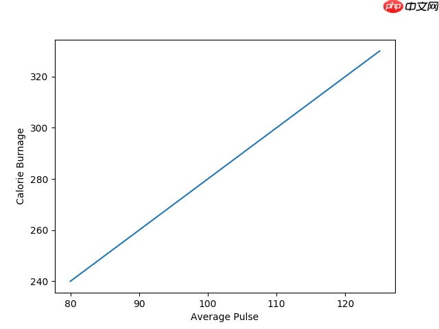
使用 Pyplot,您可以使用 xlabel() 和 ylabel() 函数为 x 轴和 y 轴设置标签。
为 x 轴和 y 轴添加标签:
import numpy as np
import matplotlib.pyplot as plt

x = np.array([80, 85, 90, 95, 100, 105, 110, 115, 120, 125])
y = np.array([240, 250, 260, 270, 280, 290, 300, 310, 320, 330])

plt.plot(x, y)

plt.xlabel("Average Pulse")
plt.ylabel("Calorie Burnage")

plt.show()
运行实例 »点击 "运行实例" 按钮查看在线实例
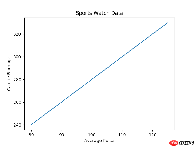
使用 Pyplot,您可以使用 title() 函数为图表设置标题。
为图表添加标题以及 x 轴和 y 轴的标签:
import numpy as np
import matplotlib.pyplot as plt

x = np.array([80, 85, 90, 95, 100, 105, 110, 115, 120, 125])
y = np.array([240, 250, 260, 270, 280, 290, 300, 310, 320, 330])

plt.plot(x, y)

plt.title("Sports Watch Data")
plt.xlabel("Average Pulse")
plt.ylabel("Calorie Burnage")

plt.show()
运行实例 »点击 "运行实例" 按钮查看在线实例
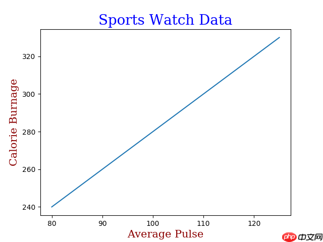
您可以在 xlabel()、ylabel() 和 title() 中使用 fontdict 参数来设置标题和标签的字体属性。
设置标题和标签的字体属性:
import numpy as np
import matplotlib.pyplot as plt

x = np.array([80, 85, 90, 95, 100, 105, 110, 115, 120, 125])
y = np.array([240, 250, 260, 270, 280, 290, 300, 310, 320, 330])

font1 = {'family':'serif','color':'blue','size':20}
font2 = {'family':'serif','color':'darkred','size':15}

plt.title("Sports Watch Data", fontdict = font1)
plt.xlabel("Average Pulse", fontdict = font2)
plt.ylabel("Calorie Burnage", fontdict = font2)

plt.plot(x, y)
plt.show()
运行实例 »点击 "运行实例" 按钮查看在线实例
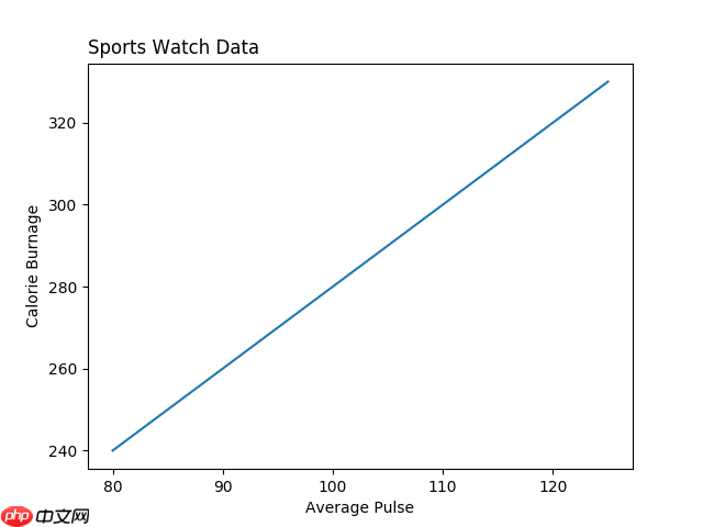
您可以使用 title() 中的 loc 参数来定位标题。
合法值包括:'left'、'right' 和 'center'。默认值是 'center'。
将标题定位到左侧:
import numpy as np
import matplotlib.pyplot as plt

x = np.array([80, 85, 90, 95, 100, 105, 110, 115, 120, 125])
y = np.array([240, 250, 260, 270, 280, 290, 300, 310, 320, 330])

plt.title("Sports Watch Data", loc = 'left')
plt.xlabel("Average Pulse")
plt.ylabel("Calorie Burnage")

plt.plot(x, y)
plt.show()
运行实例 »点击 "运行实例" 按钮查看在线实例
相关
视频
RELATED VIDEOS
科技资讯


1
2
3
4
5
6
7
8
9
精选课程

共5课时
17.3万人学习

共49课时
77.6万人学习

共29课时
62.1万人学习

共25课时
39.6万人学习

共43课时
71.4万人学习

共25课时
62万人学习

共22课时
23.1万人学习

共28课时
34.2万人学习

共89课时
126万人学习


